Miami Heat

Miami Heat
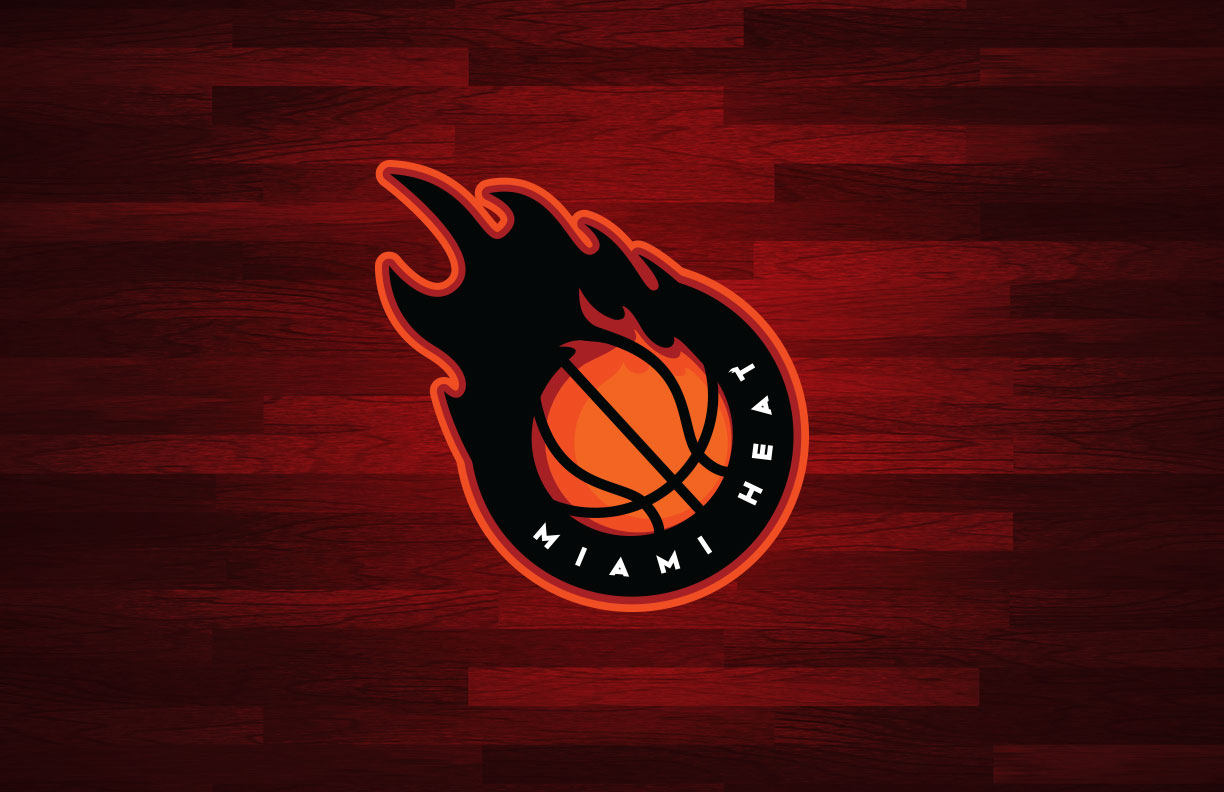
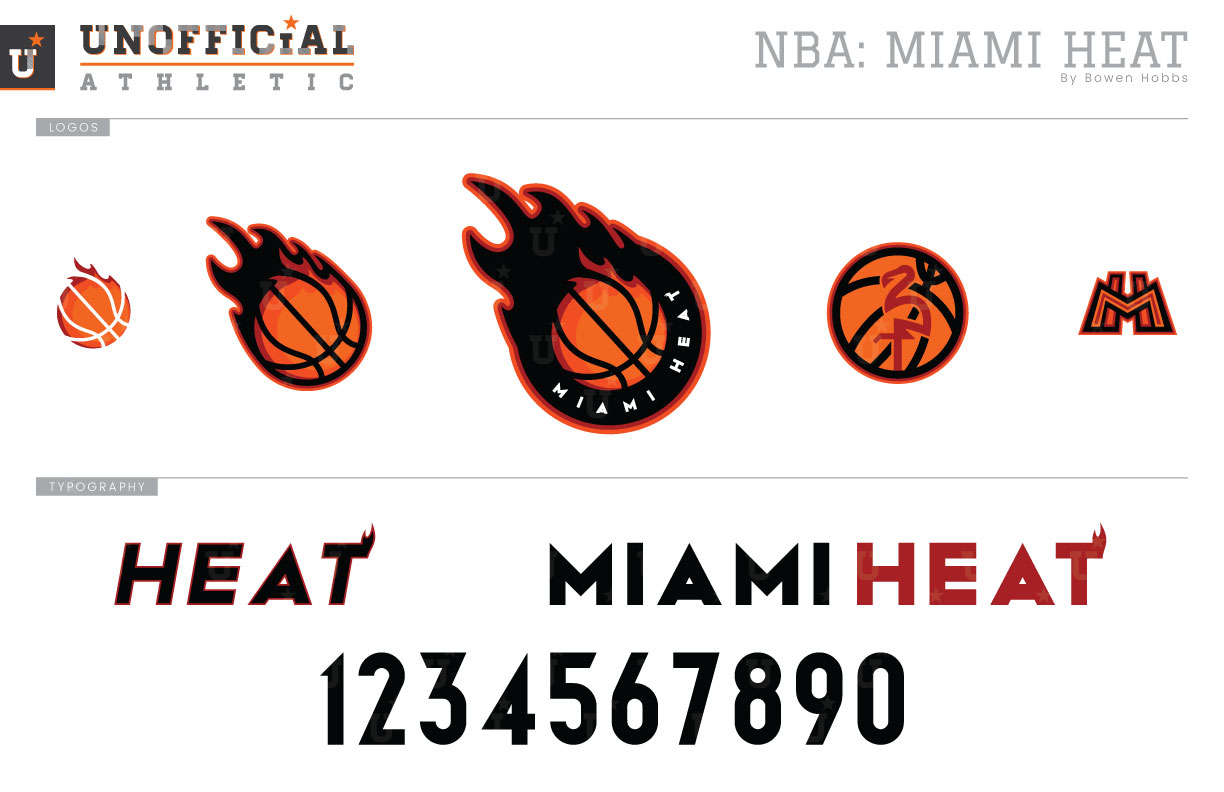
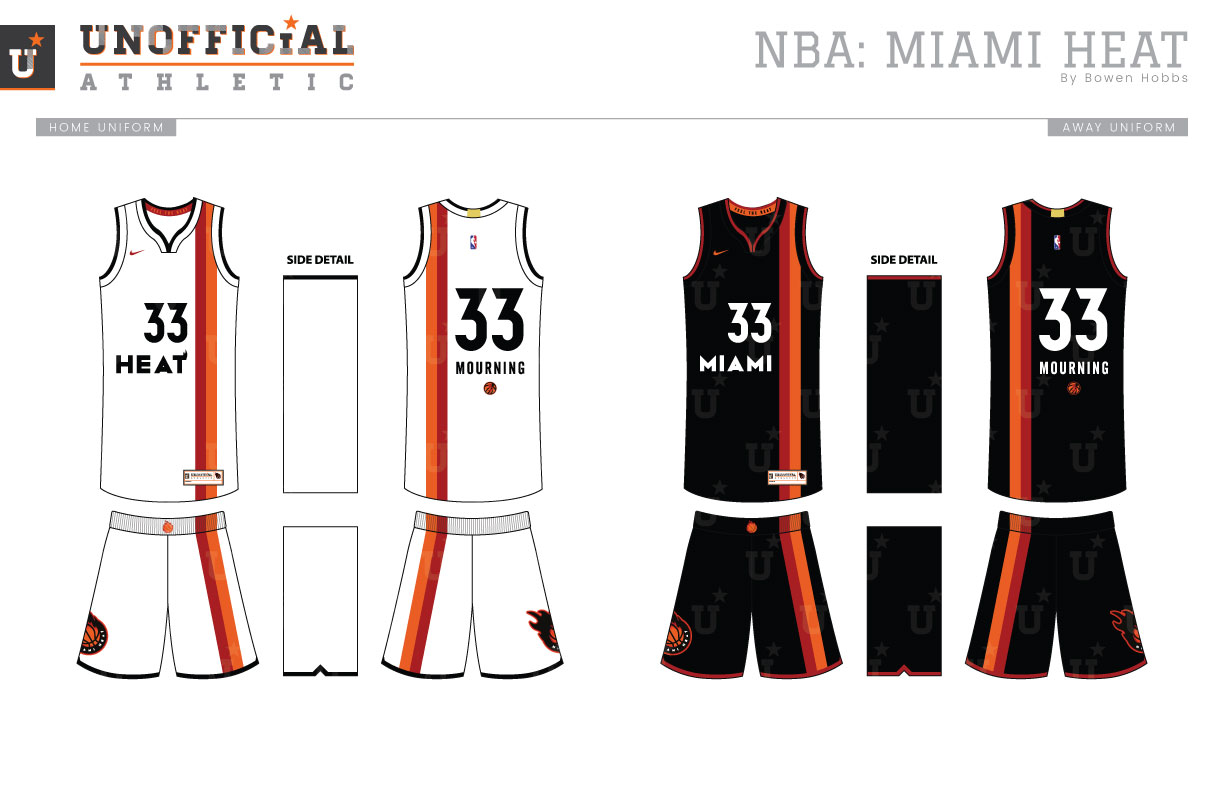
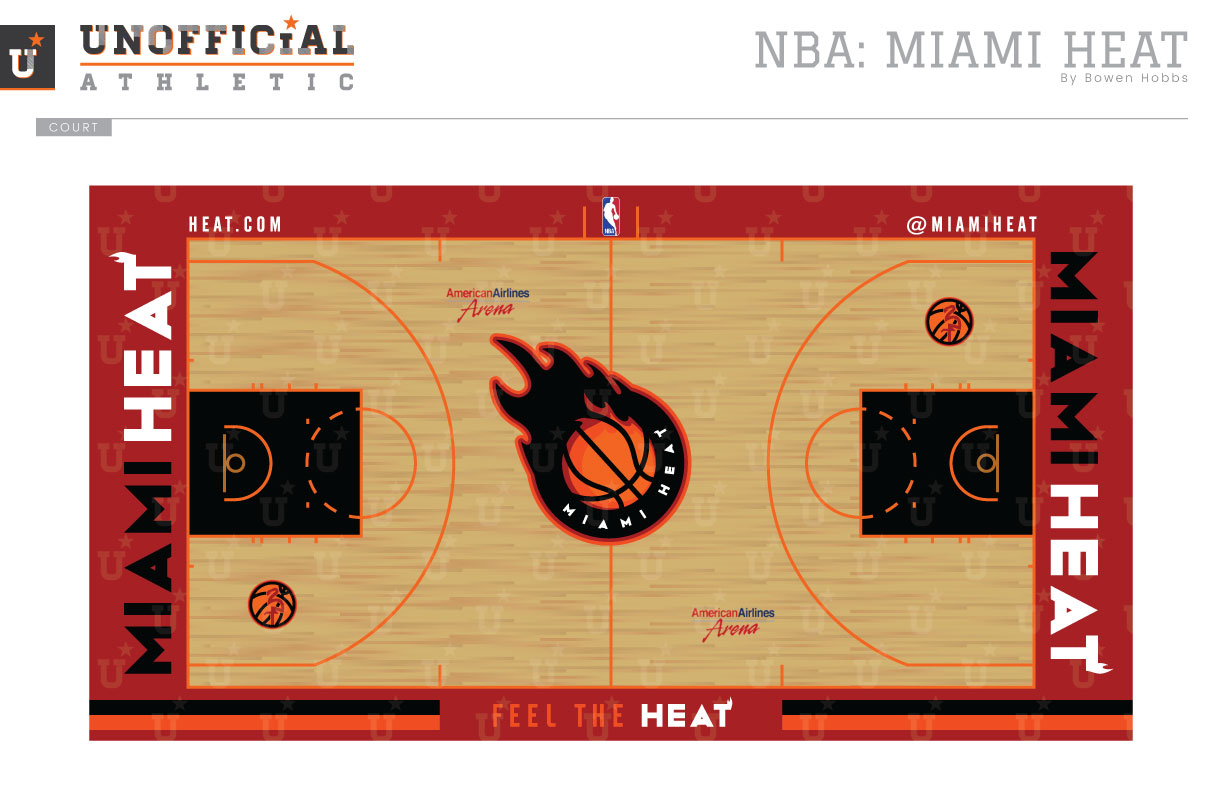
Since 1988, the Miami Heat have only updated their logo once, and it was essentially a color change, removing the red/orange gradient for cardinal and athletic gold and adding a black stroke around the mark. One issue the Heat’s branding has had since the NBA went to a six-division format was that the Heat’s branding often overlapped with the Hawks. My goal in redesigning the Heat was to draw a distinction between the two teams. The primary logo has been updated to a broken roundel with a streaking, flaming basketball rendered in cardinal red and orange with a thick black circle and additional flames in black. The primary mark breaks down into a non-roundel version and an icon without any outlines. The logo set is completed with a hybrid flamingo-basketball and an art deco MH mark. The custom typeface also taps into the modernity of Miami style with a flame on the T in HEAT. The uniforms pay homage to the ABA’s Miami Floridians with an off-center two-tone stripe over the player’s left side. The player name appears below the number on the back, while the primary logo appears on the right leg. The Pride uniforms combine elements of the Heat’s original uniforms with a Miami Vice palette of black, hot pink, and aqua. The court features the primary mark at center court and hot orange boundaries and three-point lines. Outside the boundaries is cardinal red, while black marks the lanes.
Date
April 22, 2018
Category
Basketball, NBA

