Chicago Cubs

Chicago Cubs
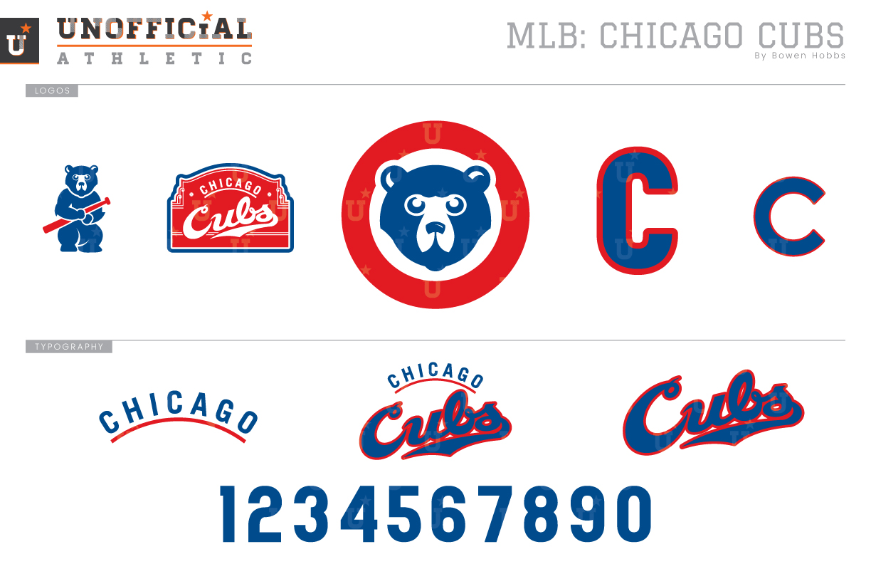
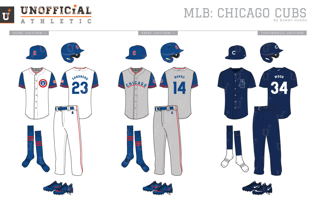
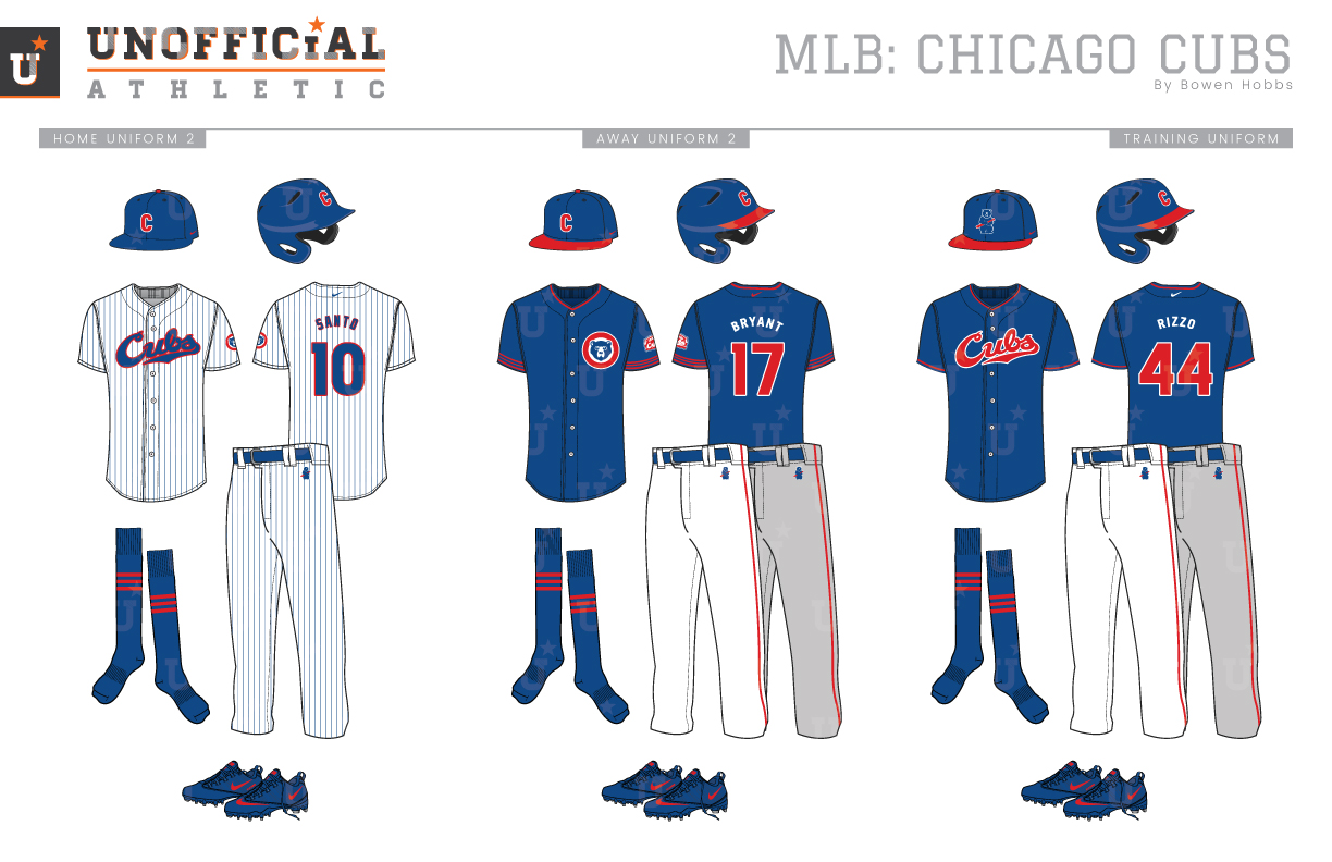
Most fans are familiar with the round-C that has been synonymous with the Cubs brand throughout their history. The circular letterform was used as early as 1908 and consistently since 1946. Over the years, the Cubs have also used an olde-english C, a thin slabserif C, a tuscan-style C, a wishbone C, as well as a rectangular C. But the round C won the fans over and has represented the Northsiders for more than 80 of the 115 years they have been the Cubs. My goal in this redesign was to find a way to marry elements of the team’s history with a fresh take on the overall aesthetic. The primary logo is a fresh take on the Cubs’ 80s sleeve patch. The cub is redrawn with a modern take and placed inside the broad red ring. The classic C is reimagined with increased height indicative of The Second City’s skyscrapers, with a rounded outline for a friendly look to match the team’s confines. Speaking of confines, a Wrigley-themed sleeve patch displays the team name against the sign-inspired holding shape. A re-styled cub holding a bat and the classic round C fill out the logo offerings. The Cubs name appears in a script form with CHICAGO in a minimal sans serif that matches the C on the caps. The numbers are styled to match the CHICAGO wordmark. The home whites and road greys conjure memories of Cubs teams from the 1940s with royal sleeves and simple red striping. The home uniforms feature the primary cub-head logo on the chest, with the tall C on the cap, while the roads opt for a blue CHICAGO with a red underline. The throwback uniforms throw it all the way back to 1914 with a solid navy scheme and the bat-holding cub on the chest. The home alternate brings back the familiar pinstripes with the cursive Cubs script, while the second alternate places the primary mark on a solid royal jersey and can be worn at Wrigley or away. The batting practice uniform uses the cub on the cap with the script on the jersey in the classic royal, red, and white.
Date
June 1, 2018
Category
Baseball, MLB


