Cleveland Spiders
Cleveland Spiders
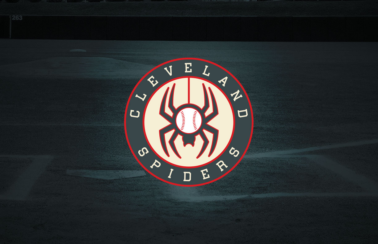
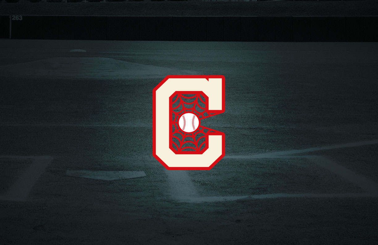
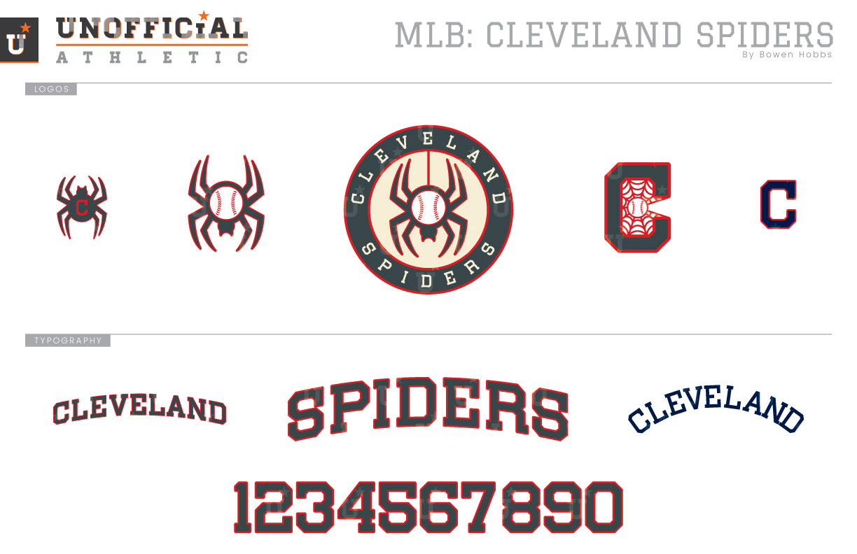
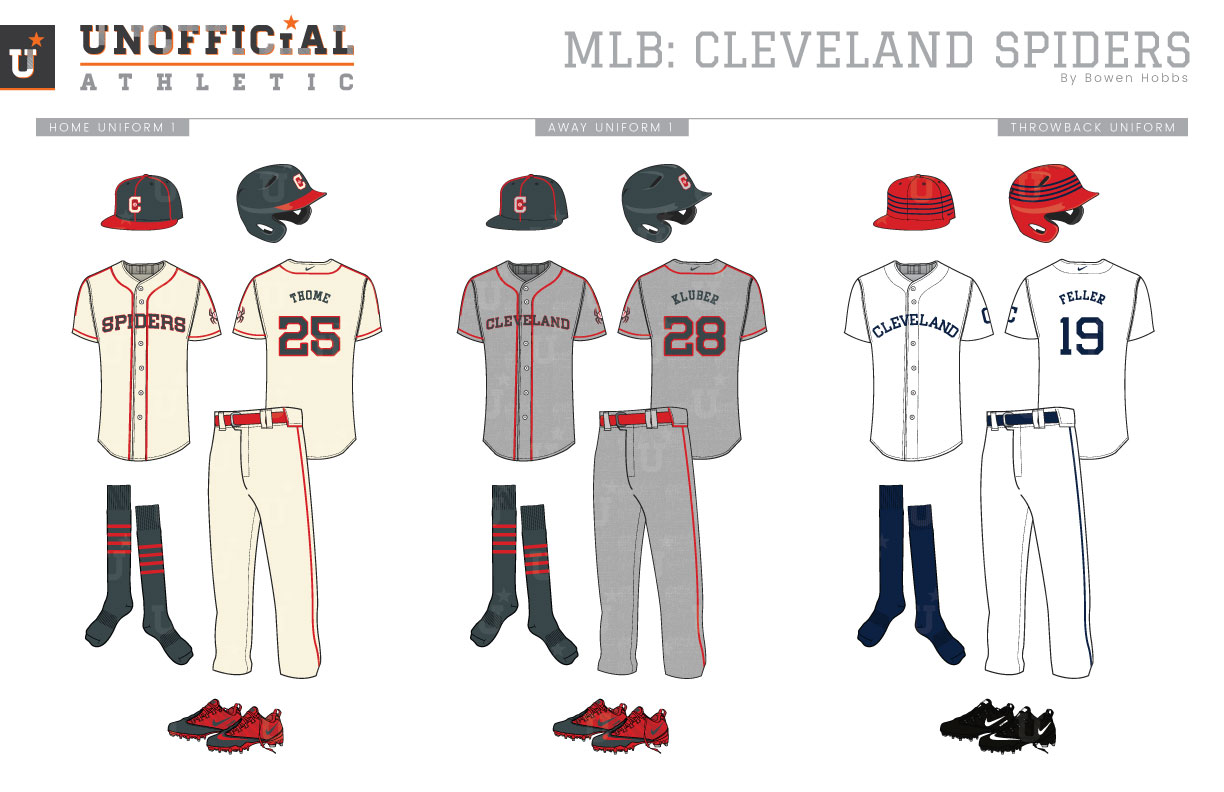
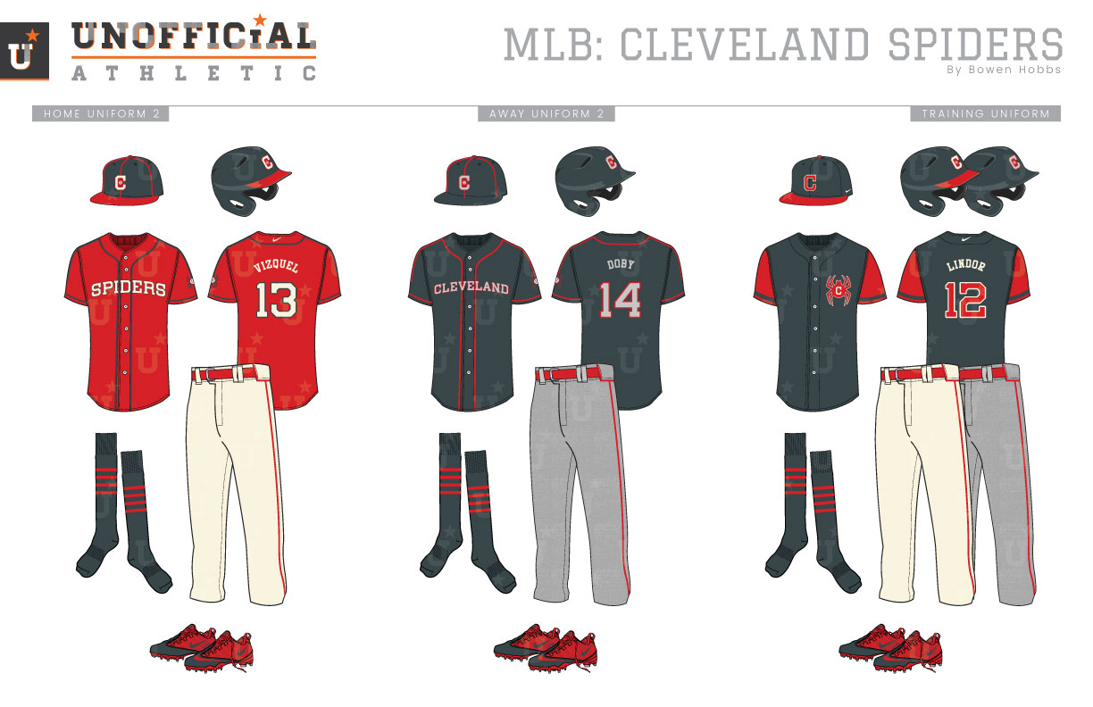
The Cleveland Indians. Where to start? In 2019, the team will no longer use Chief Wahoo, the racist caricature of a Native American, in their repertoire of branding elements. That leaves the team with an athletic block typeface-C, and… that’s about it. While I applaud the move away from Chief Wahoo, it leaves the team in prime position for a rebrand in every facet of its on-field identity. To accomplish a rebrand that engages fans, it is important to look at the pre-Indians history of Cleveland Baseball. The team had a few names before Indians, such as Naps (1905–1914), Blues (1901–1904), Lake Shores (1900), and Spiders (1887–1899). Spiders seems to be an obvious candidate to move forward with. My concept works to build new traditions in The Forest City, while still retaining some of the charm established by teams along the shores of Lake Erie. For the Spiders, I started with a color palette of graphite, red, cream, grey, and white. I wanted to bring in shades of a certain university that fans could naturally feel comfortable wearing. The graphite is paired with red as a bridge to the history of the franchise, while cream, white and grey round out the colorway for a vintage feel that evokes the tradition of America’s Pastime. The primary logo is a roundel with CLEVELAND SPIDERS placed around a baseball/spider lowering itself into the mark. The cap logo retains the Block-C, but places a spider web inside the letterform with a baseball at the center. The baseball/spider, a spider with a C, and a plain Block-C complete the logo set. The typeface is a standardization of the Block-C font, which is kept minimal to accentuate the no-frills attitude of the Rust Belt town. The home uniforms start with a cream base and red trim, with the sleeve accents descending into the spider sleeve patch. The home caps also feature some red trim along the construction seams of the cap to accent the jerseys. The away uniforms keep the red trim on the jerseys and caps, but on top of a flannel-texture grey uniform. Both the home and away uniforms feature graphite type with a red outline. The throwback uniforms pay homage to the original Cleveland Spiders with a white base, navy type, and a red cap with navy stripes. The home alternate uniform keeps the home cap and pants, but swaps the cream jersey out for a red option with graphite piping and cream type, while the away alternate pairs a graphite jersey with grey numbers and letters. The training jersey is graphite with red sleeves, and the C-Spider on the chest, while the training cap uses the plain Block-C in red and outline in cream on a graphite cap with a red bill.
Date
September 24, 2018
Category
Baseball, MLB

