Detroit Lions
Detroit Lions
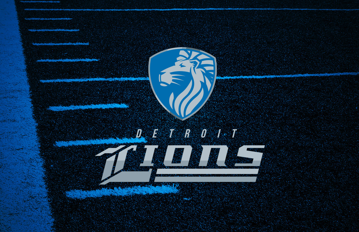
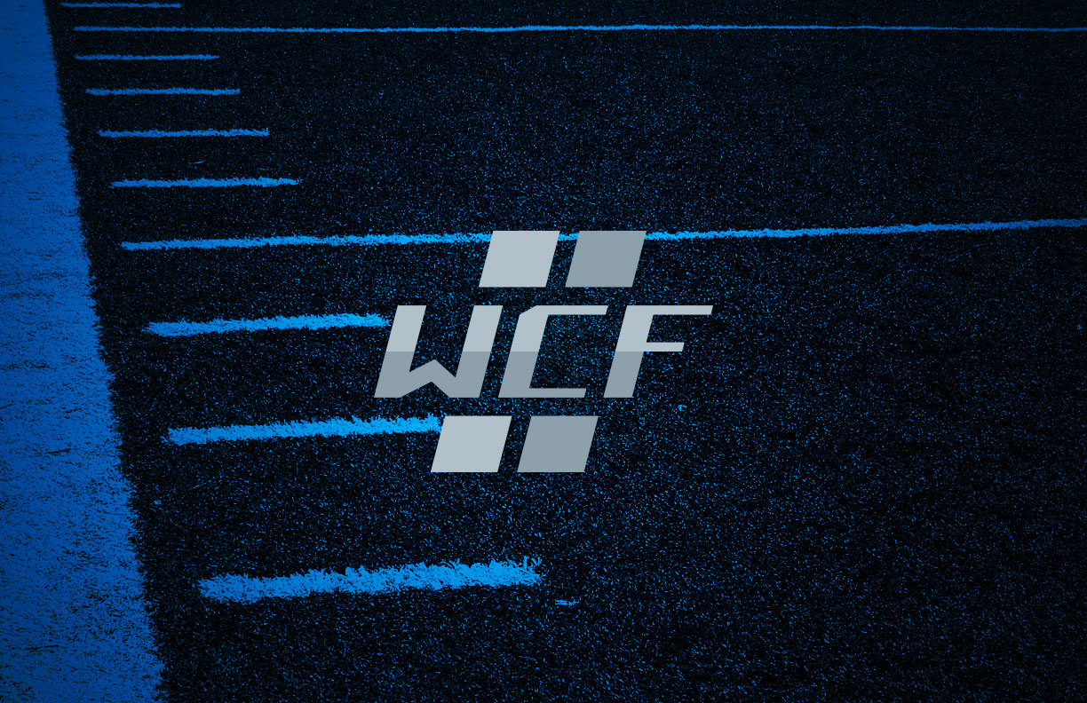
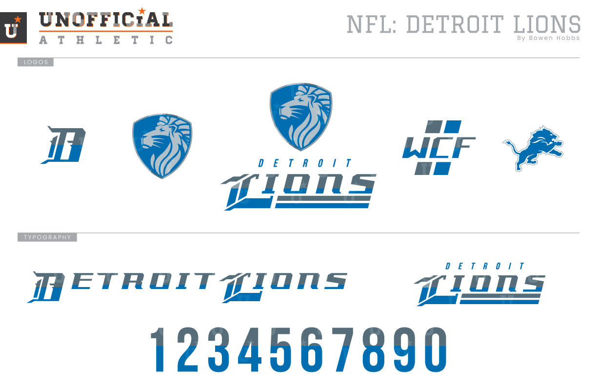
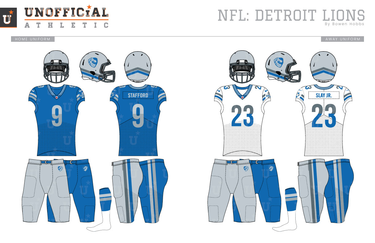
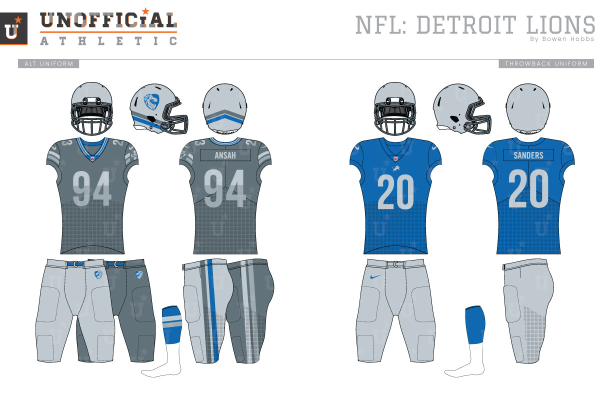
The Detroit Lions franchise was born in 1929 in Portsmouth, Ohio. Originally the Portsmouth Spartans, the Lions moved to Motown in 1934, started playing on Thanksgiving, and never looked back. They would go on to win four titles (1935, 1952, 1953, 1957) before the Super Bowl was established. Throughout most of their early history, the Lions wore simple blue jerseys with silver numbers and paired them with plain silver helmets and pants. The team has routinely revived this look for Thanksgiving and other celebrations of team history. The shade of blue has changed over the years. The Lions wore a more muted blue in the 1930s and switched to Honolulu Blue until the 1950s, when they would wear a deeper royal blue. The jerseys would first see the introduction of stripes in 1957, but only on the road. The home jerseys would first see stripes in 1961. In 1975, the blue switched back to Honolulu blue, and white outlined would frame the silver numbers and stripes. Those silver number would become white with a silver outline in 1982. That general look would last until 2003, when black accents were added to the scheme, much to the displeasure of fans. The team would go through another uniform evolution in 2009 when the lion logo was updated and subtle tweaks were made to the uniform to make it simpler and more cohesive. The Lions most recently rebranded in 2016, removing all black and adding a small amount of charcoal grey. My redesign for the Lions places a lion head inside a shield looking left to signify a change in direction as the team enters a new era. The shield is combined with a strong modern italicized font that features a large capital L with an Olde English flair. The team’s alternate logo is a tribute to their late owner, William Clay Ford. His initials appear against two stripes reminiscent of the team’s identity from 1961 through 1969. To complement the shield and WCF tribute logo, I created an Olde English D to be worn on coaches caps and retained the leaping lion logo for throwback purposes. The aggressive and angular wordmark is paired with a clean modern sans serif secondary typeface that is used for the city name and the jerseys numbers. The new helmets place the shield on each side with the lion facing forward, ready for action. Instead of relying on a stripe down the middle of the helmet, I placed a pair of stripes angling up as they reach a point in the back of the headgear. The facemasks are charcoal grey. The home jerseys are Honolulu Blue with two-tone silver stripes and numbers as a nod to Detroit’s history as the automotive capital of the US. The away white jerseys feature a similar “shiny” two-tone effect but with charcoal and blue against a white base. Both the home and away uniforms can be paired with silver or blue pants. The alternate jersey is charcoal grey with silver numbers and stripes and a blue collar for a chrome look that can be combined with silver or charcoal pants. The throwback uniforms bring back a familiar look with a twist. Plain blue jerseys, silver helmets, and silver pants are mixed with a more modern typeface and the leaping lion logo just below the collar.
Date
November 28, 2018
Category
Football, NFL

