Los Angeles Chargers
Los Angeles Chargers
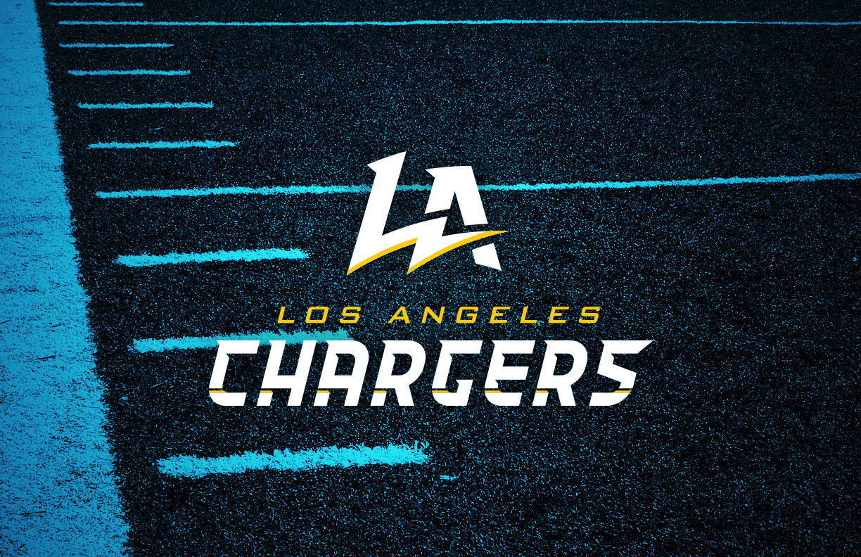
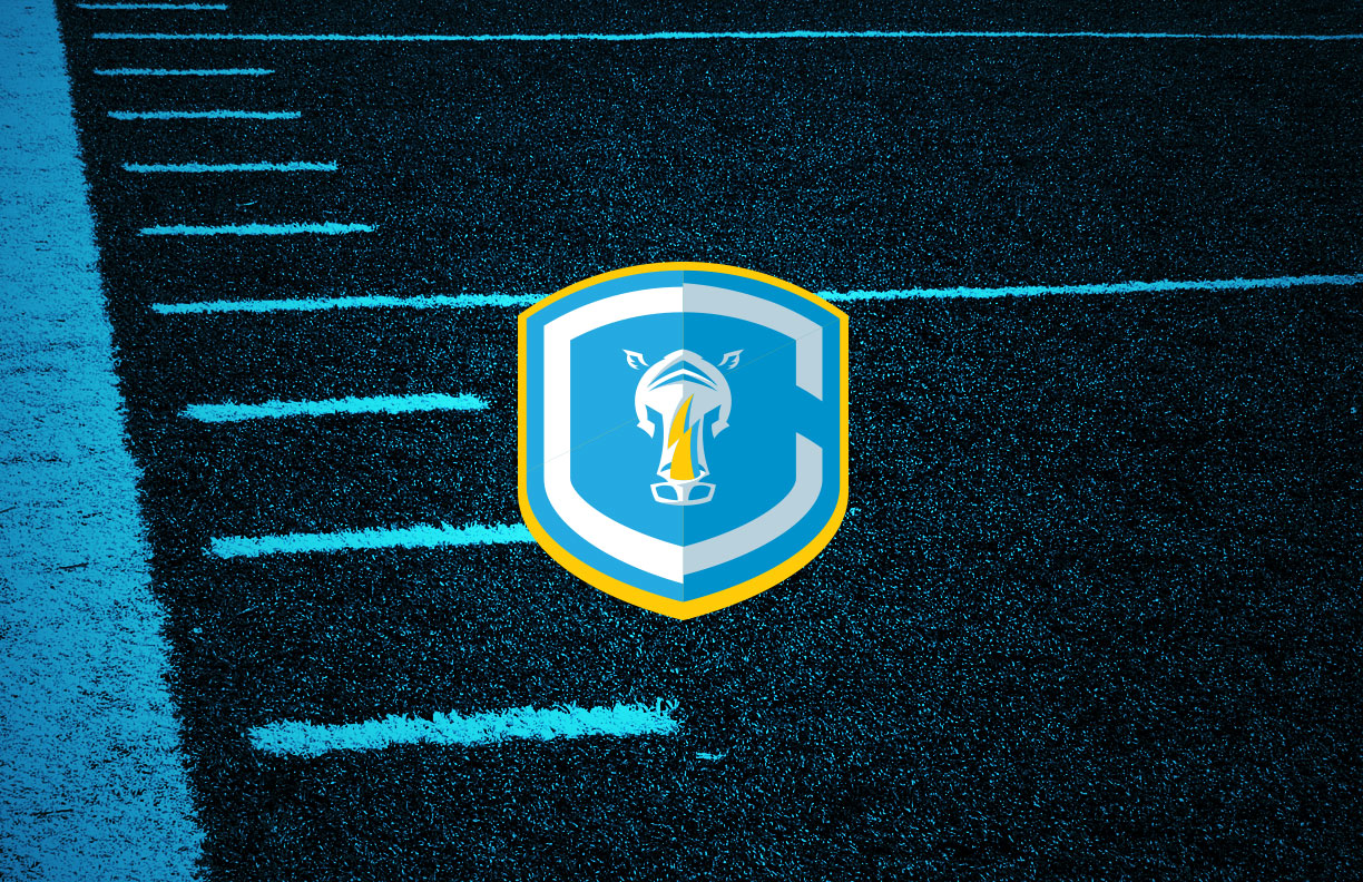
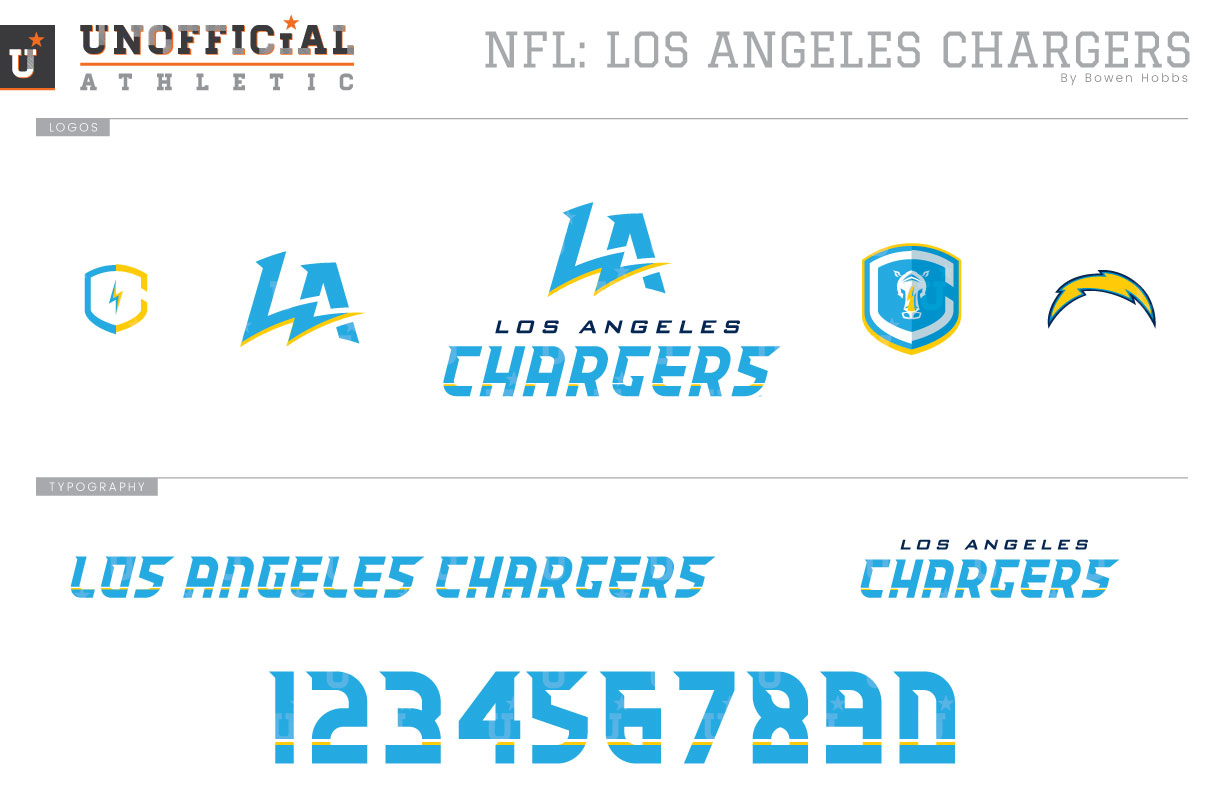
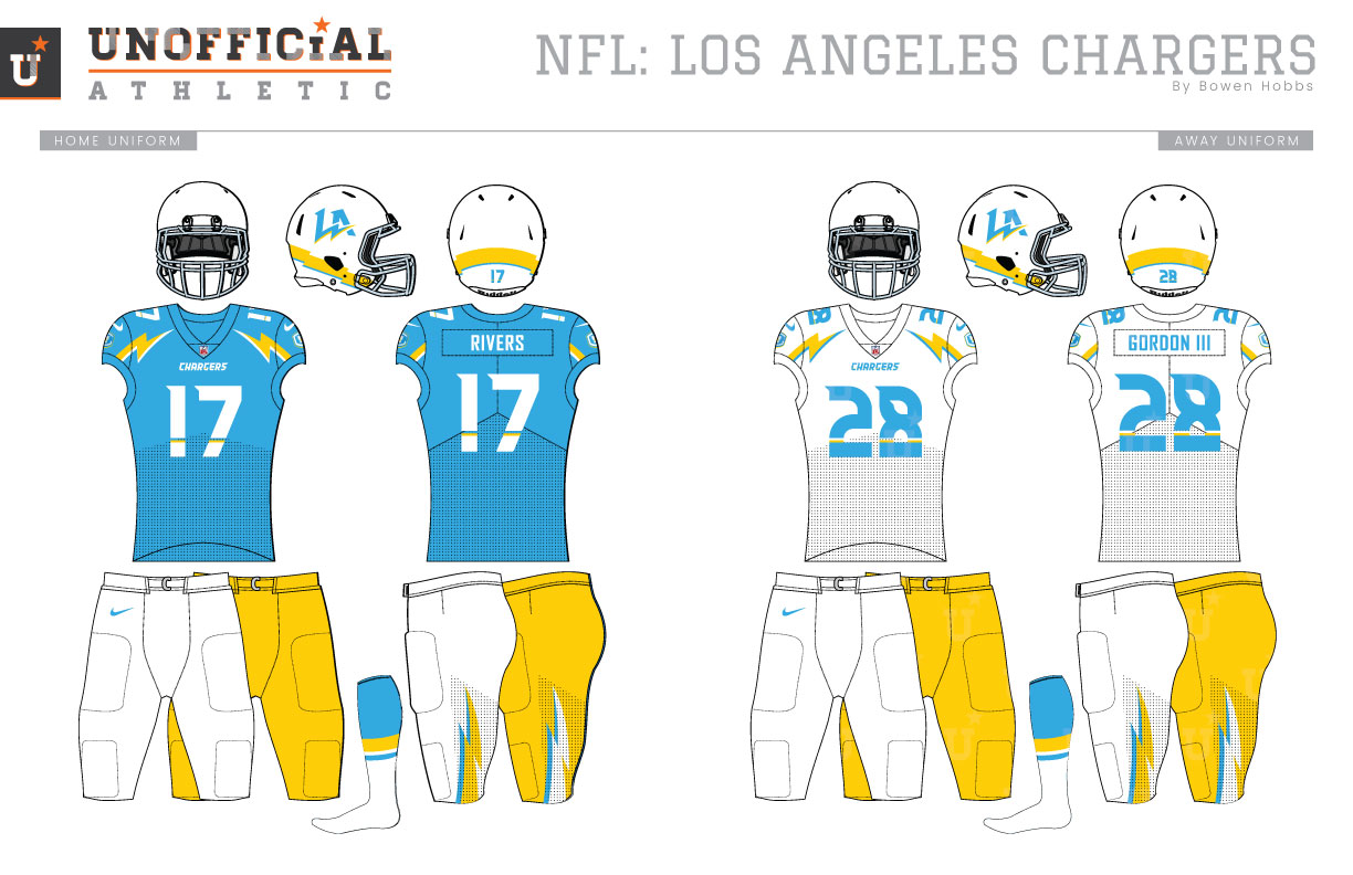
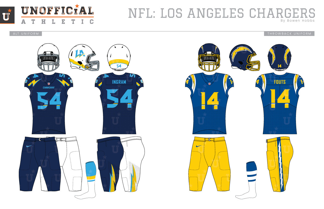
In 1960, the Los Angeles Chargers began play as one of the original American Football League teams along with the Boston Patriots, Buffalo Bills, Dallas Texans (Kansas City Chiefs), Denver Broncos, Houston Oilers, New York Titans (Jets), and Oakland Raiders. The Chargers would move to San Diego a year later and stay in California’s second largest city for 56 seasons. In 2017, the Chargers would move back north to Los Angeles and play at the LA Galaxy’s stadium in Carson as they await the construction of their shared stadium with the newly-returned Los Angeles Rams. Over those many years the Chargers uniforms would remain relatively consistent, featuring a lightning bolt on each side of the helmet and along the players’ shoulders. The original version of the Bolts’ uniforms placed the player number on the side of the white helmet below the lightning bolt, with powder blue jerseys and white pants. Over the years the shade of blue has changed and the team has also experimented with more traditional pant stripes. The powder blue would lighten in 1966 and the team would introduce athletic gold pants. This combination would last until 1974, the the Chargers would opt for navy helmets, royal jerseys, and gold pants. That combination would become more subdued in the 1980s, as the team transitioned to white pants in 1985, and navy jerseys in 1988. The powder blues would see a rebirth in the early 2000s as a throwback option, and a new powder blue uniform set would be introduced as the team’s alternate in the 2007 rebrand that saw a return to white helmets. The team has worn that same scheme since, albeit with some minor edits to work with evolving manufacturer templates. My Chargers redesign brings Los Angeles to the forefront with a stylized LA featuring a lightning bolt charging through the city initials. The alternate logo reimagines a new mascot for the team. I chose a rhino over a horse to ensure that the Chargers’ brand doesn’t get confused with either the Broncos or Colts, who each have horse mascots of their own. The rhino head contains a bolt horn and is placed against a shaded C-Shield. The LA logo appears with and without the team name, while the classic bolt remains for throwback purposes. The coach’s caps have a minimalist C-Shield with a bolt icon in the center. The updated script carries over the italicized, charging letterforms with the classic strikethrough treatment, but with a sharper font to represent the new era. The uniforms have also been updated, with LA appearing on white helmets with blue-grey facemarks and an athletic gold lightning accent by the player’s neck. The new jerseys use the bolts in a different orientation, now along the collarbones pointing toward the neck instead of as shoulder stripes. The alternate logo appears on the sleeves. The home jersey is powder blue with white type, while the away uses powder blue type on white and the alternate uses powder blue type on navy. Both the home and away have options for white or athletic gold pants, while the alternate jersey can be paired with navy or white pants. The throwback-inspired uniforms bring back the Air Coryell era with navy helmets, royal jerseys and athletic gold pants updated with the new team font.
Date
December 3, 2018
Category
Football, NFL

