Flint Tropics
Flint Tropics
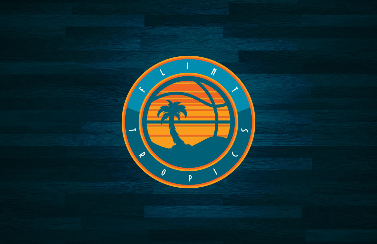
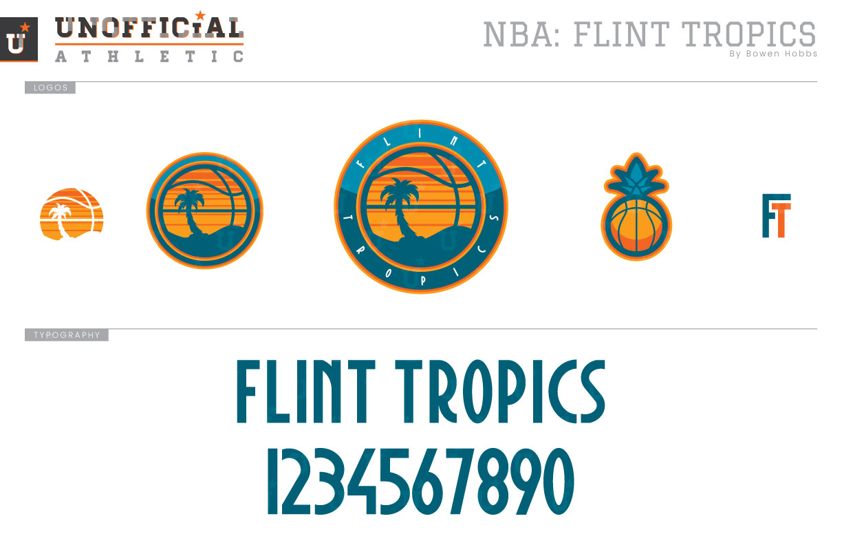
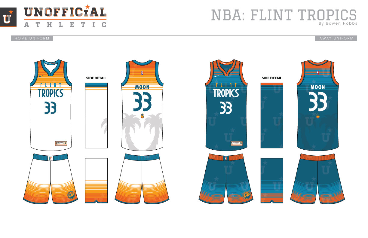
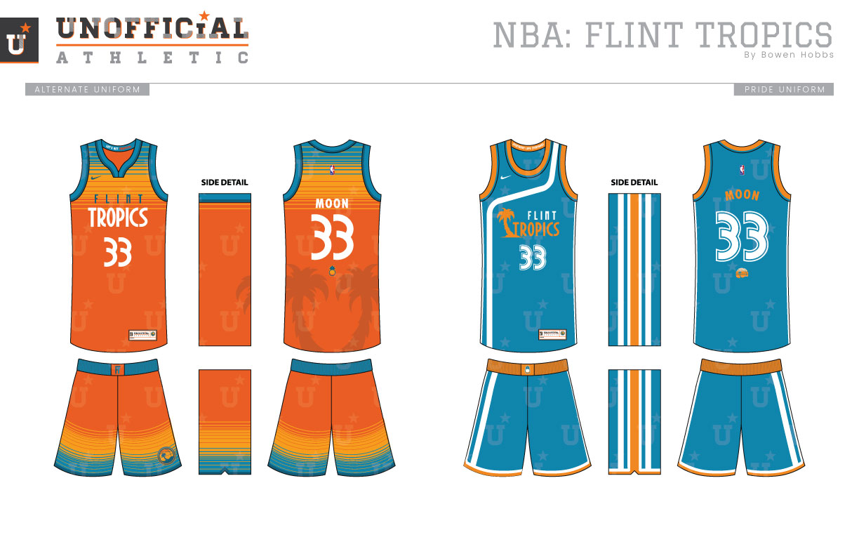
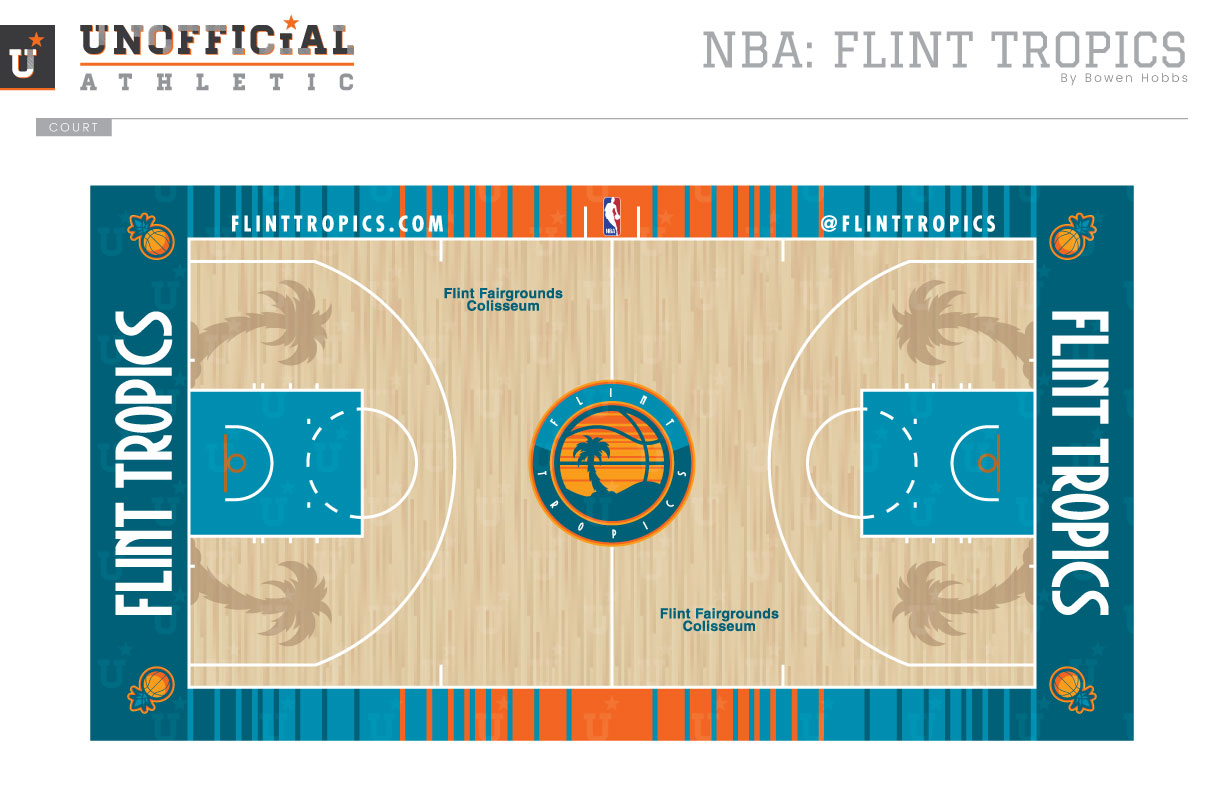
What if the Flint Tropics really existed and weren’t just Will Ferrell’s excuse to wear short shorts and a ‘fro? If the Tropics were a real team, how would the changing fashions of sports branding have influenced them? Would they have kept their colors? Their logo? These are the kind of questions I often ask myself. To answer those questions (at least in my mind) I developed a concept for the team that depicts how I believe they could have (or should have) looked in the present era. My take on the Tropics’ primary logo is a roundel with two shades of teal, orange, and athletic gold. The orange and athletic gold create a sunset pattern, while the deep teal is used for the line work and is paired with the bright teal for the two-tone ring around the sunset-basketball. To complement the roundel logo, I developed a textless version of the sunset-basketball, an icon version, a pineapple secondary logo, and an FT lettermark. The typeface is geometric and fun, representing a combination of the 70s aesthetic and the tropical nature of the team name. The uniforms continue the loud, yet fun look by utilizing the horizontal sunset pattern on the shoulders and shorts to create a gradiated effect. The entire team name, FLINT TROPICS, appears on the chest of the jerseys, while a pair of palm trees is sublimated on the backs. The Pride uniforms are an updated version of what the Tropics wear in Semi-Pro, with revised typography. The court also uses the horizontal line pattern to set the tone, and rotates the traditional hardwood pattern most courts have to match the Flint Fairgrounds Coliseum from the movie. The pineapples appear in the corners of the court, while sublimated palm trees make another appear inside the three-point line.
Date
April 23, 2018
Category
Basketball, NBA

