Houston Astros

Houston Astros
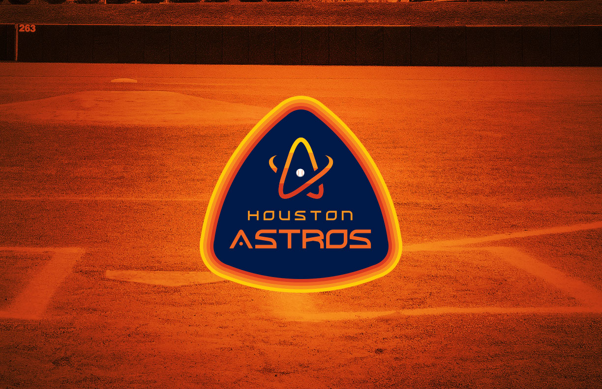
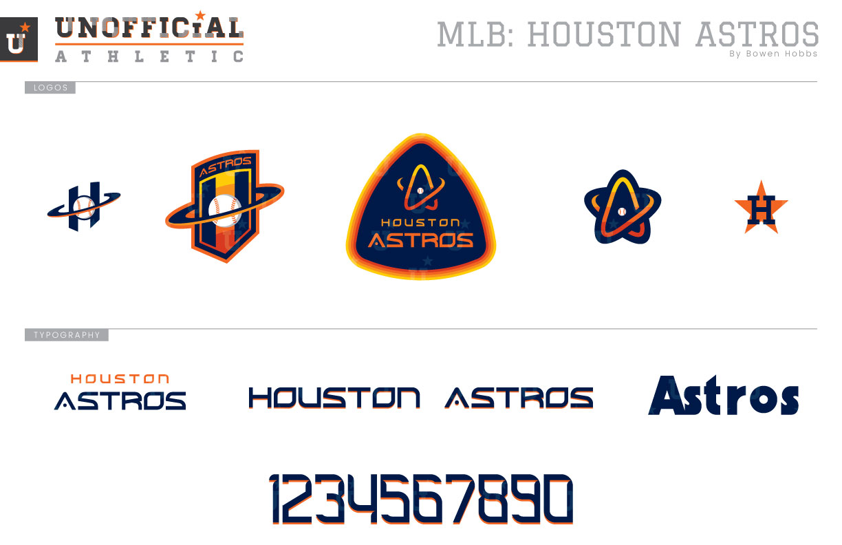
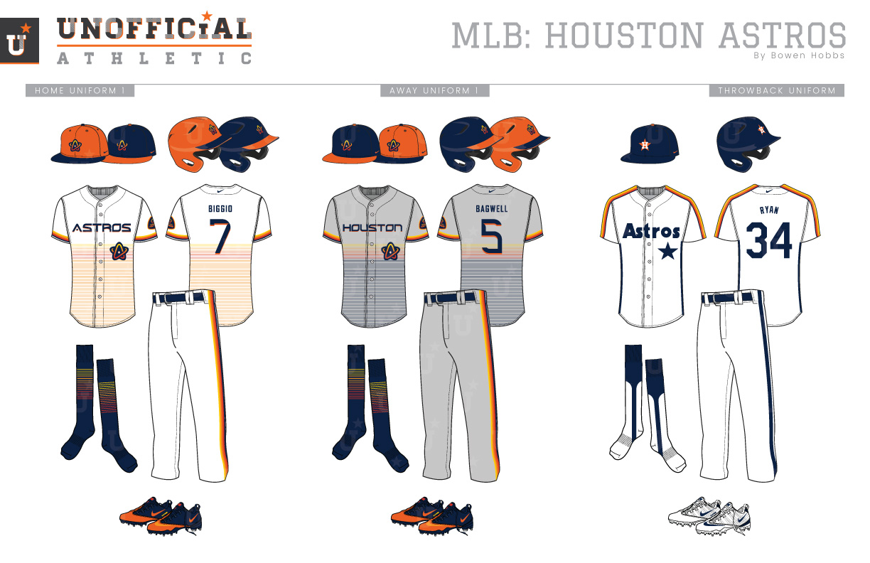
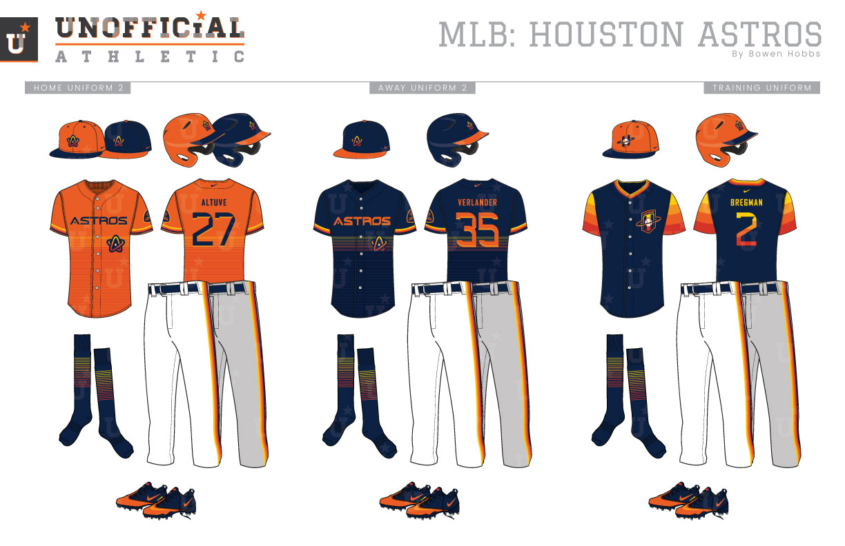
Houston first became a major league city in 1962, but the team would not be known as the Astros until 1965. For those first three seasons, Lone Star baseball was known as the Houston Colt .45s. They wore navy caps with “.45s” on them in orange. Those same colors transferred over to the Astros brand once the name change took place, and a new cap and uniforms were unveiled. The caps were still navy, but with a white H placed over an orange star. The home whites featured a shooting star above the team name, while the road greys opted for HOUSTON in a block serif typeface. In 1971, the team would embrace a brighter look by making orange their dominant color, accented by navy. The orange caps now featured a navy star with a white H and would survive the team’s design overhaul in 1975. That season, the ‘Stros would unveil their infamous Tequila Sunrise uniforms, which featured bold red, orange, and athletic gold horizontal stripes on the sleeves and torso of the jersey, as well as down the sides of the pant legs. The team name was rendered in a navy sans serif font with a navy star over the torso stripes on the player’s left side. The Tequila Sunrise uniforms were used for both home and road games, as their were unique enough to identify the Astros no matter where they were playing. The Astros would not have a second uniform until 1980, when they unveiled a beige road uniform with a navy cap and the sunrise pattern running down their sleeves. The orange caps would be phased out after the 1982 season in which a white version of the Tequila Racing Stripes uniform was unveiled to match the beige road gear. The Tequila Sunrise jerseys were the next to be retired, after the 1986 season. The Tequila Racing Stripes would last on their own for seven more seasons, when the Astros would once again rebrand. The 1994 season brought a midnight navy and metallic gold scheme to the forefront along with futuristic italicized typography and an angular shooting star cap logo. The paired down color pallet was revised once again for the 2000 season, when it was replaced by coal (black), brick red, and metallic gold. The new black-and-red Astros were capitalizing on the neo-classic tastes in ballparks and overall aesthetic that baseball fans clamored for at the time. It was an awkward fit for the Astros, however, as that same wave of nostalgia unearthed the dormant nationwide affection for their Tequila Sunrise throwbacks. So in 2013, as the team moved over to the American League, it took the opportunity to once again redesign its brand, returning to navy and orange as its colors, along with a modernized version of its H-Star cap logo. The current brand is subdued and uses a similar font to the old .45s road jerseys, but the team has added splashes of its rainbow pattern into trim and on the batting practice gear. My Astros rebrand pays homage to the rich visual history of a Houston staple: NASA. The primary logo starts with a rounded triangle holding shape and contains a Tequila Sunrise-themed A-Star icon above the team name. The A-Star icon also works on its own as a cap logo. The classic H-Star mark is used in conjunction with the throwbacks, while two versions of an H-Orbit logo are reserved for practice attire. The new font is minimal and streamlined with a subtle drop shadow. The orange cap is used as the primary home cap, while the navy cap is typically used on the road, but either can be used as an alternate option. The uniforms feature sunrise trim on the sleeves and pants, as well as a subtle sunrise on the torso composed of thin lines that create a scaled back version of the original. The home uniforms are white with orange shading on the torso, while the road greys use navy striping below the rainbow pattern. The throwbacks replicate the Tequila Racing Stripe uniforms with their navy caps and simple typography. In addition, there are two colorful alternate jerseys: an orange jersey with navy type, and a navy jersey with orange type. Both feature the subtle torso sunrise pattern. The batting practice caps are orange with a navy bill and the H-Orbit mark, while the BP jerseys are navy with sunrise sleeves and the expanded H-Orbit logo on the left chest and rainbow numbers on the back.
Date
March 8, 2019
Category
Baseball, MLB

