Houston Rockets
Houston Rockets
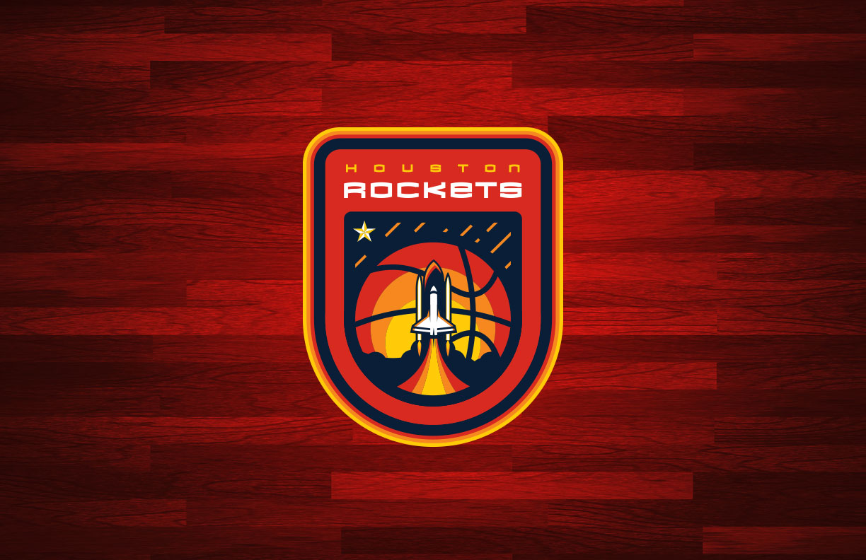
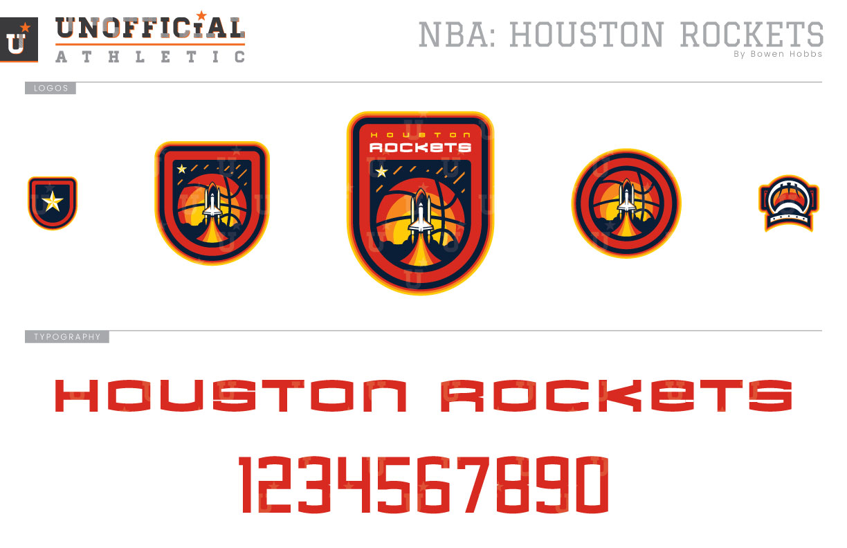
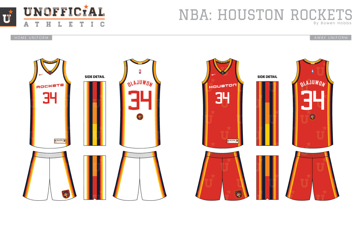
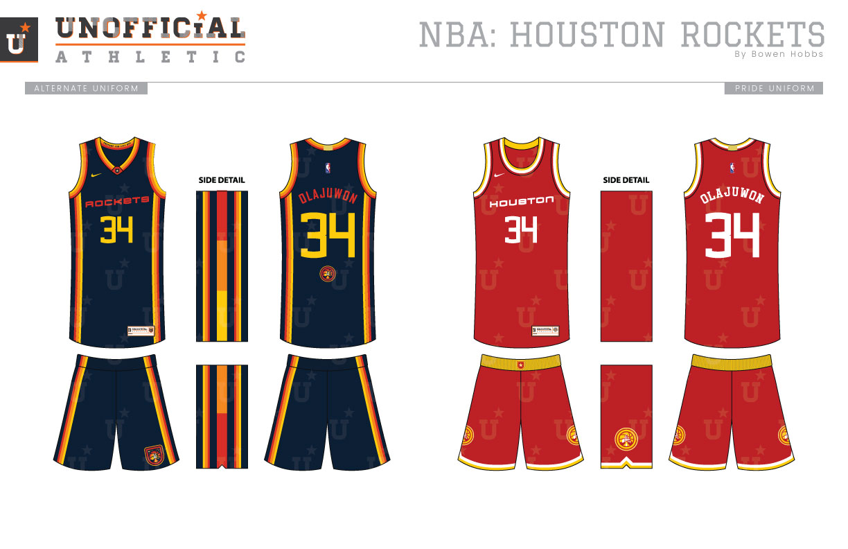
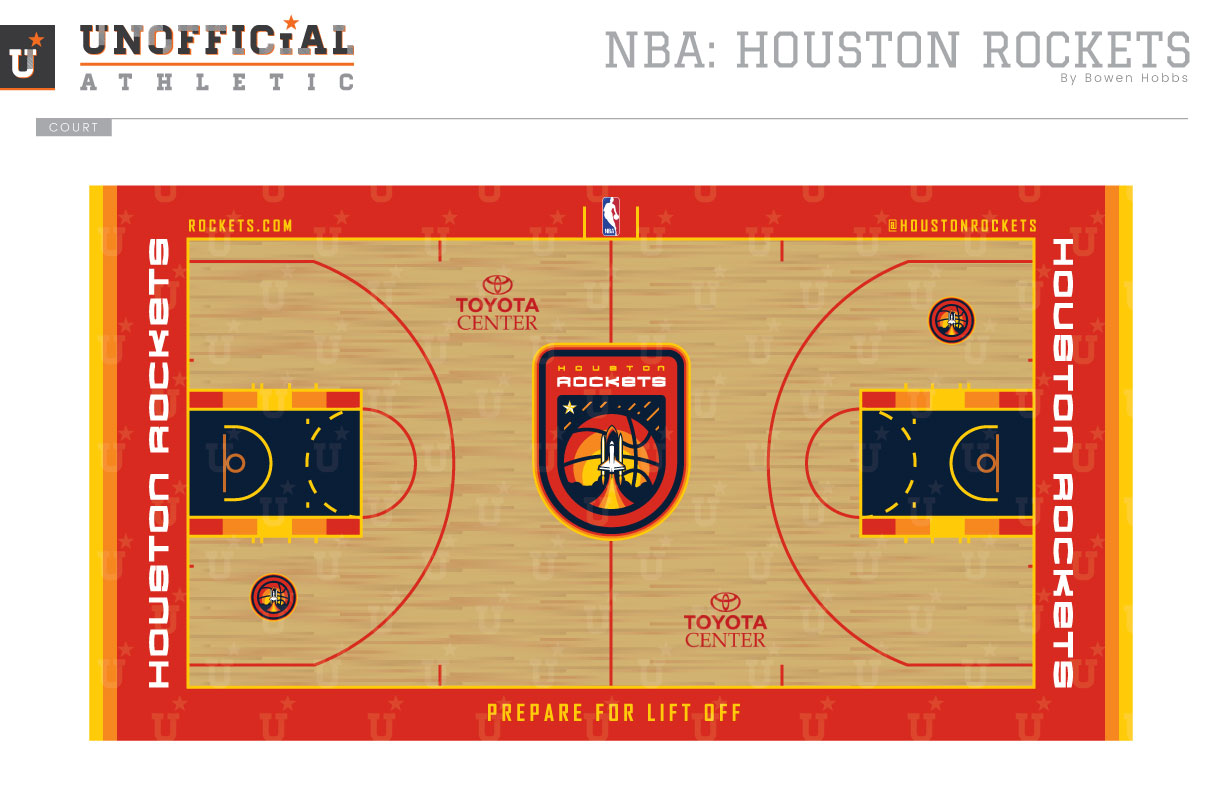
Much of the Rockets’ history has been built around a simple red and athletic gold scheme. In 1995, that changed when the team unveiled a rebrand in navy, red, and silver, complete with boldly pinstriped uniforms. In 2003, the team dropped the navy to focus on red and silver, since adding black to the scheme. While the Rockets don’t have that one single uniform like the Pistons or Nuggets, they do have NASA. And with that said: Houston, we have a rebrand. My primary logo pays homage to NASA, with a mission patch-style primary logo featuring a rocket lifting off in front of a basketball/moon with a single lone star to the upper left of it. The mark is paired down to a textless and a circular version and is complemented by a star-shield and an astronaut helmet icon. The typeface is sleek and modern with curved strokes at the top and bottom of the letterforms. The uniforms feature a tilted wordmark and navy side panels containing a segmented gradient of red, orange, and yellow. The type is rendered in a single color for a timeless appearance. The alternate is much like the Icon and Association uniforms, but with a combination of red and yellow type. The Pride uniforms pay homage to the 90s Rockets teams that won two NBA Championships while Michael Jordan was playing baseball. The court features red boundaries with a navy lane accented by the segmented gradient. A reminder to PREPARE FOR LIFT OFF greets the team as they take the court for every home game.
Date
September 4, 2017
Category
Basketball, NBA

