Kansas City Chiefs

Kansas City Chiefs
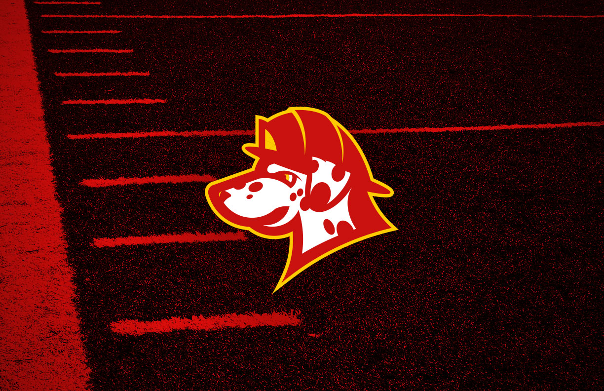
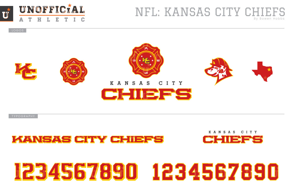
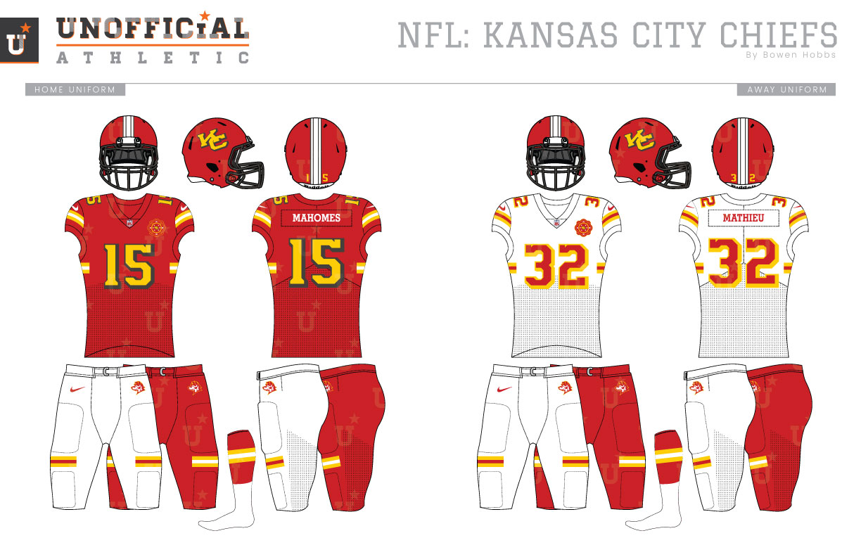
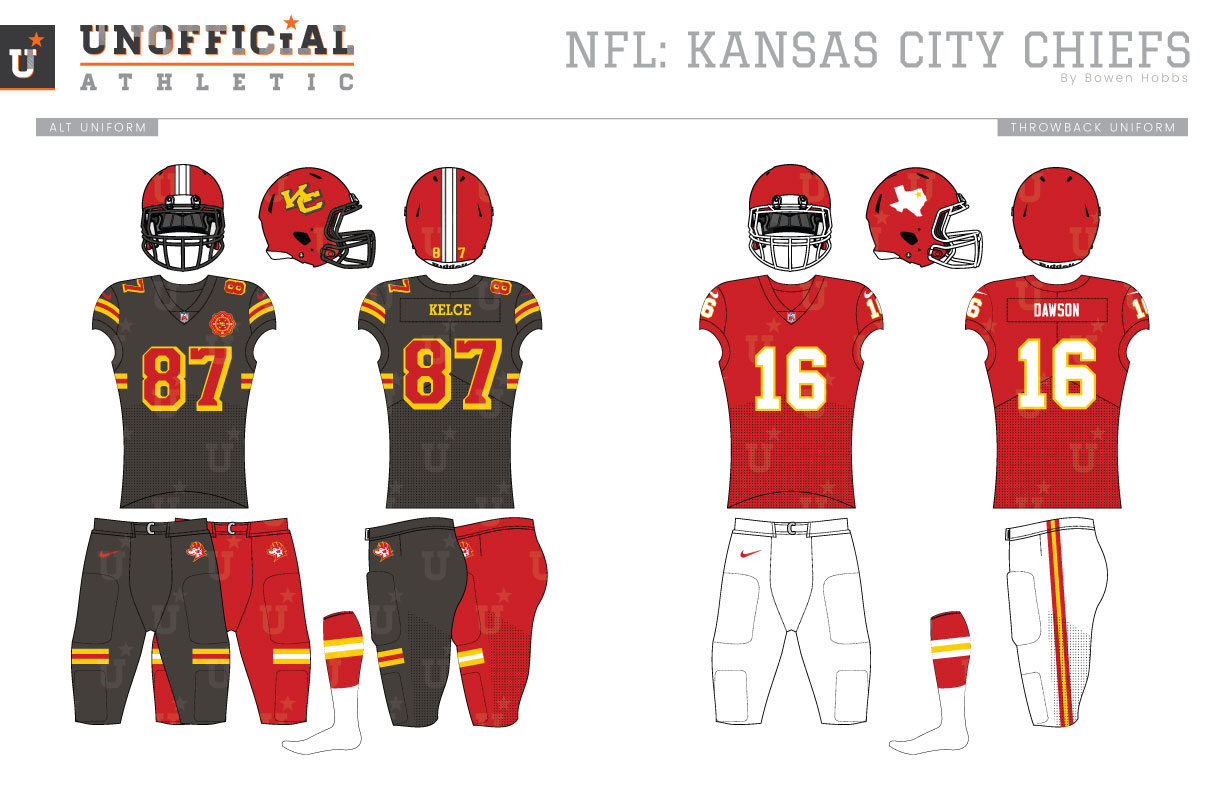
While the Chiefs franchise was an original AFL member founded in 1960, they didn’t play their first snap in the Show Me State until 1963. During those first three seasons, they were the Dallas Texans and wore red helmets with a white Texas and a gold star over Dallas. Their uniforms were similar to the Chiefs uniforms, although the sleeves lacked any striping. White numbers on red with a gold outline, reversed on the road, defined the classic look and were paired with white pants featuring a thin red-gold-red stripe. The only change the team made to their uniforms upon becoming the Kansas City Chiefs was swapping the Texas logo on the helmet for a white arrowhead with a red KC outlined in black. Five seasons later, a thin triple stripe was added to the sleeve cuffs while red pants became the norm for road games. Over time the sleeve cuff striping would become thicker while the facemasks would change from gray to white for the 1974 season. Kansas City’s uniforms were locked in for decades after the initial tinkering phase, with the next update occurring in 2007 when the Lamar Hunt memorial patch was added to the left chest. For the 2012 season, Nike made a few updates to the jerseys to accommodate smaller sleeves. The sleeve stripes became even thicker than before and moved off the cuff to be more visible, and the TV numbers moved from the sleeves to the shoulders. My Chiefs redesign removes the Native American imagery from the team’s branding but keeps the name Chiefs. How is this possible? I restyled the identity to revolve around a different leader: the Chief of a fire department. To that end, the new primary logo displays a Maltese Cross that features an interlocking KC. The mark also includes six stars to represent the original ALF logo, the team’s inaugural season (1960), an A for AFL, and LH for the team’s original owner Lamar Hunt. The Maltese Cross icon is placed above a slab serif KANSAS CITY and CHIEFS in a stout block serif font with a drop shadow to create the team signature. The alternate logo shows off the team’s new mascot, a Dalmatian in a firefighter’s helmet rendered in red, white, and athletic gold. The firefighter theme continues to the helmet, with its gold and charcoal interlocking KC against a gloss red helmet alongside a white and charcoal stripe that matches KCFD trucks. The home jerseys start with a red base and make use of stripes on the sleeves and ribs placed similarly to the reflective elements of tactical gear. The numbers match the KC on the helmet in athletic gold and charcoal. The white away jerseys swap the gold, white, and charcoal elements for red numbers and stripes with gold accents. Both the home and away jerseys pair with white or red pants that feature the same horizontal stripes as the jerseys. The alternate jersey opts for charcoal grey with red type outlined in gold and red and gold striping. It pairs with either charcoal gray or red pants. For the throwback uniform, I chose to commemorate the team’s inaugural season as the Dallas Texans.
Date
February 22, 2020
Category
Football, NFL


