Kentucky Colonels

Kentucky Colonels
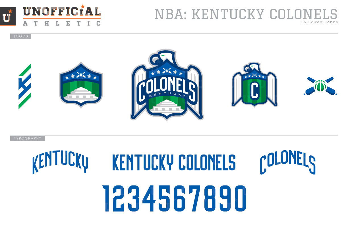
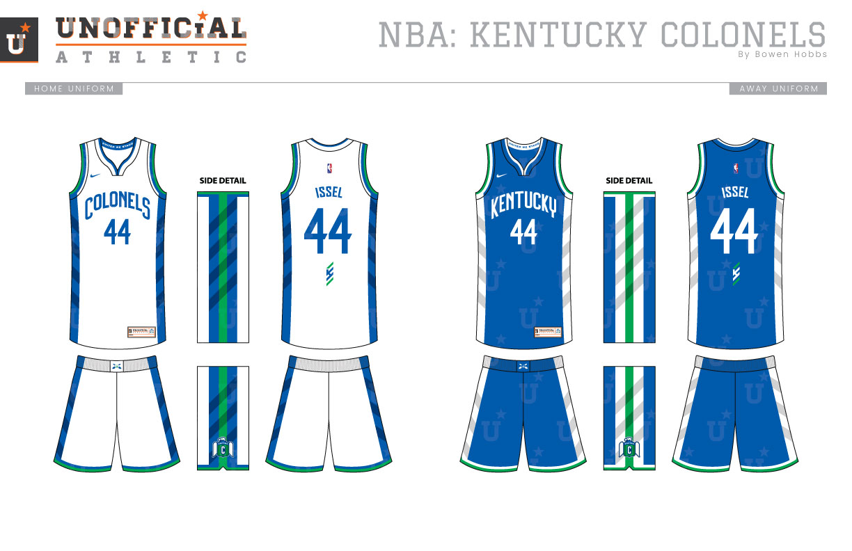
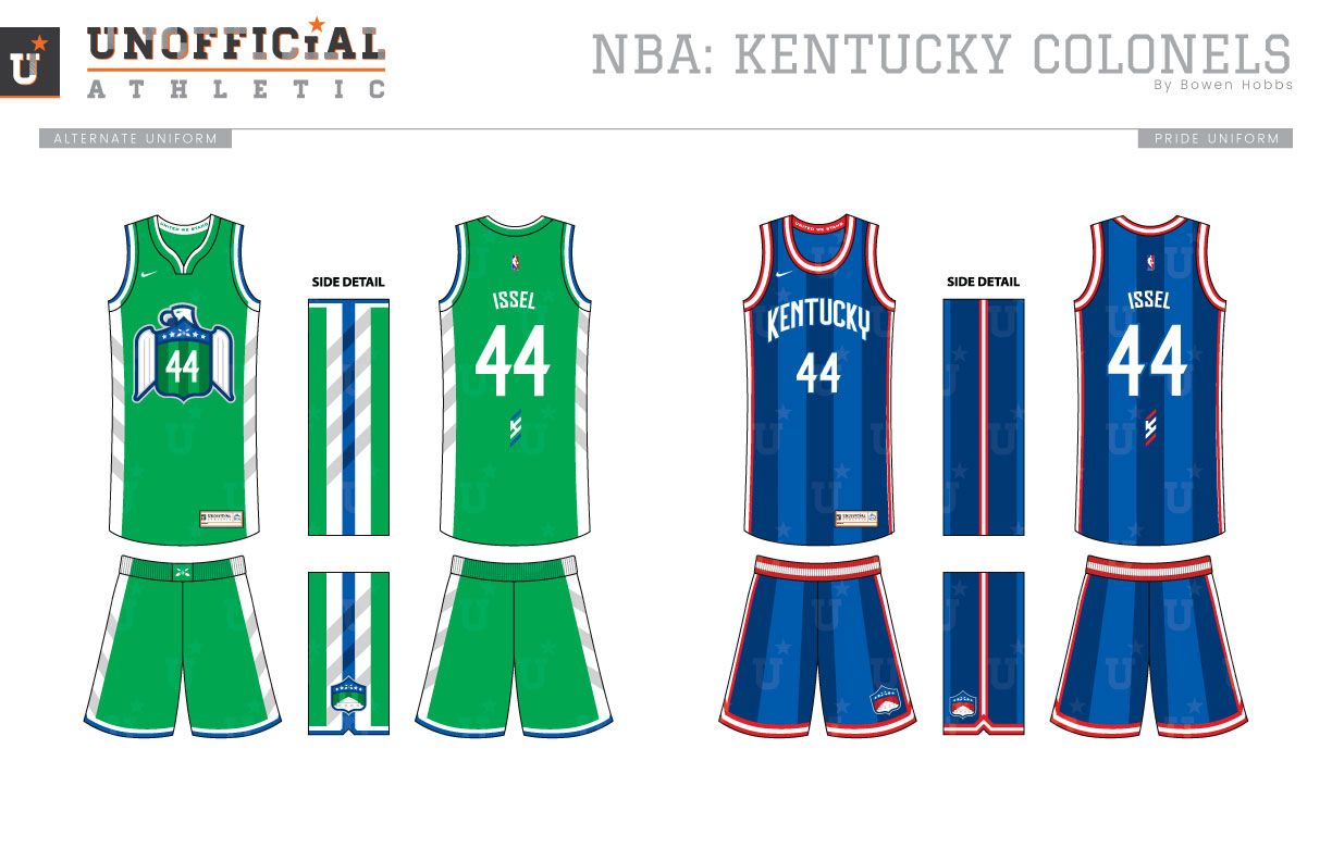
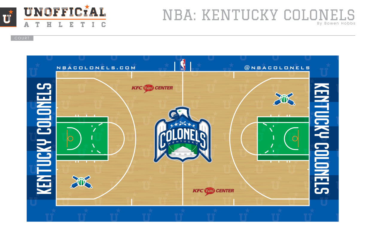
The Kentucky Colonels were one of only two teams that neither moved, changed their nickname, nor folded during the duration of the ABA. Unfortunately, they did not survive the 1976 ABA-NBA merger, unlike the Indiana Pacers. Born in 1967, the Colonels originally sported a kelly green and black scheme before switching to a more standard royal and red scheme in 1970. My concept blends elements from both visual eras into a color scheme of blues and greens with silver accents. The primary logo combines an eagle with a shield containing stars, stripes, cannons, and Fort Knox. The elements from the primary logo are reconstructed into two of the secondary logos, an Eagle-Shield adorned by a C, and a Fort Knox-Shield mark. The cannons from the top of the shield stand alone as an icon, with a KY-stripe logo combining the state abbreviation with a designation of military rank. The uniforms carry over the diagonal lines and subtle shading from the logo set on the side panels. The Association whites proudly display COLONELS on the chest, while the Icon edition uniforms say KENTUCKY. The Statement Edition uniforms are kelly green with the Eagle-Shield on the chest containing the player number. The Pride jerseys combine vertical broad stripes in royal and navy with red accents and KENTUCKY on the chest. The court also works in the subtle striping with royal and navy out of bounds and kelly green and emerald in the lanes.
Date
April 22, 2018
Category
Basketball, NBA

