Los Angeles Dodgers
Los Angeles Dodgers
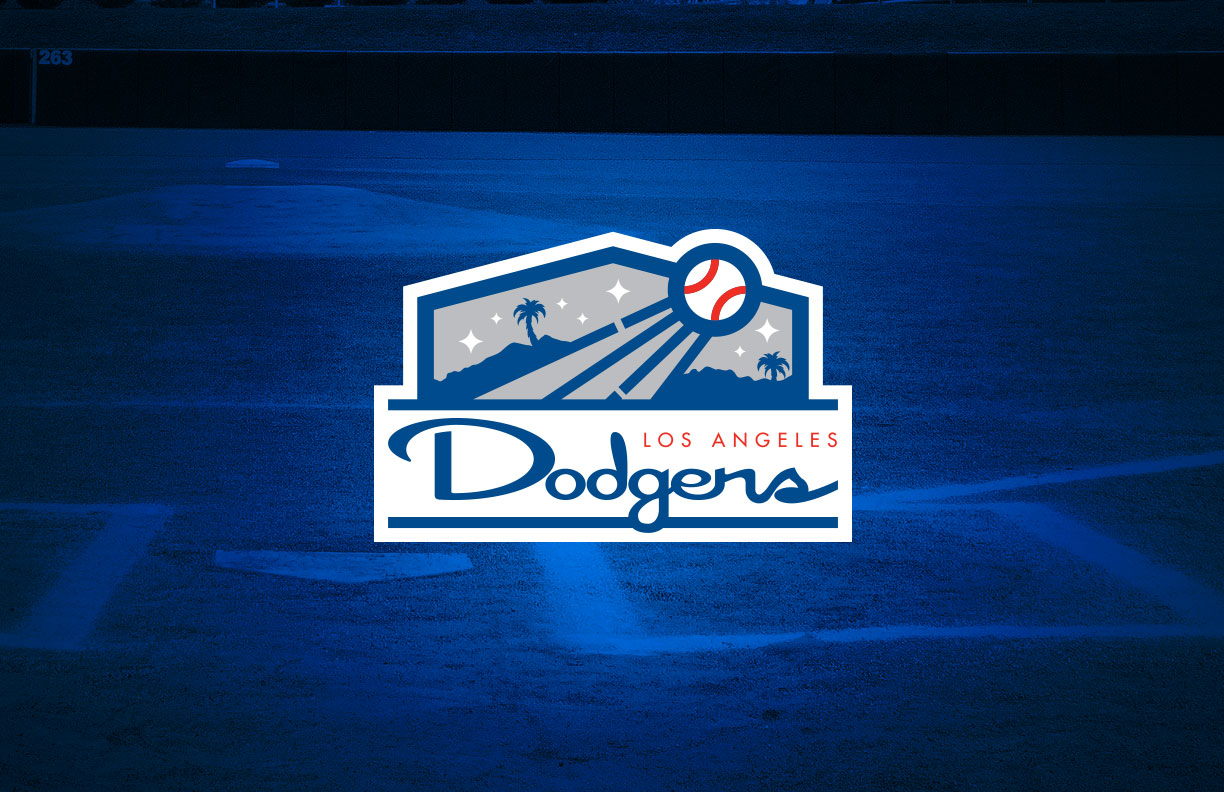
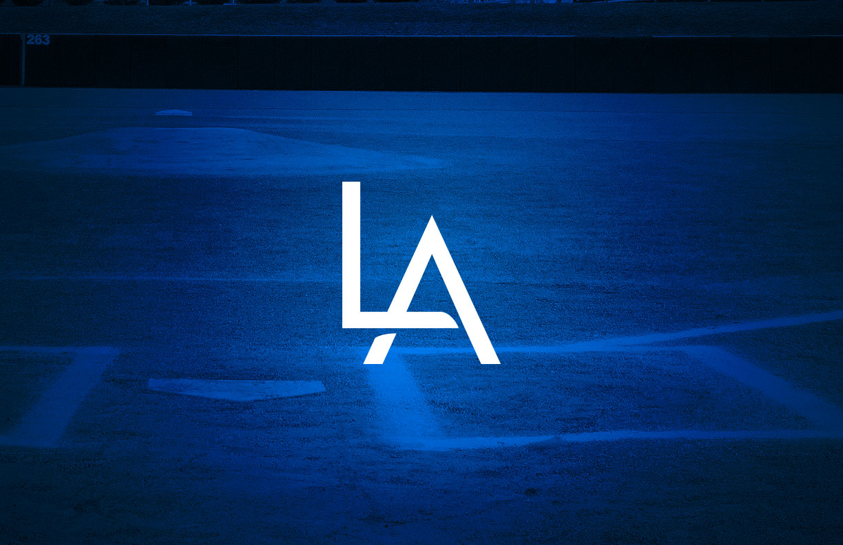
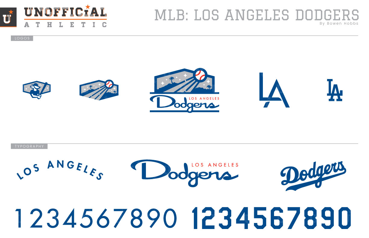
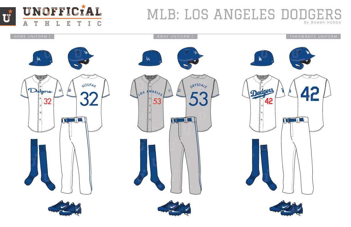
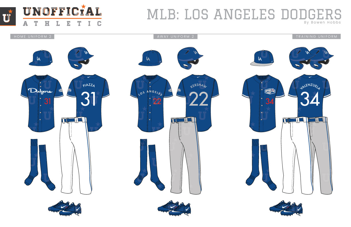
The Dodgers’ journey to Los Angeles begins in the 19th century. Brooklyn was home to some of the first pro baseball teams in recorded history during the 1860s. The Brooklyn Grays sprung from that heritage in 1883. The Grays would join the NL in 1889. The name Trolley Dodgers was first coined in 1895, but the team would also go by various nicknames including the Bridegrooms, Superbas, and Robins. The name Dodgers was only first officially used in 1932, when it appeared on the team’s jerseys. During this time and beyond the Dodgers would experiment with various color schemes and uniform styles but kept coming back to royal blue as a dominant color. The Dodgers really started resembling the modern-day club in 1938, with royal blue caps and their signature script. They would experiment with shiny powder blue uniforms designed to shimmer at night in 1944, but the next big change to the uniforms would be the addition of red numbers on the front of the jerseys in 1952. The Dodgers were the first team in MLB history to have a number on the front of their uniforms, and they made the most of it by making the numeral bright red. After moving to Los Angeles following the 1957 season, the team updated its road uniform with a Los Angeles script in 1959. Outside of toggling between the Dodgers and Los Angeles scripts on the away jersey, white-and-blue sleeve trim was added to the aways for the 1977 season. Fast forward to 1999, when the team surprisingly wore grey vests with blue undershirts for its road games. The vests only lasted one season, as the Dodgers went with blue head spoon and sleeve piping until 2007, when they would unveil their current uniforms. My Dodgers rebranding concept imagines what the team would look like in an alternate universe where the uniforms more closely resemble elements of the stadium experience instead of maintaining the branding of the Brooklyn era. The classic script is replaced by a wider cursive font with a mid-century flair. The wider profile is carried over to the hexagonally-framed California landscape above the team name that mimics the team’s video boards and signage. A baseball streaking out of Chavez Ravine adds a splash of red to the primary logo. The team’s LA cap logo is revised with a geometric typeface fitting of the overall aesthetic. The icon from the primary logo is also used as a sleeve patch, while the classic-LA and a Dodger Dog mascot logo complete the logo set. The home uniforms start with classic blue caps with a white LA and blue sleeve and pants piping. While the typefaces are updated, the front jersey numbers remain red. The grey away uniforms also start with a royal cap, but with a grey LA instead of white. The grey jerseys proudly state LOS ANGELES in sans serif letters paired with royal trim. The throwback uniforms are very similar to the current style but without names on the backs of the jerseys. The home and away alternate jerseys swap the royal and white/grey from their primary home and away counterparts. The spring training uniforms feature a royal blue cap with a white LA and a grey brim, while the training jerseys place the hexagonal icon on the left chest with the red number below it.
Date
February 24, 2019
Category
Baseball, MLB

