Milwaukee Bucks
Milwaukee Bucks
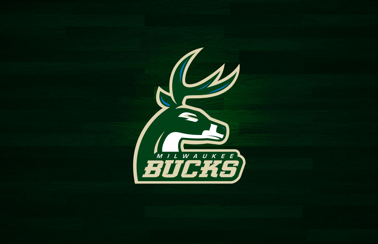
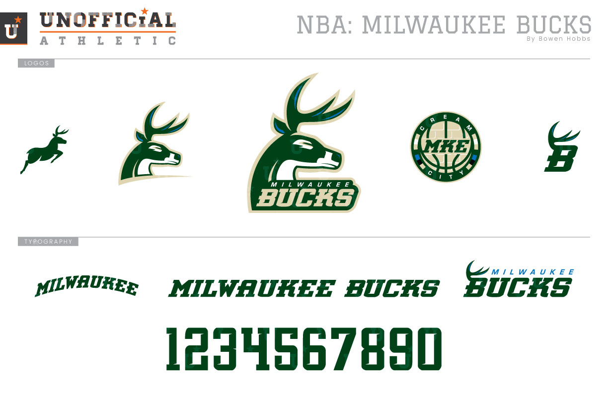
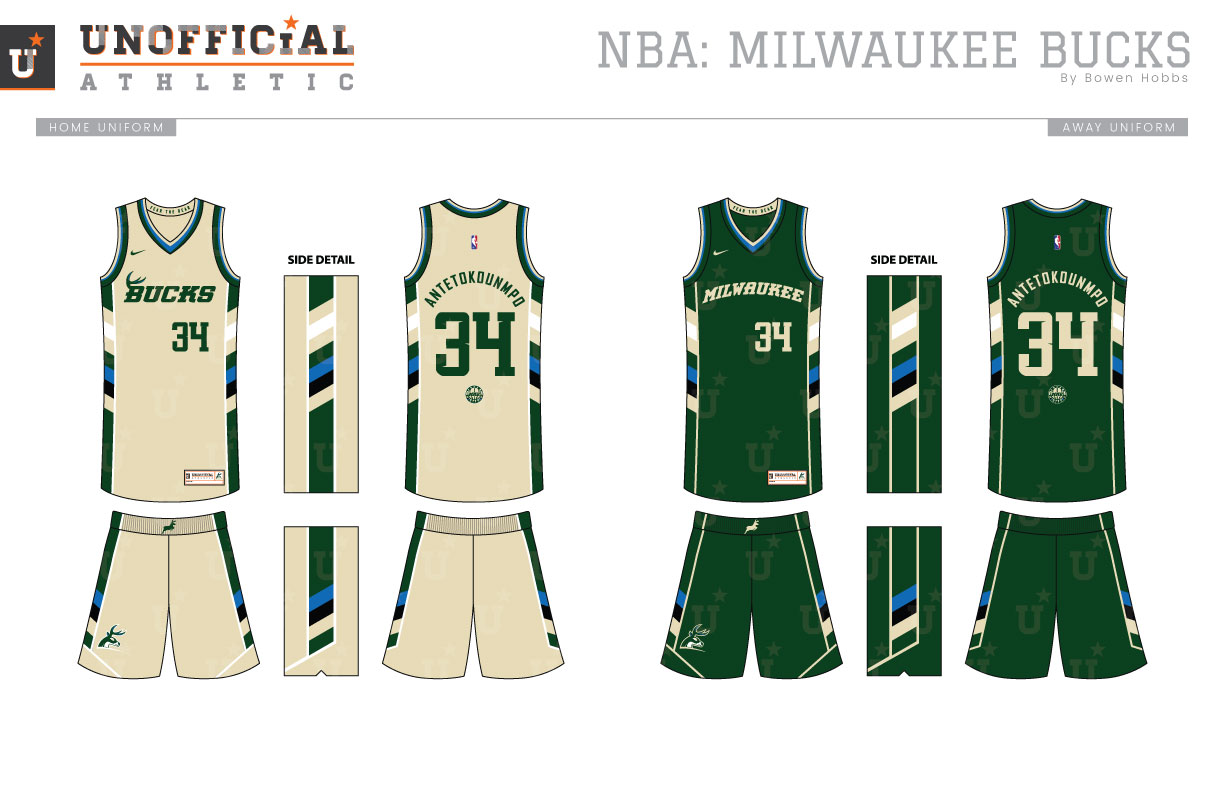
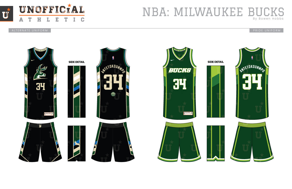
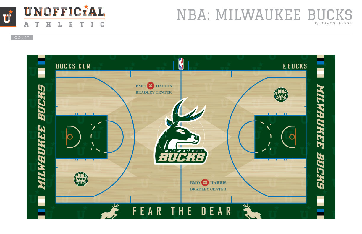
Born in 1968, the Bucks have had a number of logos and color schemes over the years. However, one constant remained: forest green. The woodland hue was initially paired with red while lime green was added to the palette in 1976. In 1986, the red was dropped and the team sported a scheme of forest green and lime with small hints of emerald green. Over these eras, the team’s logo was Bango Buck sitting on an italicized slab-serif MILWAUKEE BUCKS type treatment. That lasted until 1993, when the Bucks switched to a new logo featuring a mounted deer against a triangle holding shape above a new BUCKS wordmark. Purple became the dominant color, while forest green took a back seat and touches of silver were used on the type and the trim. The Bucks would tweak that logo in 2006, and in the process, reassert forest green as the dominant color. The green was once again paired with red and the touches of silver were kept, although used less. Over time the Christmas colors wore on fans and the team made another change in 2015, revising the deer head logo to include an M and placing it against a circle rendered in forest green and cream, for the Cream City. The green and cream were paired with black and Great Lakes Blue, with the latter used in a supporting mark of Wisconsin to designate the state’s water borders. My redesign starts with a primary logo of a deer turning, instead of a dead-and-mounted deer, to give the overall look more motion and energy. I kept the color scheme of forest green, cream, black, and blue, as I feel it does an excellent job capturing the soul of Milwaukee, and by extension, Wisconsin. The primary logo is complemented by a typeless alternate version, a full deer silhouette icon, a Cream City roundel, and an antler-B. The typeface is a squared slab-serif with rounded corners and small notches cut into the letterforms. The Association uniform is unique, because it ignores the standard white for a cream hue. The Irish Rainbow pattern used from 1976 through 1993 (and brought back as a Cream City rainbow, albeit modernized) is angled for added motion and also placed on the shorts. BUCKS appears on the chest of the Association jersey, while MILWAUKEE is placed on the Icon edition, which is green with cream type instead of cream with green letters. The alternate uniform is black with cream type, and the buck head mark on the chest. The Pride uniform throws back to the late 80s era with a forest green, lime, and emerald scheme and BUCKS across the chest. The court keeps the recently revived Mecca design of sublimated M’s in the woodgrain, but my version uses blue line work outside of the lane. MILWAUKEE BUCKS appears at each baseline rendered in natural wood against a green background. The primary mark is placed at center court, while the Cream City roundel appears within the three-point in on each end. The players are reminded to FEAR THE DEER overtime they step onto the court, as it is rendered between two stags along the sideline.
Date
May 2, 2018
Category
Basketball, NBA


