Minnesota Timberwolves
Minnesota Timberwolves
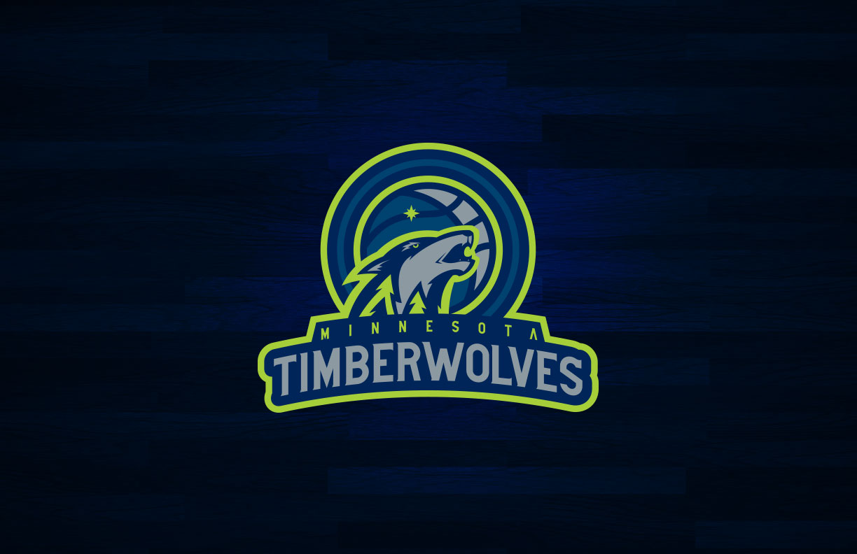
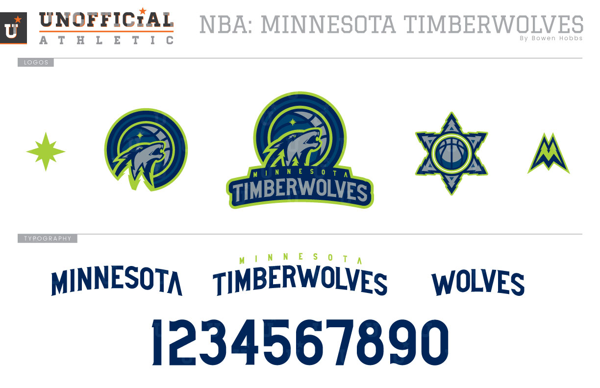
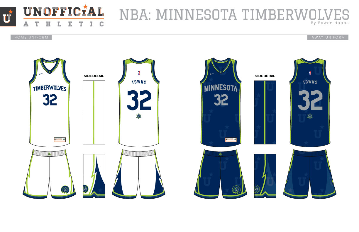
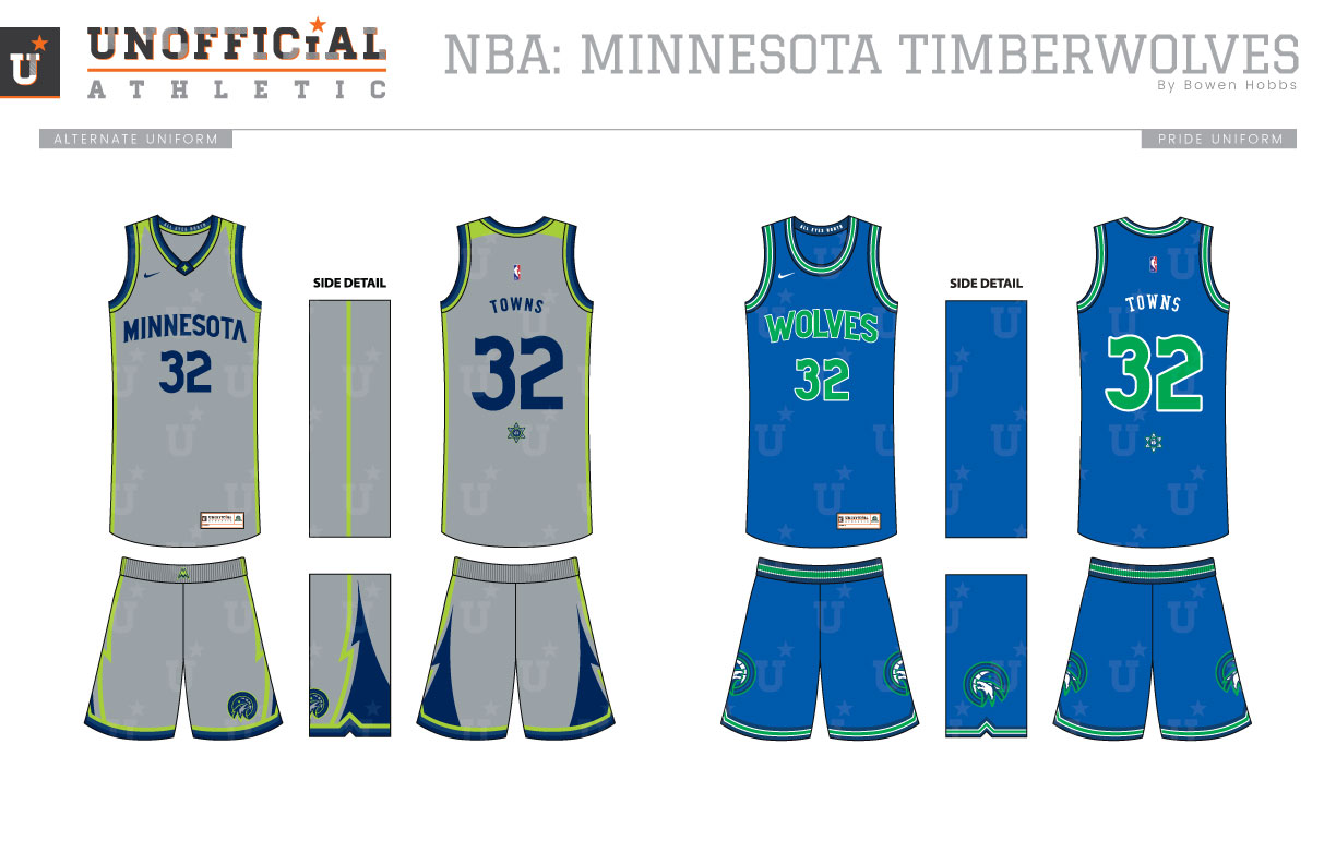
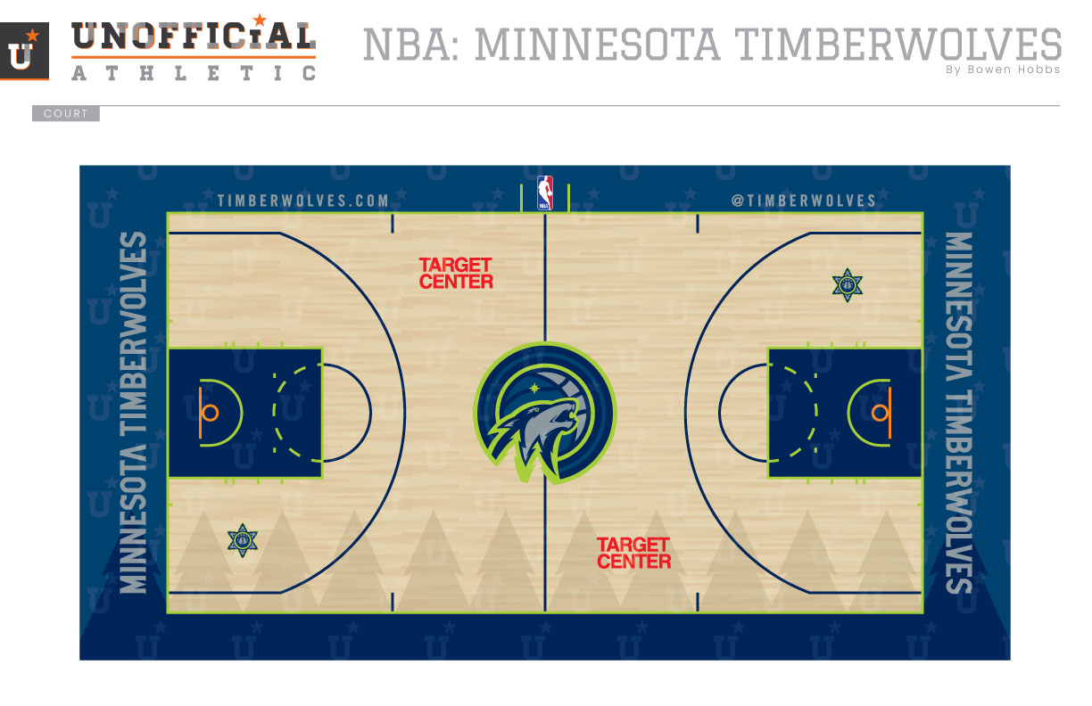
The Minnesota Timberwolves entered the Association in 1989 with a color scheme of royal, kelly green, and silver. Their inaugural logo featured a blue and white wolf inside a silver basketball with green eyes. That mark would last them until 1996, when like many teams in the 90s, they would redesign their brand with a more cartoony logo and unique colors. The new palette featured a muted french blue alongside black, kelly green, and silver, as well as red and yellow accents on the eyes and tongue. The primary mark eschewed the basketball for a straight-on half-shaded wolf head coming out from the trees. The new font was much more aggressive, but difficult to read. In 2008, the team attempted to refine their logo with a more straightforward typeface, streamlined trees, and an updated wolf. The team would once again mix things up in 2017, returning to the classic wolf-on-basketball motif, but with an updated color palette of navy, french blue, wolf grey, and lime and an added North Star to help guide the team through this new era. My brand evolution for the Wolves keeps the current color scheme, but enhances the use of lime and breaks the monotony of roundels in the NBA with a marquee type treatment. The wolf is redrawn to have more detail and increased attitude, while the font is updated to a semi-serif from the geometric letterforms they currently use. To complement the primary logo, a broken roundel version of the wolf-basketball and a North Star icon show additional marks that add brand awareness in any size space, while a basketball/snowflake and a pine tree-M complete the logo set. The font is a semi-serif to balance the sharpness of teeth with readability. The Icon Association, and Alternate uniforms feature lime green accents and pine trees on the shorts, while the Pride uniform is a modified version of the team’s inaugural design. Lastly, the court is accented by sublimated trees that overlap the playing surface and the french blue and navy out-of-bounds area.
Date
June 19, 2018
Category
Basketball, NBA


