Minnesota Twins
Minnesota Twins
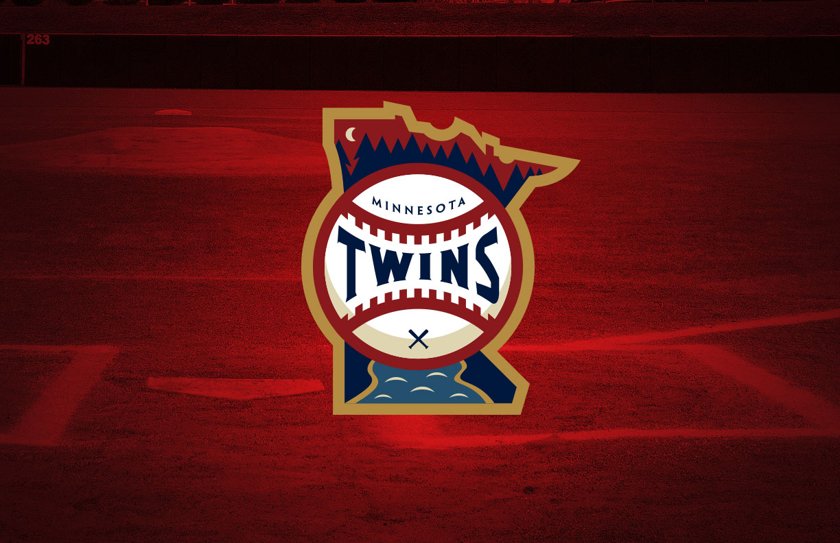
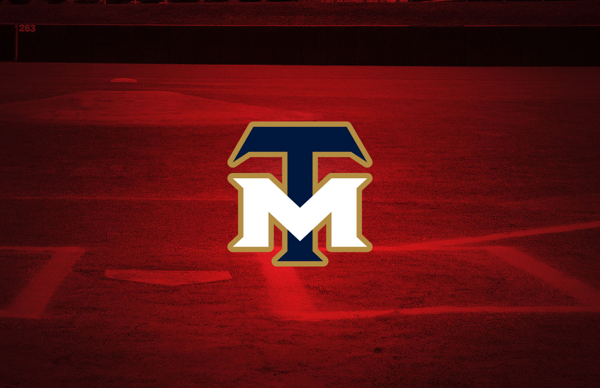
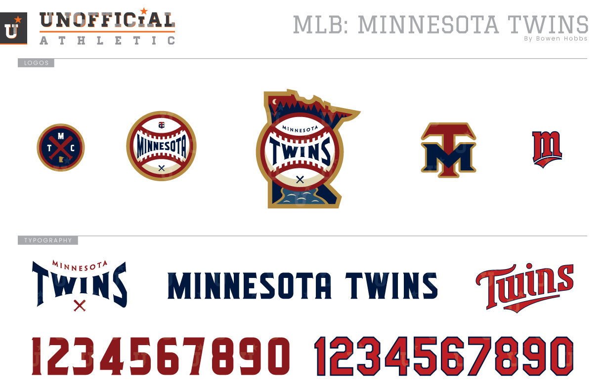
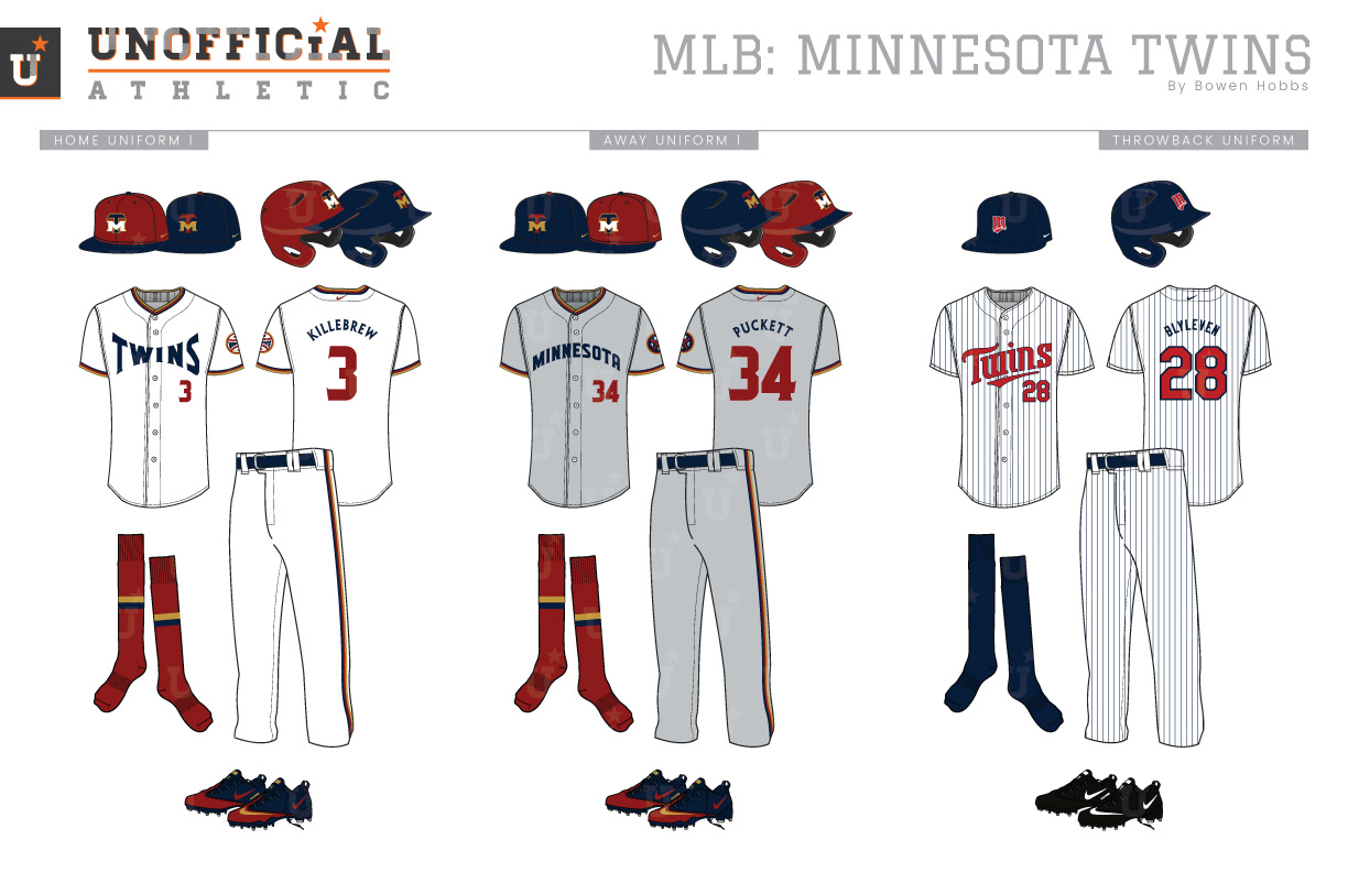
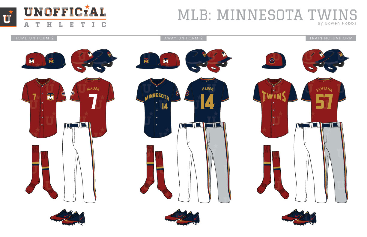
The Minnesota Twins organization has been around since 1894, although they would not play a single inning in the Twin Cities until 1961. Before then, they were known as the Kansas City Blues of the Western League until 1901, when they would relocate to Washington DC and play as the Senators, Nationals, and then Senators again. Fast forward to November 1960. The team announces its move to Minnesota and renames itself the Twins. The Twins would wear navy caps with a red-and-white TC mark, home uniforms with navy pinstripes and type, and solid grey away uniforms with the same Twins script as the homes. The navy-centric scheme would last until the 1972 season when they would balance their use of blue and red with red type on the uniforms and replacing the pinstripes and solid grey uniforms with polyester double-knits that featured red and navy trim on Sansabelt pants. The uniforms would continue to evolve with the introduction of powder blue road uniforms in 1973, as well as the switch to red caps at home in 1976. Both of theses changes were reflective of the era, as baseball tried to maximize the advent of color TV with brighter color schemes. The Twins would once again redesign their uniforms for the 1987 season. The new all-navy caps would move the TC mark to the sleeve and replace it with a red underscored M with a white outline. Both the home and road uniforms would opt for navy pinstripes with red type outlined in navy. The new Twins script was an upward-tilted slab serif font with an underscore that matched the cap logo. The MINNESOTA wordmark on the road uniforms used a standard block typeface. The TC would return to the caps in 2002 and split time with the underscored-M until the team’s 2010 brand update. The update would tweak the Twins primary logo package and wordmark while adding a new Minnesota script for the road uniforms. They would also add a cream home uniform that mimicked the 1961 homes. 2015 would see the introduction of metallic gold into the team’s color palette while a red alternate jersey would be added a year later. My Twins rebrand takes a fresh look at the team’s color scheme, addressing the overabundance of teams wearing navy and red in MLB. Instead of the common shades the team has worn going back to its Washington days, I decided to add a Northwoods touch to the scheme. Navy and red are replaced by maroon, navy, metallic gold, and a touch of slate blue. The primary logo takes a new look at the Minnie and Paul patch by placing a baseball over the state of Minnesota with a forest and a river in the state. The bottom seam of the baseball doubles as a bridge uniting the Twin Cities across the Mississippi River. The cap logo swaps out the TC mark for an MT monogram in a bold serifed font. The sleeve patch consists of a baseball with MINNESOTA across the middle, while the alternate logo places two crossed bats and M, TC, and the state outline within a circle. The underscored-M comes back for the throwback uniforms. The home uniforms start with a maroon cap with the MT mark and a navy brim, with an all-navy cap as a secondary option. The white home uniforms feature navy team and player names, with maroon numbers and maroon, navy, and gold trim on the sleeves, collar and pants. The home and away uniforms are paired with maroon socks and navy belts and shoes. The road greys are primarily worn with the navy cap, although the maroon cap is an option. Like the homes, the team wordmark and player names are navy, while the numerals are burgundy. The throwback uniforms revive the World Series champion look of the early 90s with navy cap, pinstripes, and socks along with red type. The home alternate jersey starts with a maroon base and the MT mark on the left chest. The gold player number offsets it on the left chest. On the back of the home alt the player number is white while the player name is gold. The other alternate features a navy jersey with gold type and maroon accents. The batting practice cap places the crossed bats logo on a two-tone cap with a navy base and maroon front panels. The BP jerseys are maroon with navy sleeves and gold type.
Date
March 29, 2019
Category
Baseball, MLB


