Montréal Expos
Montréal Expos
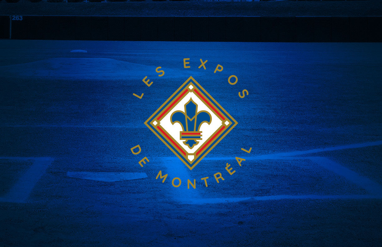
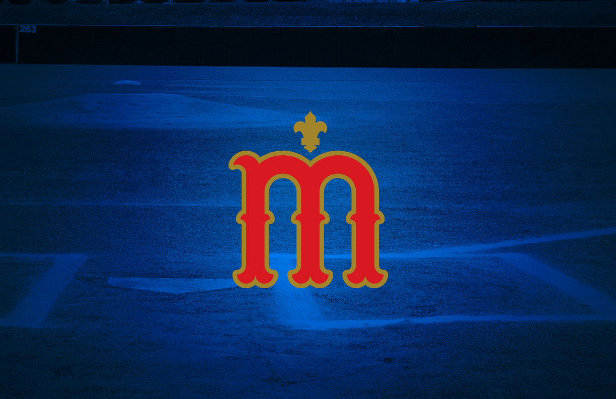
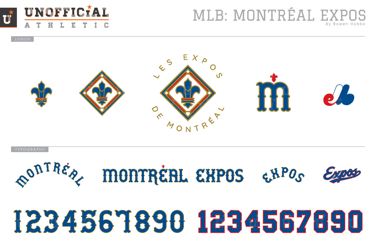
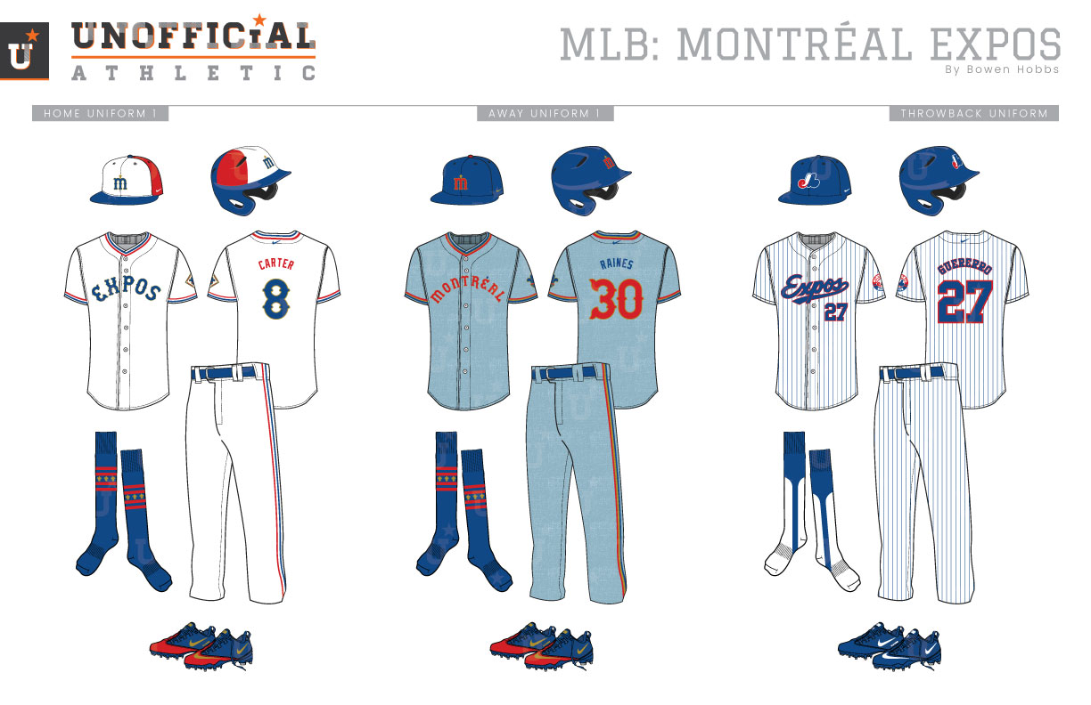
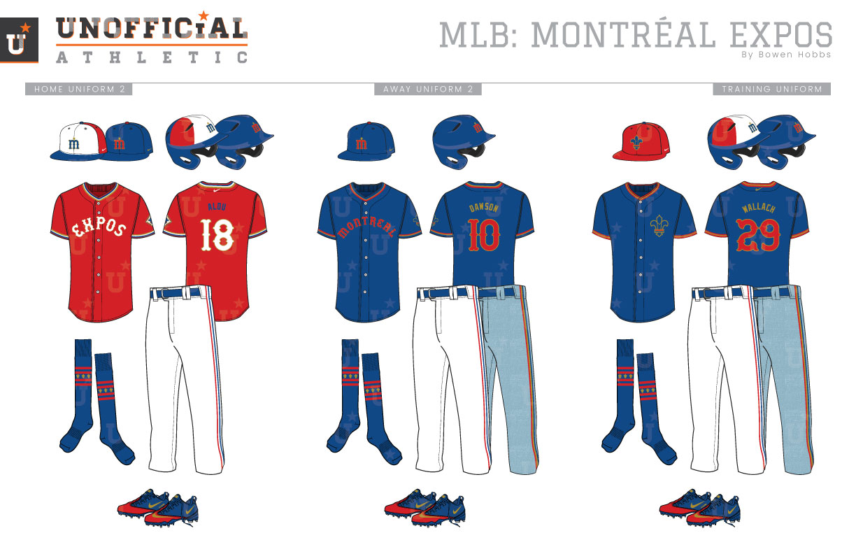
While they are currently known as the Washington Nationals, the Montréal Expos were initially Canada’s first MLB team. They played their inaugural season in 1969, alongside the San Diego Padres. Their primary logo was an eMb icon in red, white, and blue that stood for Les Expos de Montréal Baseball, and the initial version of the logo placed expos in a lowercase slabserif typeface below the eMb icon. The first Expos uniforms featured the team’s classic pinwheel caps, with white on the two front panels, red on the sides, and royal blue on the back panels and brim. The home uniforms were white with royal slabserif numbers and the team’s inaugural primary logo on the left chest. Red, white, and blue trim adorned the sleeves and the pants. The away uniforms kept the same format as their home counterparts, but with a powder blue base color and a white outline around the player numbers. The Expos’ first uniform tweak came in 1978, when the player number on the chest would become red instead of royal on the home and away jerseys. A more significant change was made prior to the 1980 season, with the sleeve trim replaced by royal and red racing stripes down the sleeves, jersey sides, and pants. The 1980s jersey placed blue type on the home jerseys and red type on the powder blue away jerseys. In 1992, the Expos would go through the largest redesign in their history. The eMb icon was placed in a roundel that was red on the top and blue on the bottom. The pinwheel caps were subbed out for an all royal cap with the eMb. The new home jerseys featured royal pinstripes and a royal Expos script outlined in red across the chest. The away uniforms became grey with tri-color sleeve trim and a red Montréal script outline in royal and white. After the 2004 season, the Expos would pack their bags and move south to Washington, DC. However, MLB has talked about Montréal as a candidate for expansion in recent years. My Expos redesign adds gold trim to the brand in addition to a new fleur-de-lis icon with an M and an E within the line-work. The fleur-de-lis icon is placed within a red, white, and blue diamond with LES EXPOS DE MONTRÉAL circling the mark. The primary logo breaks down into a textless version and a standalone fleur-de-lis. The caps feature a Tuscan M with a fleur accent, while the Tuscan typeface is formal but inviting. The eMb icon was also kept for throwbacks. The pinwheel caps return to the home uniforms featuring the Tuscan M. The home whites place royal type with a gold outline alongside red, white, and blue trim on the collar, sleeve, and pants. The away uniforms feature an all-royal cap with a red M outlined in gold on flannel-textured powder blue away jerseys and pants with red, gold, and royal trim. The away jerseys also feature red type outlined in gold. The throwbacks recall the Vladimir Guerrero era with the classic pinstripes and royal eMb cap. The home alternate jerseys are red with white type outlined in gold, while the royal alternate jersey featured red type outlined in gold. The BP caps are red with the fleur logo and are placed over royal jerseys with the fleur on the left chest.
Date
June 3, 2019
Category
Baseball, MLB

