Tampa Bay Rays
Tampa Bay Rays
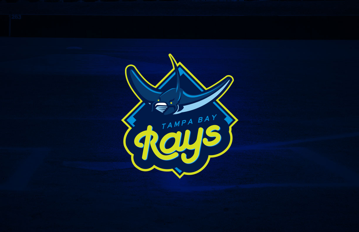
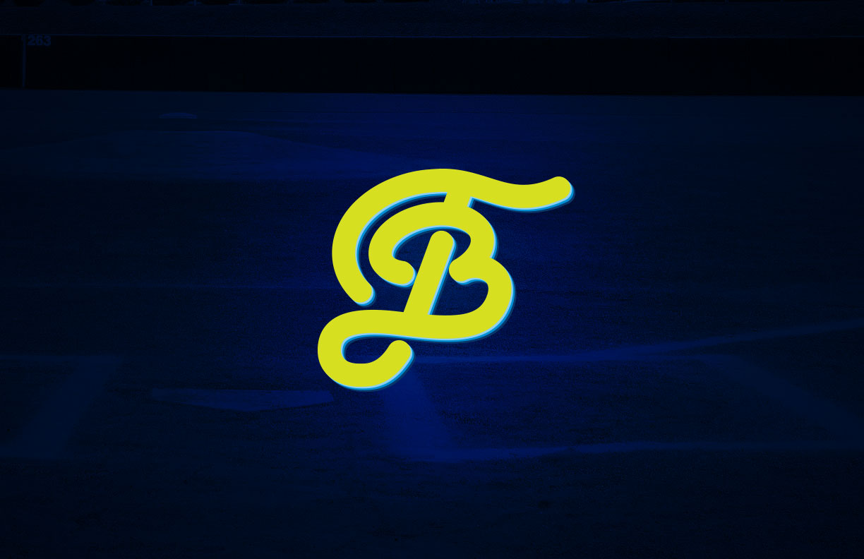
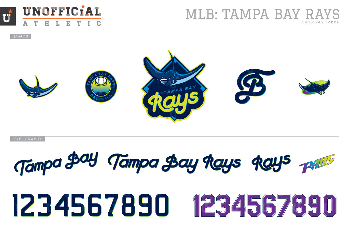
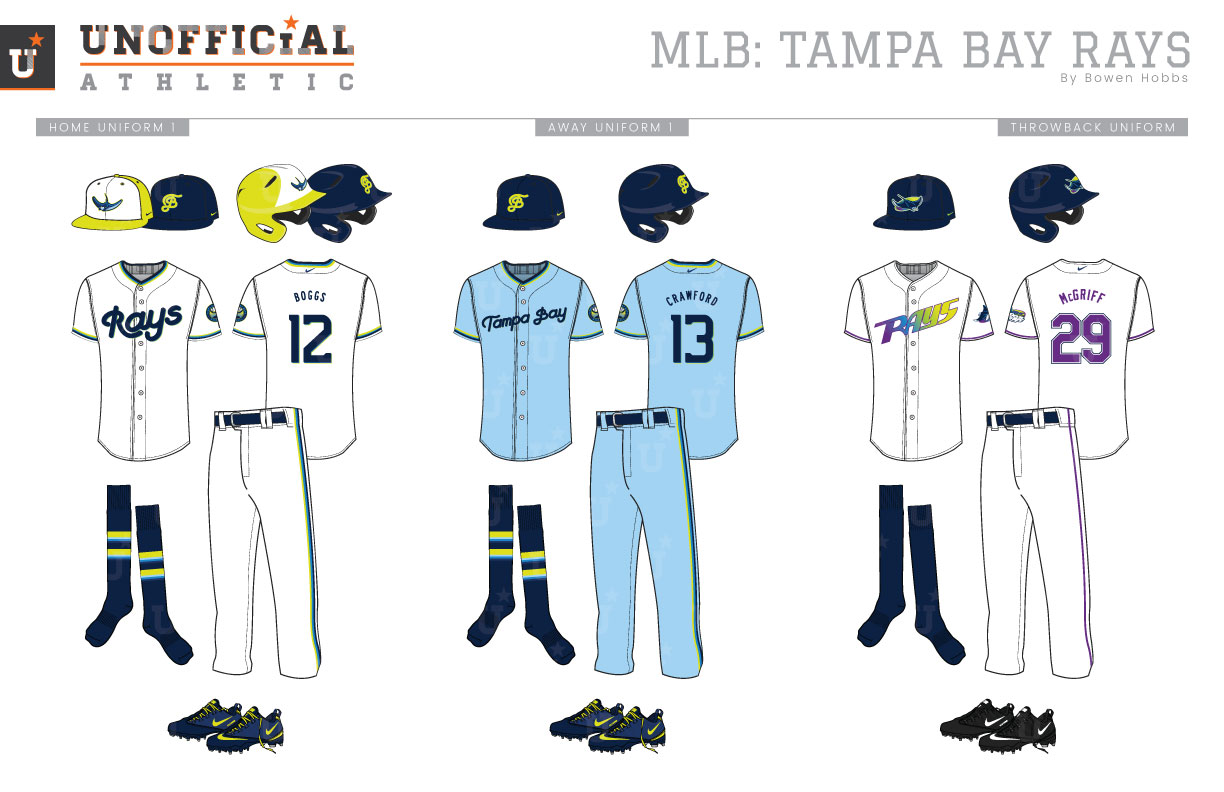
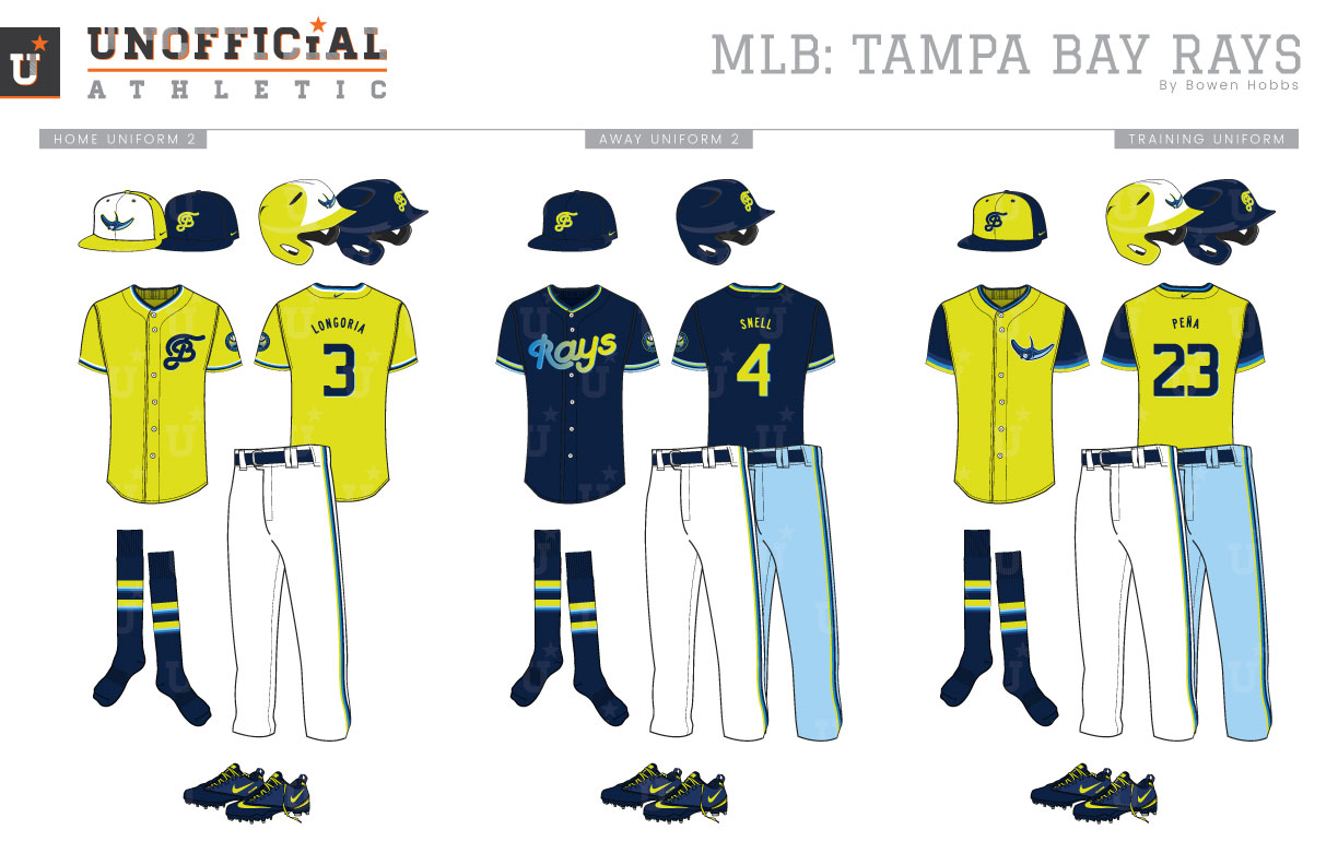
The Tampa Bay Devil Rays shocked the league when they started playing ball in 1998 with a color palette of black, purple, blue, green, and yellow arranged into an iridescent splash. The team’s inaugural logo placed a streaking manta ray adjacent to the team name against a skewed oval with the aforementioned iridescent splash. That first season, the Devil Rays wore black caps and socks, with DEVIL RAYS across their chest and purple numbers at home. Away from Tropicana Field, their grey uniforms placed TAMPA BAY on the chest with black numerals on the back of the jerseys. The Rays would also don a black alternate jersey with purple numbers for those first three seasons. In 2001, Tampa Bay evolved its look by pairing its color scheme down. Black caps and forest green typography paired with royal accents. A home alternate white vest with forest green undersleeves was used through the 2004 season. The vests would become the primary home uniform for the 2005 season, as the team shifted its chromatic focus from black to forest green. Three seasons later, the team would rebrand itself by dropping the Devil from Rays and moving to a scheme centered around sunshine. Forest green, black, and royal were swapped for navy, powder blue, and athletic gold. The futuristic font that marked the Devil Rays era was replaced by a stoic serifed typeface with a slight reflection on the R in RAYS. The home and away uniforms use a heavy dose of navy, with powder blue and athletic gold taking a back seat. In the following seasons, the Rays would add a navy jersey as well as a powder blue option. Since the rebranding, the team has also unveiled a pair of faux-back uniforms in navy, powder blue, and gold. My Rays redesign brings the manta ray back with a more forward-facing presentation and a revised color scheme of navy, volt, honolulu blue, and powder blue. The manta is placed above the team name against a baseball diamond to create the team’s primary identifier. There are also a pair of cap logos: a standalone manta ray, as well as a script-TB monogram. A roundel sleeve patch of the sun and sea with a gradient sky, and the inaugural devil ray cap logo complete the logo set. The script typeface is summery and whimsical with a series of graduated drop shadows. The numbers are a modern slab serif with the same graduated shadows. The white home uniforms feature trim along the collar and sleeves with Rays across the chest. It can pair with either a volt cap with a white front and the manta logo, or a navy cap with a volt TB. The away uniforms place Tampa Bay on the chest of a powder blue uniform and pairs with the navy cap. The throwbacks turn it back to 1998 with purple numbers and the gradient RAYS wordmark. A volt home alternate jersey pairs with either the volt or navy caps, while a navy alternate jersey with a gradient Rays script is combined with the navy cap for home or away use. The BP caps are navy with a volt front and the TB monogram. The training jerseys are volt with navy sleeves and the manta ray on the left chest.
Date
May 29, 2019
Category
Baseball, MLB

