New England Patriots
New England Patriots
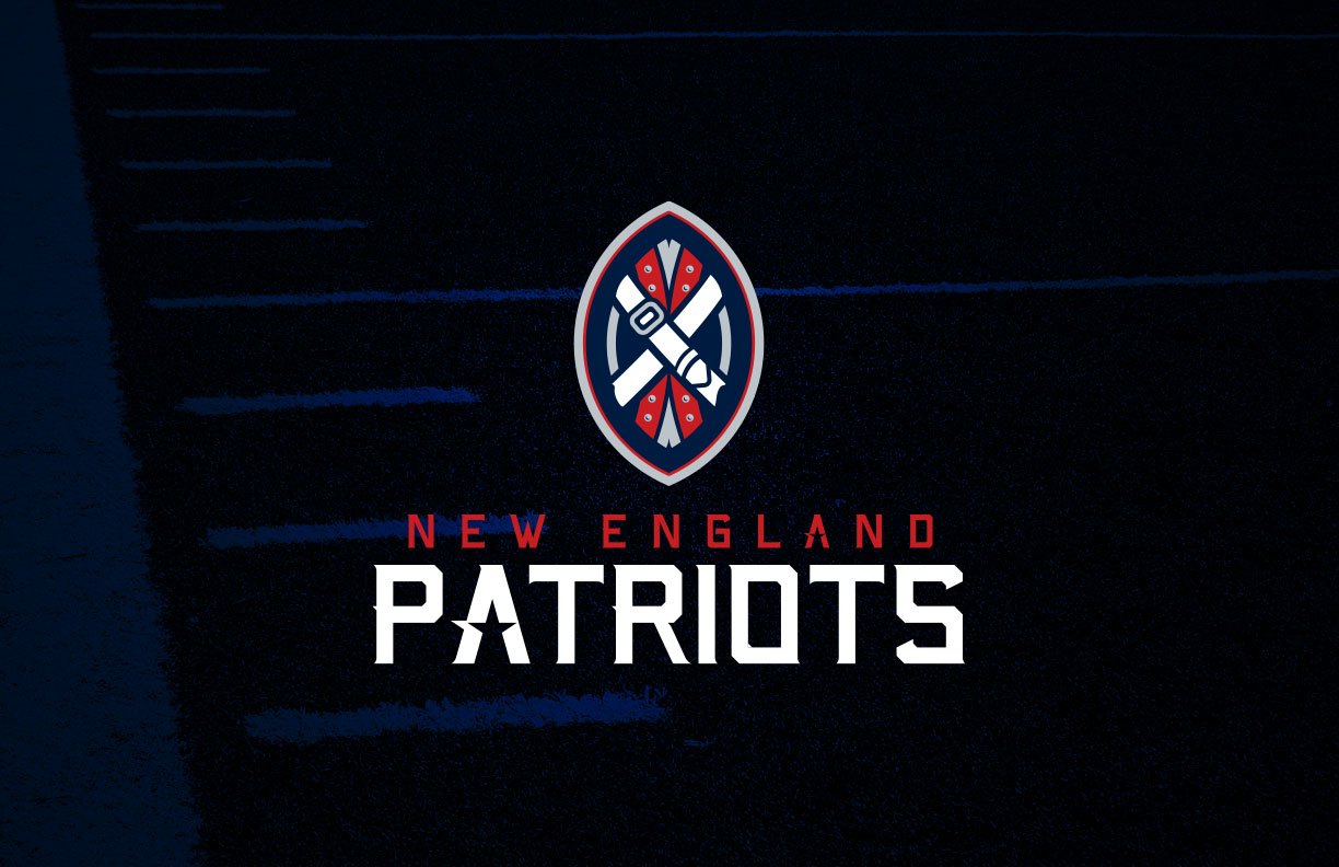
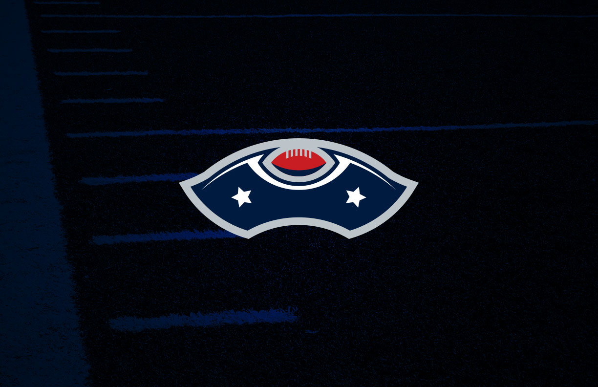
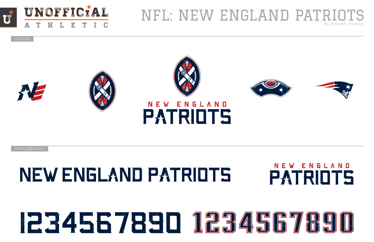
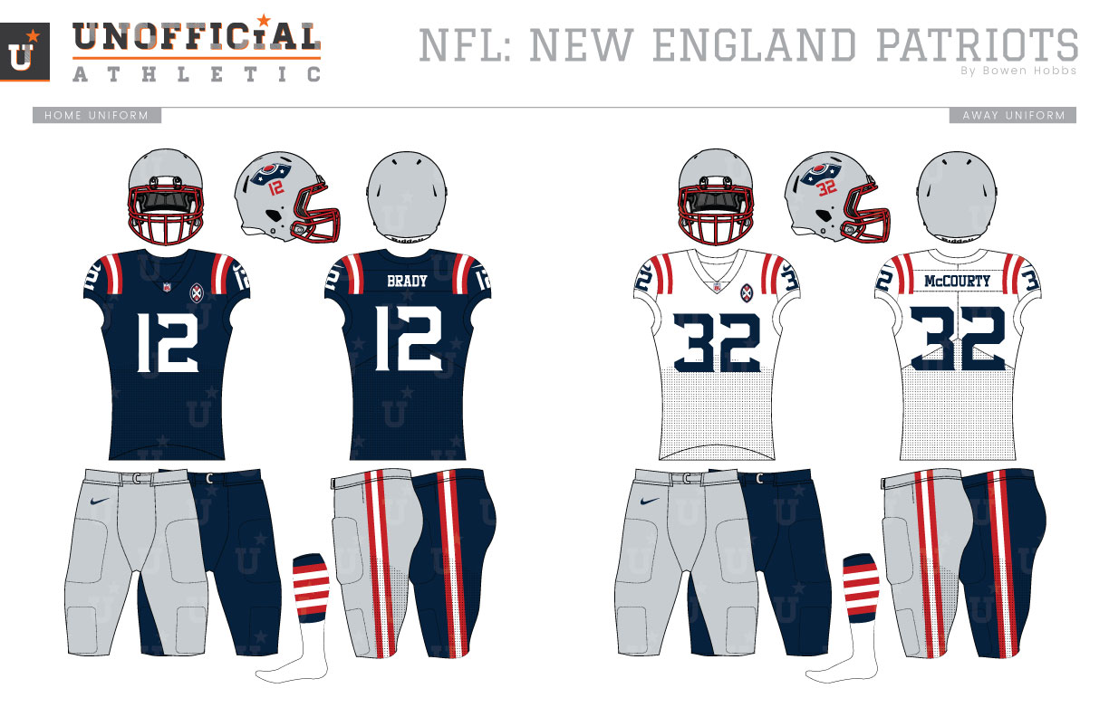
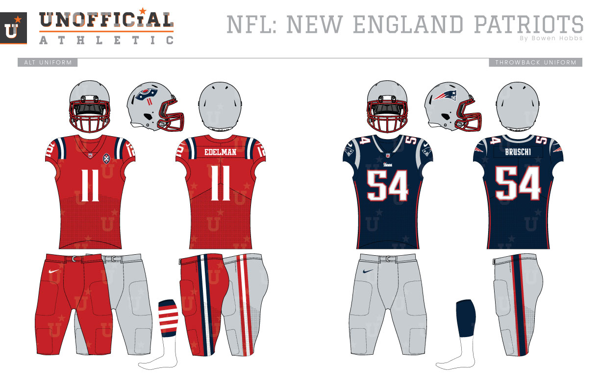
Brady. Belichick. Six rings. Everyone knows about the Patriots’ dominance over the past two decades. However, the team had been through multiple aesthetic eras before finding on-field success in navy and silver. Born in 1960 as the Boston Patriots, the team’s inaugural digs featured white helmets with gray facemasks, two red stripes down the center, and a blue tri-corner hat above the player’s red number on each side. Those triicorner helmets were paired with red and white jerseys that placed three stripes on each shoulder and white pants with red, white and blue striping. The following season, the tri-corner hats and numerals were swapped out for Pat Patriot, a no-nonsense Continental Soldier playing Center. Throughout the 1960s and 70s, the team would add striping to the sleeve cuffs and subsequently remove the shoulder stripes while experimenting with which style of sleeve stripes they would wear. The next evolution would involve addition of red pants in 1979, which were worn with their white jerseys. The stripes moved back up to the shoulders for the 1984 season and stayed that way through 1992. Then, the Patriots unveiled one of the most drastic rebrands in NFL history in 1993. They didn’t just change their logo or uniforms, they changed their color scheme to royal, silver, red, and white. The new logo, informally dubbed the Flying Elvis, brought a sleeker image to the team after decades of the charming but difficult to reproduce Pat Patriot. The new uniforms used silver helmets, royal jerseys with red numbers, and silver pants. The home jerseys would feature white numbers the following year for readability. For 1995, the jerseys would add subtle vertical striping and italicized numbers into the mix. And in true 1990s fashion, the Flying Elvis logo would get a bold treatment on the shoulders in place of a shoulder stripe. Fast forward to the year 2000. With many teams darkening their visual profile to look more intimidating, the Patriots replaced their royal with nautical blue (navy) and unveiled new uniforms again. This era was marked by a single color tapered shoulder stripe, navy and red accents down the sides of the jerseys, and custom block numbers that were more restrained than their predecessors. The following season, the Pats won their first Super Bowl and have worn navy, silver, and red ever since. The only other notable uniform aspects of this era include the use of throwbacks in five seasons, and the inclusion of all-navy alternates that blend the current era with the team’s past. My New England Patriots concept takes a look at the team’s traditions, as well as the Revolutionary War. The new primary logo features a football clad in a Continental Soldier uniform above the team name in a sharp block font. The alternate logo is a tri-corner hat with a football in the hat’s front notch. A flag-shaped NE mark is reserved for the coaches caps, while the Flying Elvis is retained for throwbacks. I decided to keep the silver helmets with red facemasks, but the tri-corner hat returns to its place above the player’s number on each side. The jerseys are still navy at home and white on the road (because the Redcoats wore red) with red and white shoulder stripes and single-color numerals. The primary logo appears on the left chest of the home, away, and alternate jerseys. Both the home and away uniforms pair with silver or navy pants and feature a trio of red and white stripes, as well as socks that place seven red and white stripes on each leg, resulting in every player wearing 13 stripes of each side representing the 13 original colonies. The alternates bring back red jerseys with blue and white stripes with options for red or silver pants while the current home navy-and-silver uniforms are retained to celebrate the team’s glory days of six titles (and maybe more).
Date
November 23, 2019
Category
Football, NFL


