Oklahoma City Thunder
Oklahoma City Thunder
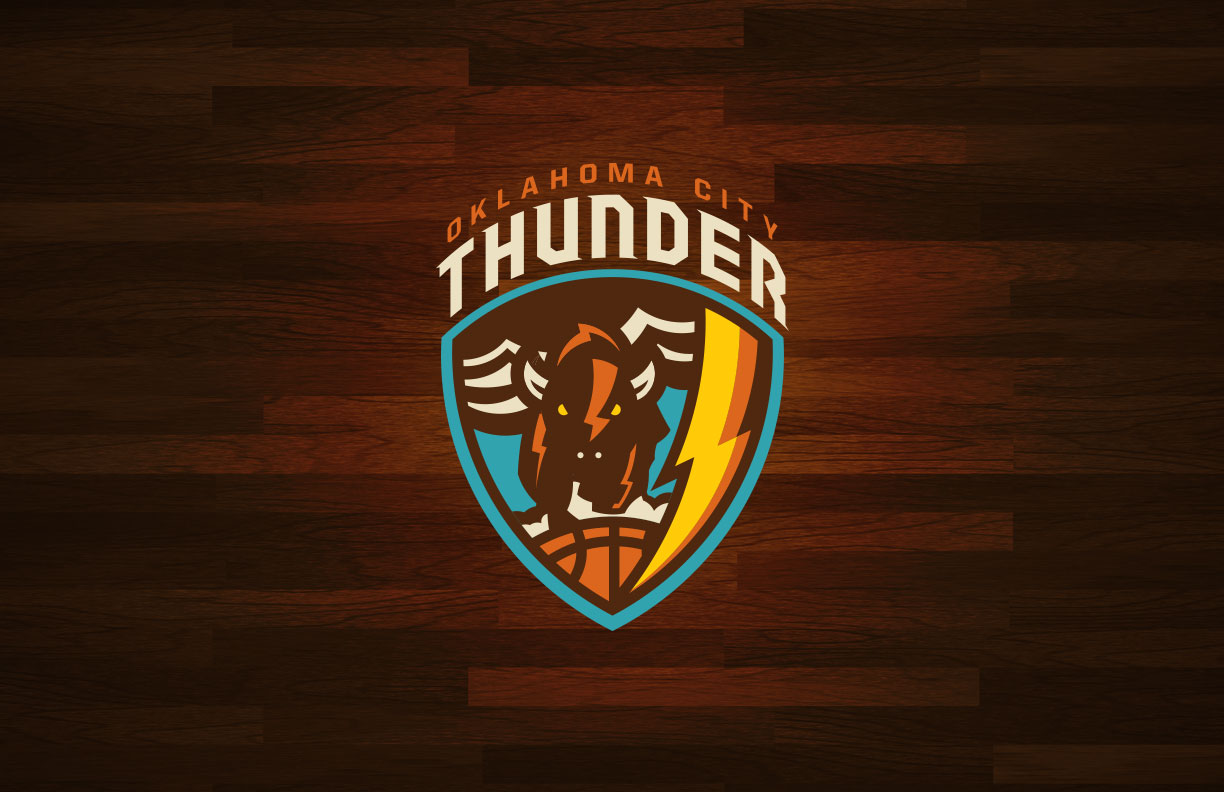
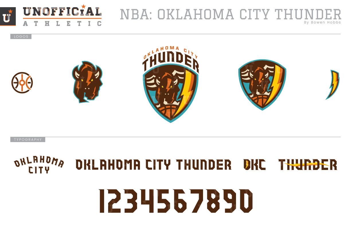
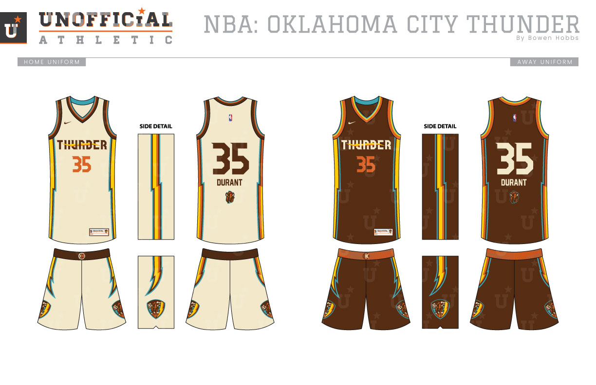
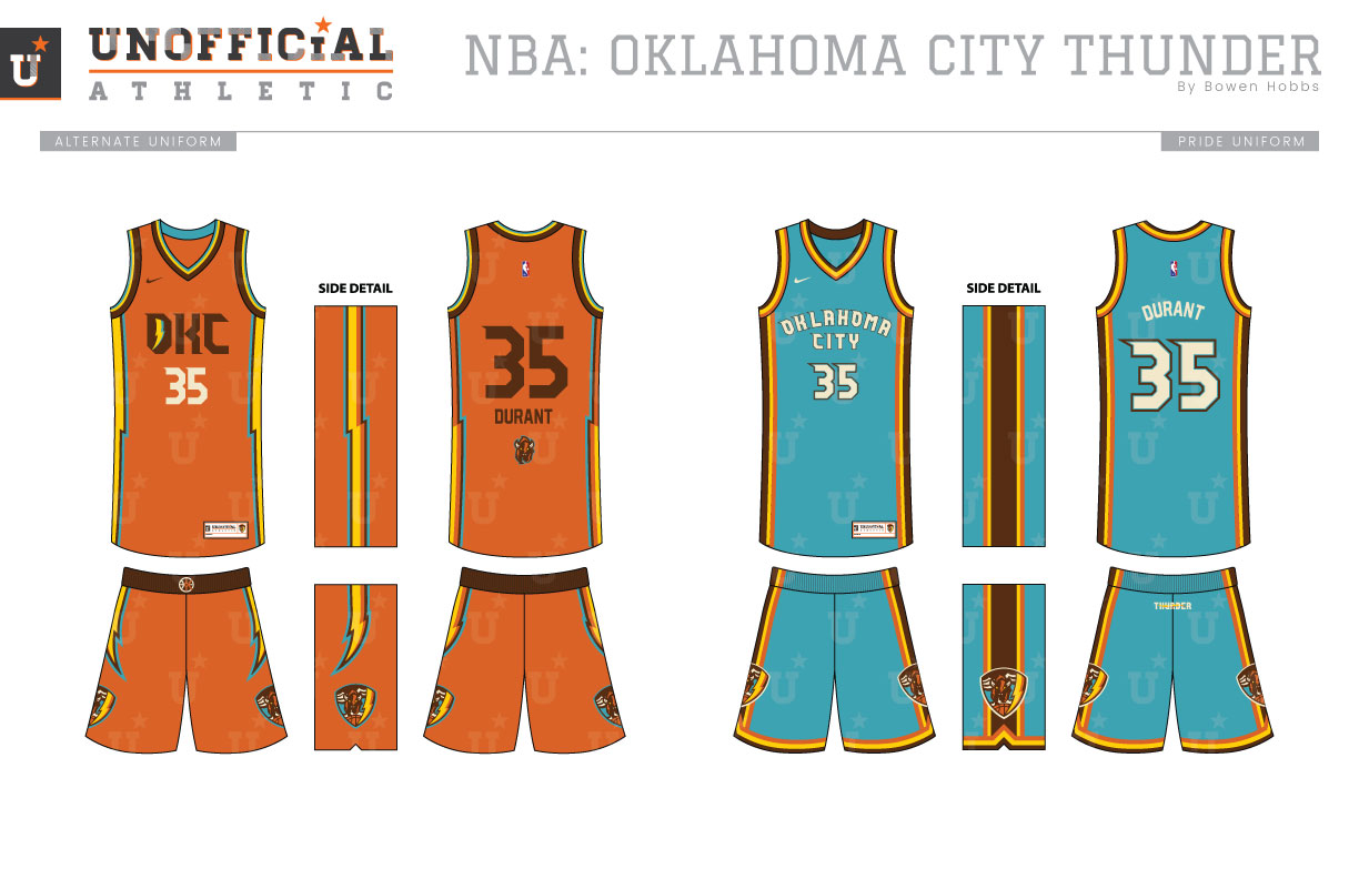
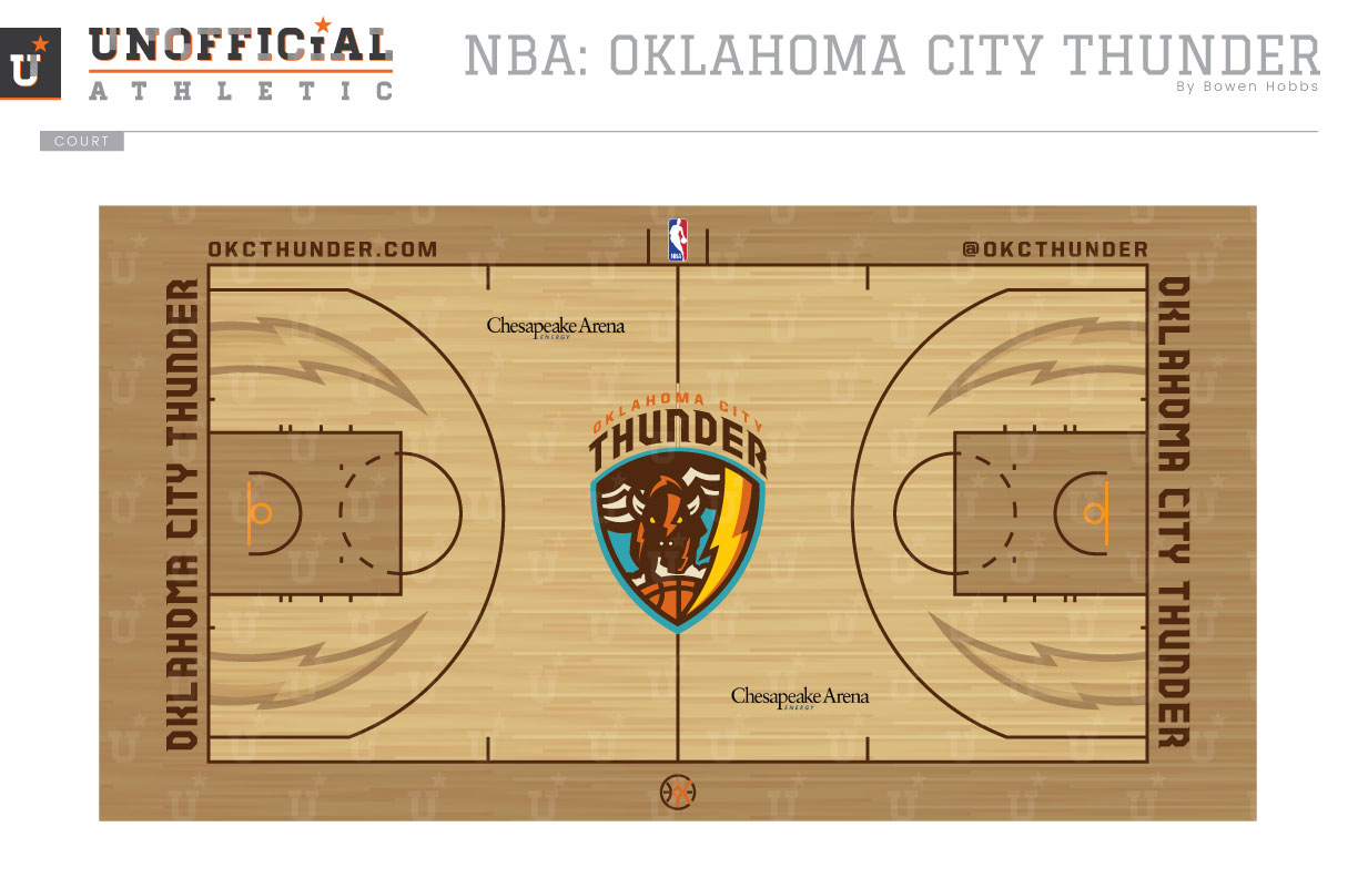
After showing the League from 2005 to 2007 that Oklahoma City could support pro basketball by offering the Hornets a temporary home after Hurricane Katrina, the Seattle Supersonics decided make a controversial move to the Sooner State. The team was somewhat rushed in the development of their branding as the Thunder, since the move happened very quickly. The team ultimately chose a color scheme of electric blue, navy, orange, and yellow and a primary logo containing an OKC shield and THUNDER spelled out above it. Many panned the branding as generic, which may have been a byproduct of the shortened timeline. My concept aims to develop a uniquely Oklahoman identity for the team. The color palette has become warmer replacing the blues and bright orange with teal (a shoutout to hosting the Hornets), brown, and burnt orange. The shield shape is retained, but instead of OKC and a ball at the center, we have a buffalo running along a basketball accompanied by a bolt and storm clouds. The shield combined with the team name above it make up the primary logo. The shield, a standalone buffalo, a thunderbolt, and an OKC wagon wheel mark fill out the logo set. The typeface is a modern angular block typeface with serifs in the upper left corners of the letterforms. The Association uniforms break tradition with a cream base layer in lieu of white, while the Icon uniforms feature a deep chocolate brown. The THUNDER script appears on the chest, while bolts run down the sides of the uniforms. The player name is placed below the number for a slight retro flair. The Alternate uniform works from the same design as the Icon and Association, but on a burnt orange base and with OKC on the chest. The Pride uniform pays homage to the team’s beginnings in OKC by adapting the team’s inaugural road uniform to the updated colors and typography. The court is an textbook example for the NBA on two-tone stained courts done right. The lanes and boundaries feature a darker stain than the rest of the floor, while the lines are rendered in brown for optimal contrast. Thunderbolts appear within the three-point line on each end for a look that seamlessly blends modern and classic.
Date
September 4, 2017
Category
Basketball, NBA

