Portland Trailblazers
Portland Trailblazers
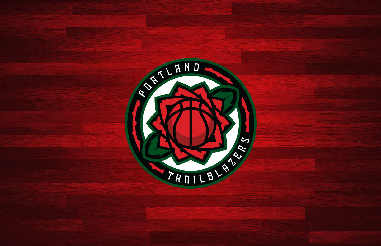
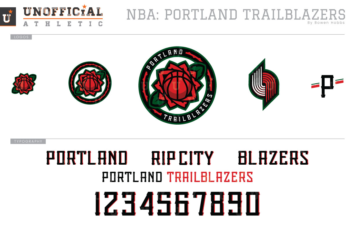
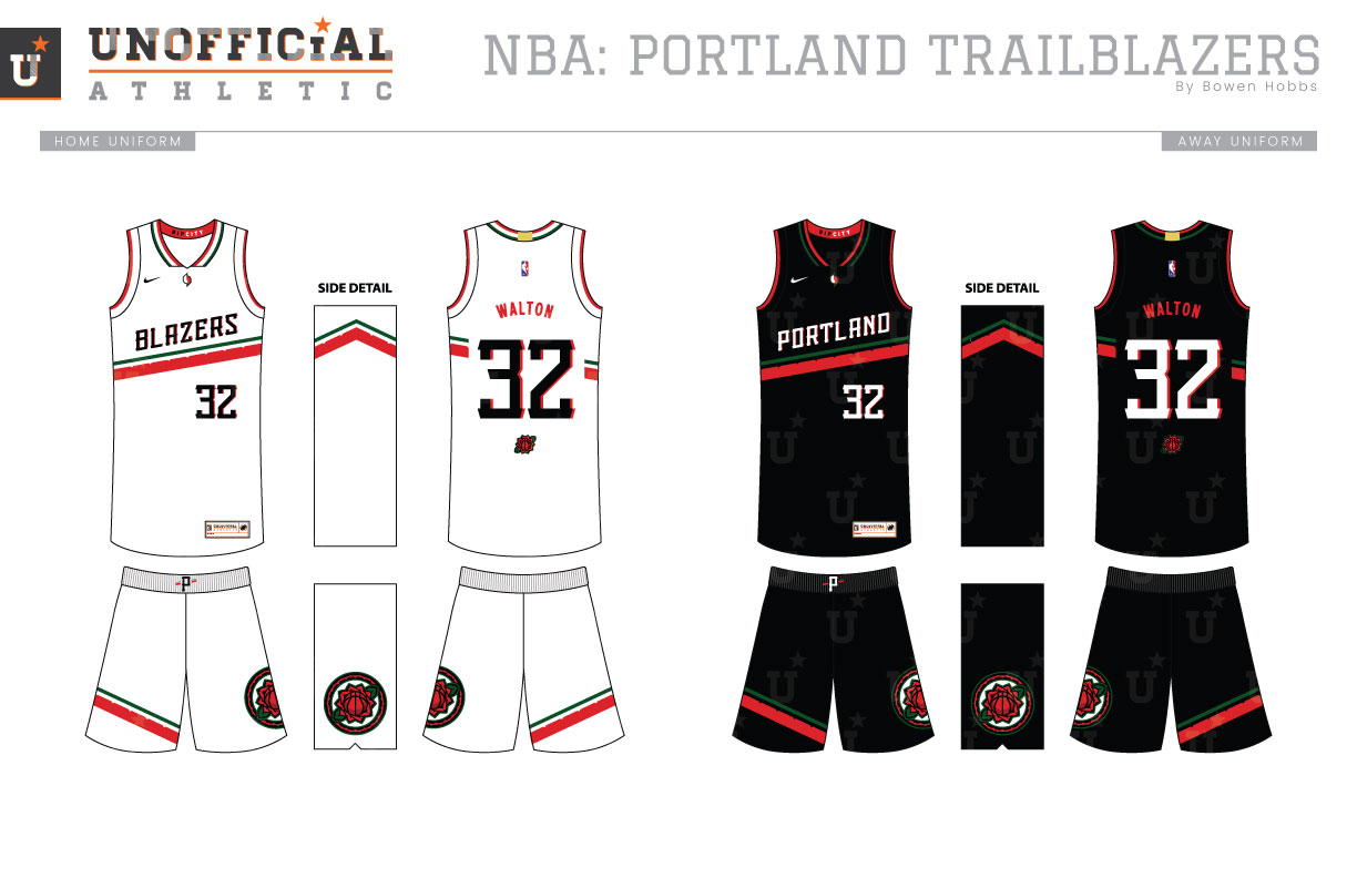
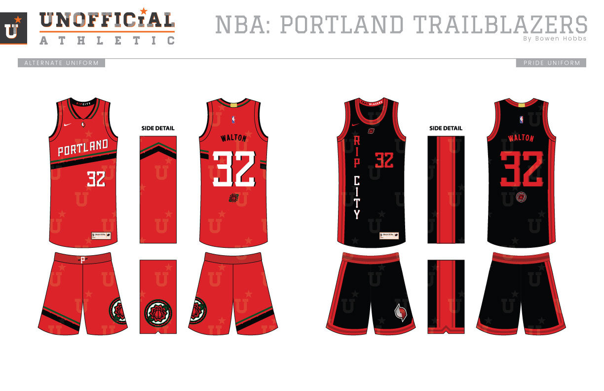
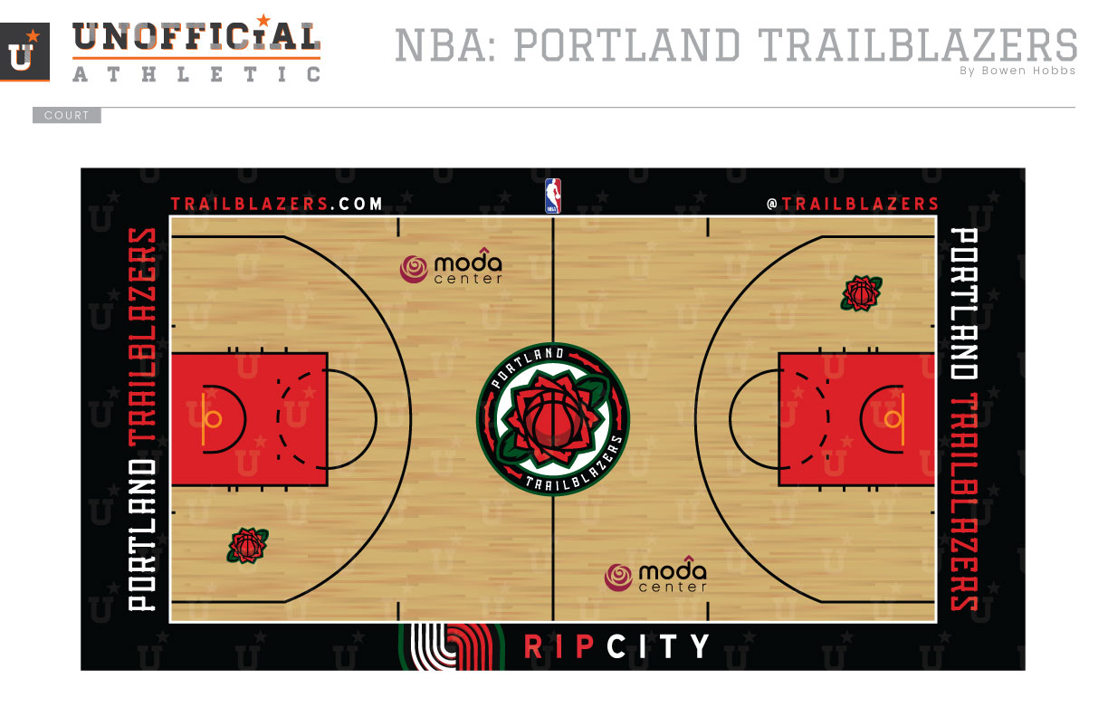
From a branding standpoint, the Blazers have been a model of consistency by occasionally tweaking their identity rather than overhauling it. Their primary mark has always featured an abstraction of the five-on-five game, with lines symbolizing the players running down the court and back. My goal was to take the team’s iconography in a different direction, using a rose as the symbol for Portland. The primary mark places a rose-basketball icon in a roundel with the team name and a thorned stripe. Green has been added to the scheme as a nod to the northwest. The rose-basketball mark breaks down into a textless version of the logo as well as a standalone icon. The secondary is an update of the team’s classic pinwheel mark, while a striped-P mark adds an option for small applications. The typeface features rustic thorned elements to give life to a squared block font. The uniforms flip the iconic diagonal strip and keep it on the jersey, instead of running down the side and onto the short. The shorts themselves have a diagonal strip on the right leg, while the rose roundel appears on the left leg. The striping is notched for a thorned appearance. The Icon is black, the Association is rendered in white, while the Alternate comes in red. The Pride uniform places RIP CITY down the player’s right side vertical a la the Bill Walton era Blazers. Red elements with cardinal accents appear throughout the design. The court features a straightforward design with black boundaries and red in the paint. The primary mark appears at mid-court, while the updated pinwheel and RIP CITY greet the players at the center court sideline.
Date
September 5, 2017
Category
Basketball, NBA

