Orlando Magic
Orlando Magic
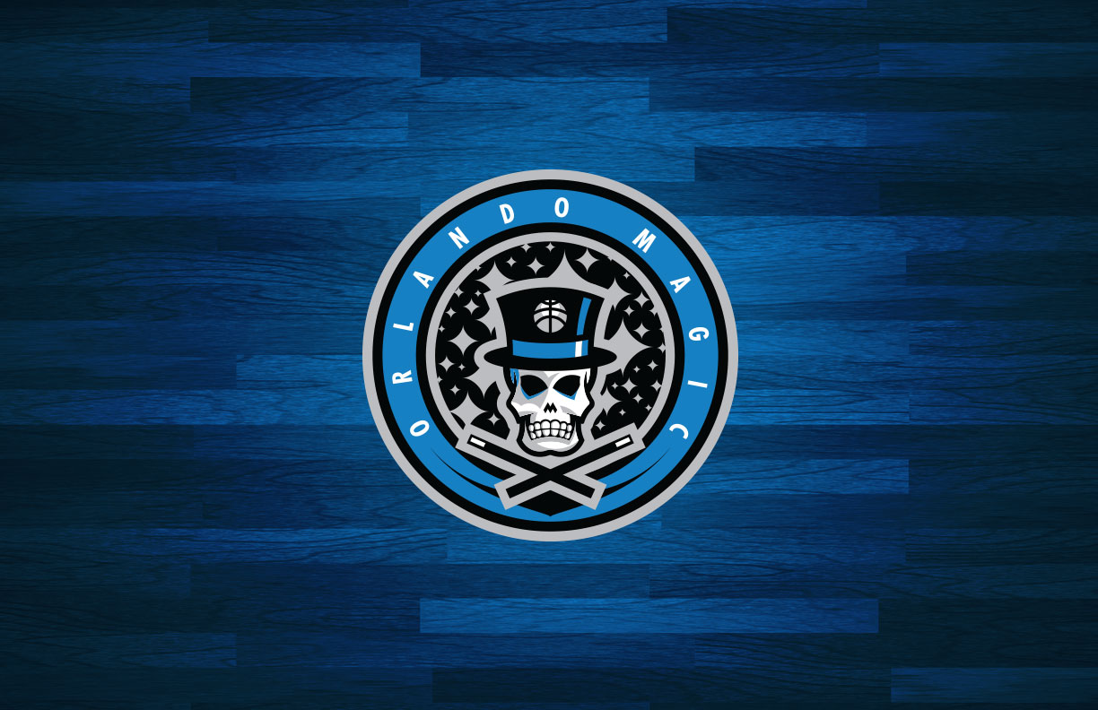
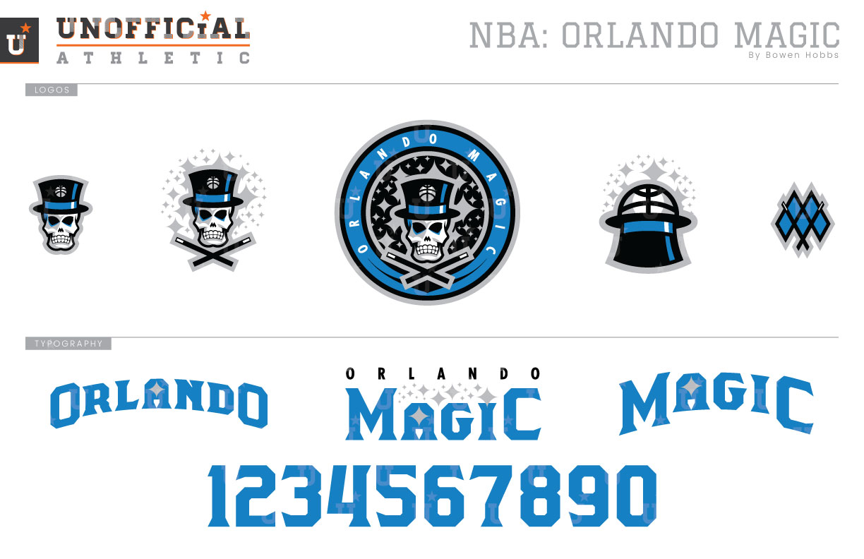
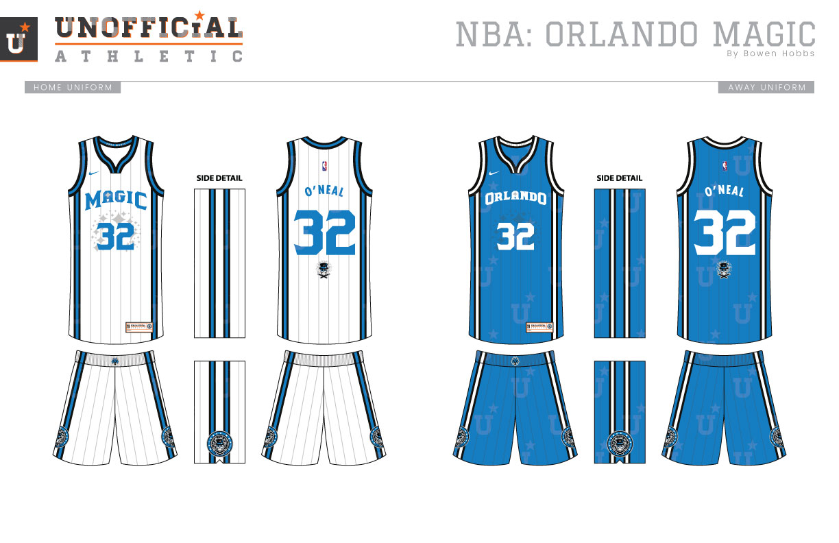
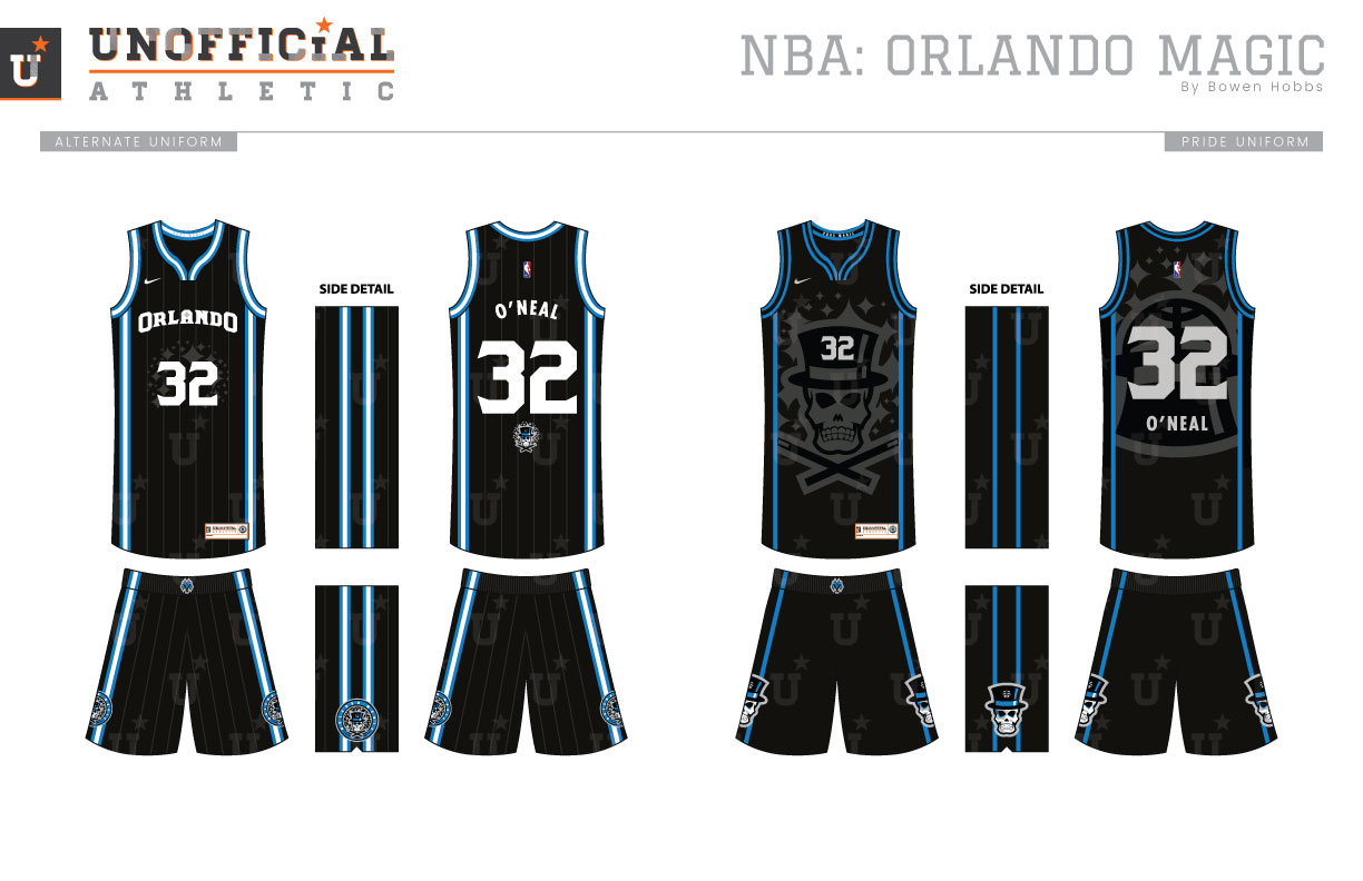
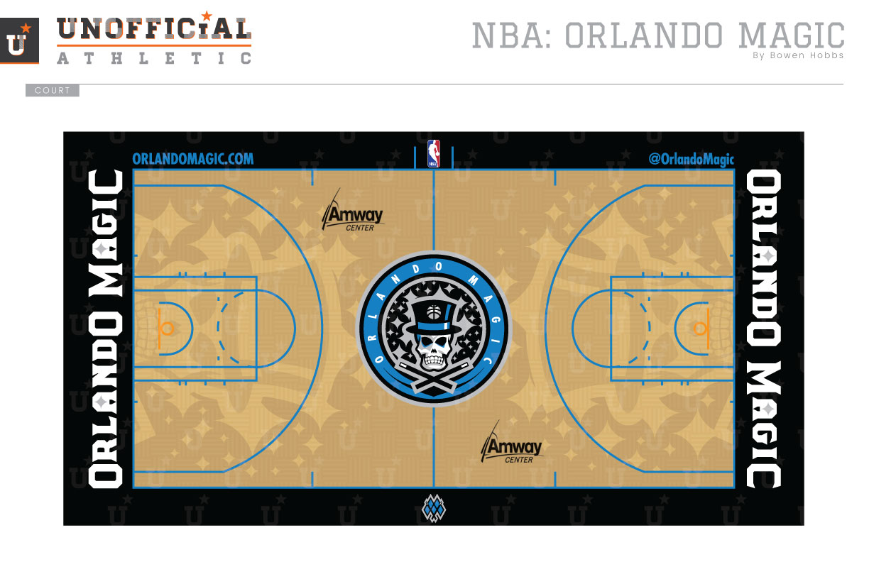
Born in 1989, the Orlando Magic have struggled to craft an iconic identity. The previous versions have focused on a streaking basketball with stars (and later lightning) in blue, black, and silver. My concept adds a bit of mystery and ferocity to the brand. A magician’s skull appears above two crossed wands within a stardust-filled roundel in the primary logo, with the mark broken down into a stardust Jolly Houdini and a standalone magician’s skull. The secondary mark places the ball into the top-hat, while a M-Wand mark is used in smaller applications. The type treatment juxtaposes an old-time semi-serif with Futura in secondary applications. The uniforms feature sublimated pinstripes and stardust behind the front numeral in addition to side piping consistent with the arm and neck trim. I refer to the Pride uniform as the Black Magic Edition. The second black uniform features a large sublimated Jolly Houdini with the numeral in its hat on the front and the top hat logo on the back alongside simple blue trim. The court keeps the parquet flooring but subtly adds the Jolly Houdini within the three-point line on each end.
Date
August 31, 2017
Category
Basketball, NBA

