Phoenix Suns


Phoenix Suns
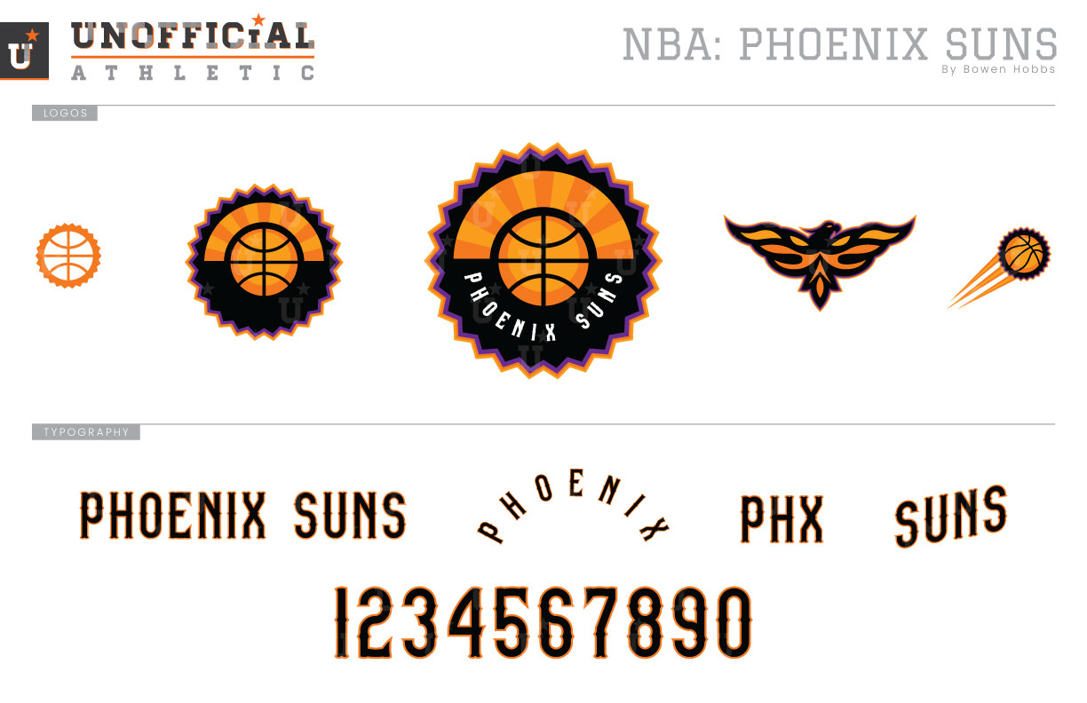
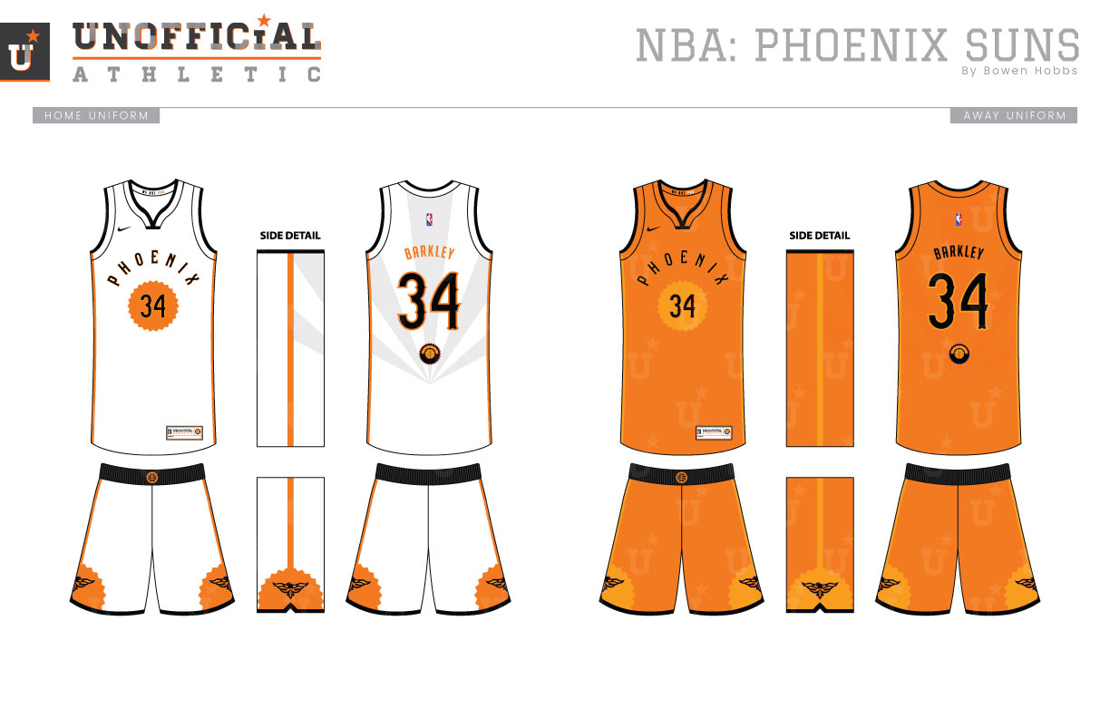
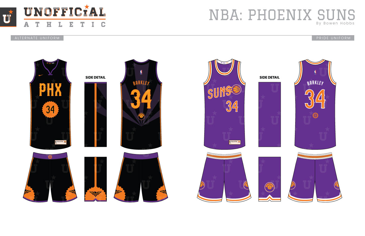
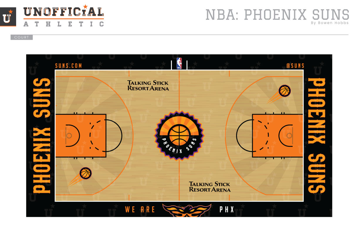
The Suns have worn purple and orange since their inception in 1968, but in recent years, they’ve reduced the role purple has played by removing it from everything but the road uniform in 2013. This summer, with the Nike switchover, the team’s Icon and Association uniforms both feature purple and orange. In my concept, I took the liberty of reducing the role of purple to a trim color, in large part because of saturation of the hue within the division. With the Lakers and Kings both sporting the shade, I thought the Suns could carve out better brand recognition with a heavier focus on orange. The primary logo I designed plays off imagery from the Arizona flag, with a sunburst shooting out from behind a basketball on the top half of a sun-shaped badge. PHOENIX SUNS is displayed along the lower half of the mark. A mark breaks down to a version without text and a one-color application. The secondary logo is a Phoenix rising, while a revival of the shooting sun mark completes the logo set. The typeface is a tuscan-style serif with a consistent stroke weight and western-style barbs. The Icon and Association uniforms place PHOENIX arched over a sun containing the player number on the front, while a sublimated sunburst adorns the back. A thin orange line runs down the side of the uniform, capped by simple black trim and a black waistband. The Alternate uniform swaps PHOENIX for PHX and adds in subtle touches of purple. The Pride uniform goes full purple by blending early Suns history with the Barkley era. The court contains black boundaries and orange lanes with PHOENIX SUNS along each baseline. A sublimated sunburst accents the space within the three-point lines.
Date
September 4, 2017
Category
Basketball, NBA


