Pittsburgh Penguins
Pittsburgh Penguins
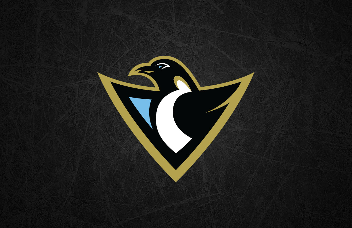
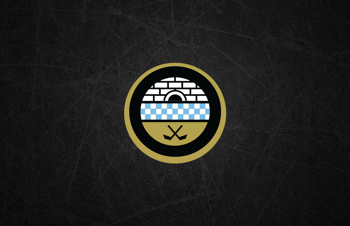
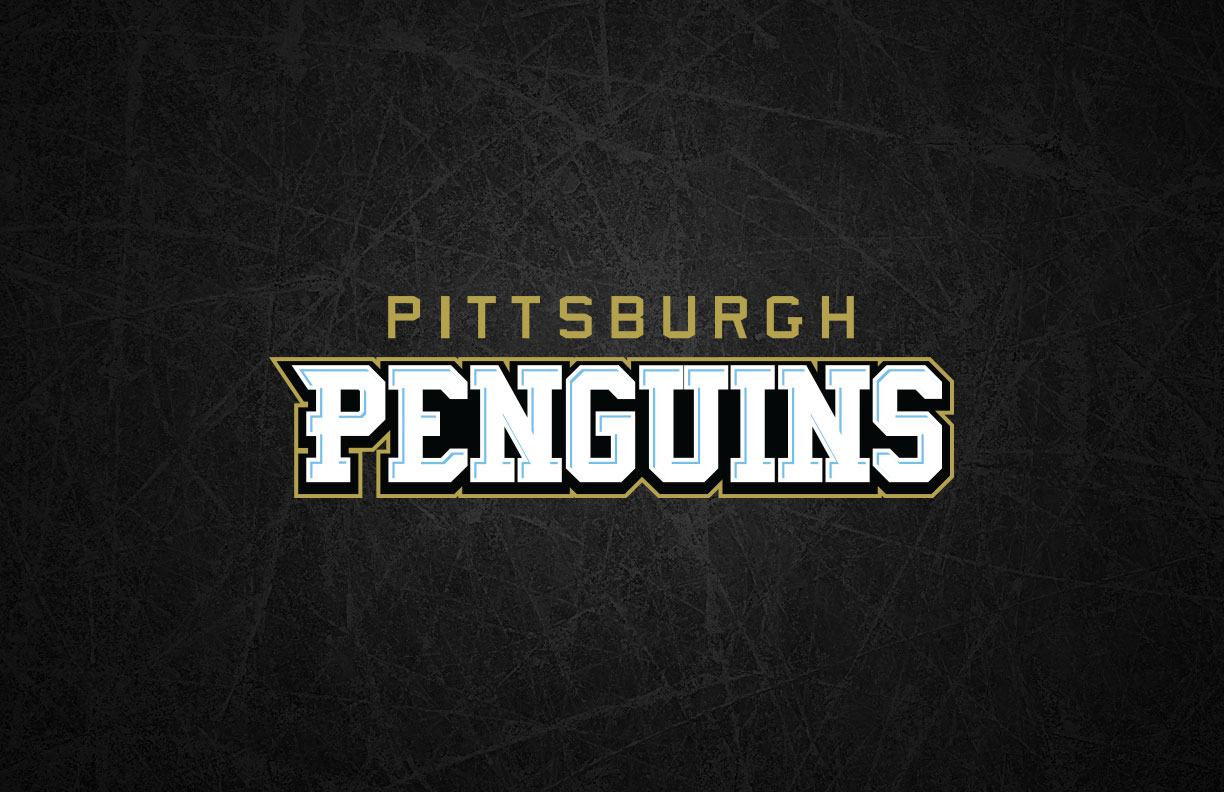
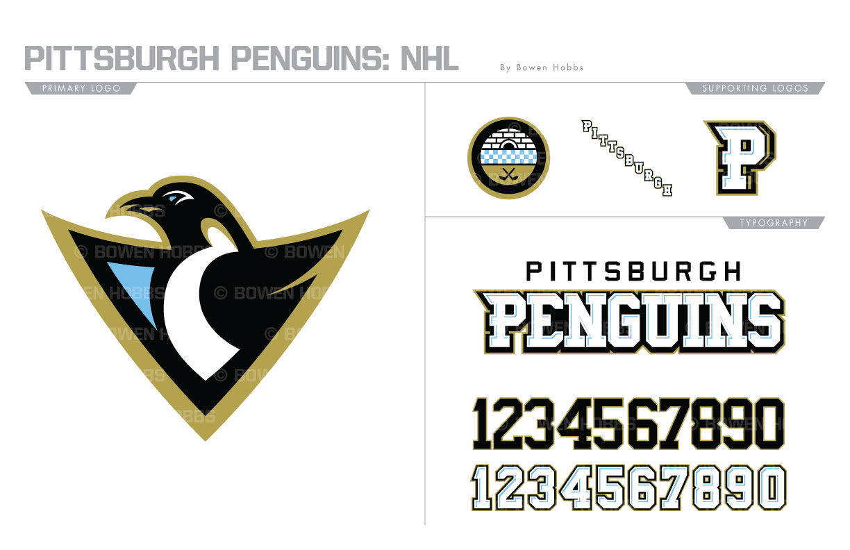
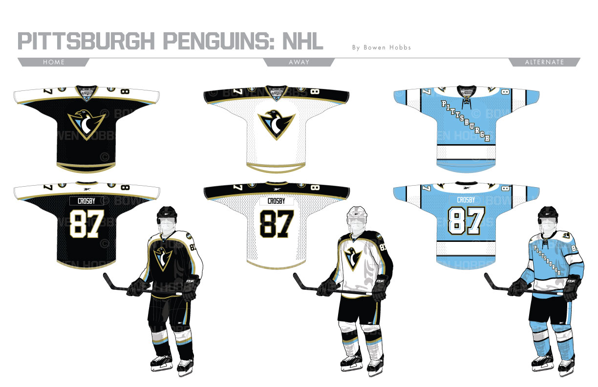
Before embracing the City of Champions’ signature black and gold at the end of the 70s, the Penguins sported a powder blue and navy palette. I blended a few eras of Pens history into a black, vegas gold, and powder palette. The logo follow the basic layout of the mark the Pens sported from 1992 to 2002, by is modernized by a more aggressive penguin and the inclusion of powder blue. The secondary logo is loosely based on the seal on the city’s flag with a checkered stripe separating the igloo and the crossed sticks. A diagonal PITTSBURGH script and standalone P mark complete the logo set. The wordmark features a blue bevel on white lettering for an icy look. The overall font is developed from the numbers the Pens wore from 1997 to 2016. The homes and roads feature a strong dose of black and white, similar to the animal for which they are named. The alternates are based on uniforms the team wore from 1967 though 1974 and display the diagonal PITTSBURGH script against a powder blue sweater with a white shoulder yoke and striping.
Date
July 1, 2017
Category
Hockey, NHL

