Nashville Predators
Nashville Predators
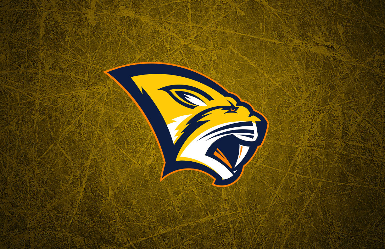
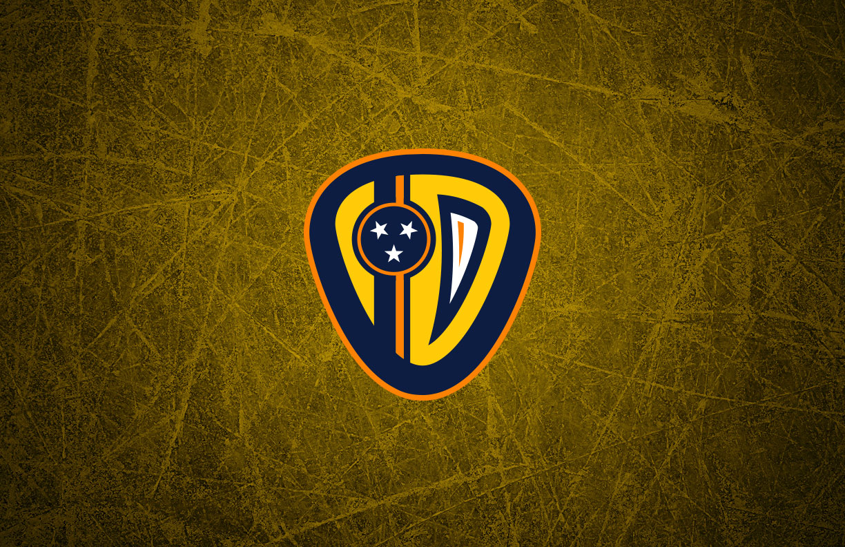
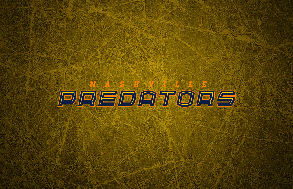
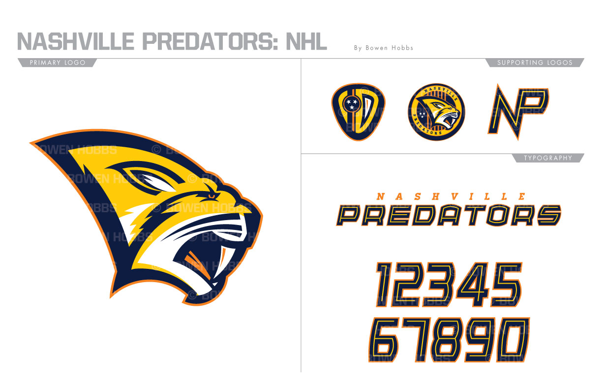
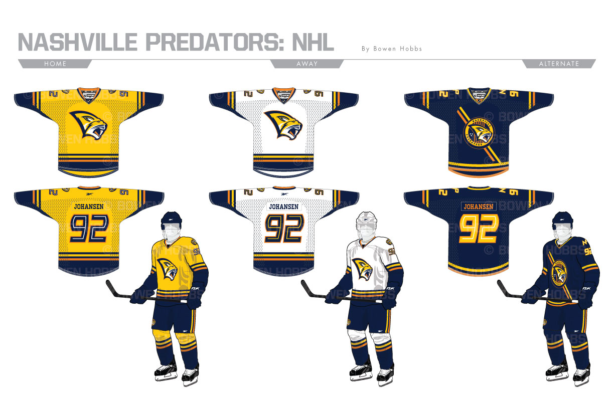
The Nashville Predators have used variations of the same big cat logo since their inception in 1998. In 2011, they simplified the mark to make it less chrome-like. My rendition of the primary logo features more more rugged sabertooth tiger with more of the team’s signature athletic gold. The secondary is a guitar pick shield with the three-star circle from the Tennessee flag and a fang. The roundel logo adds six strings similar the the opening of an acoustic guitar. An NP mark completes the logo set. The typeface evokes the feeling of neon lights in downtown Nashville. The home and aways sweaters add a splash of orange into the striping, while the alternates contain a diagonal stripe behind the roundel mark.
Date
July 1, 2017
Category
Hockey, NHL

