San Diego Padres
San Diego Padres
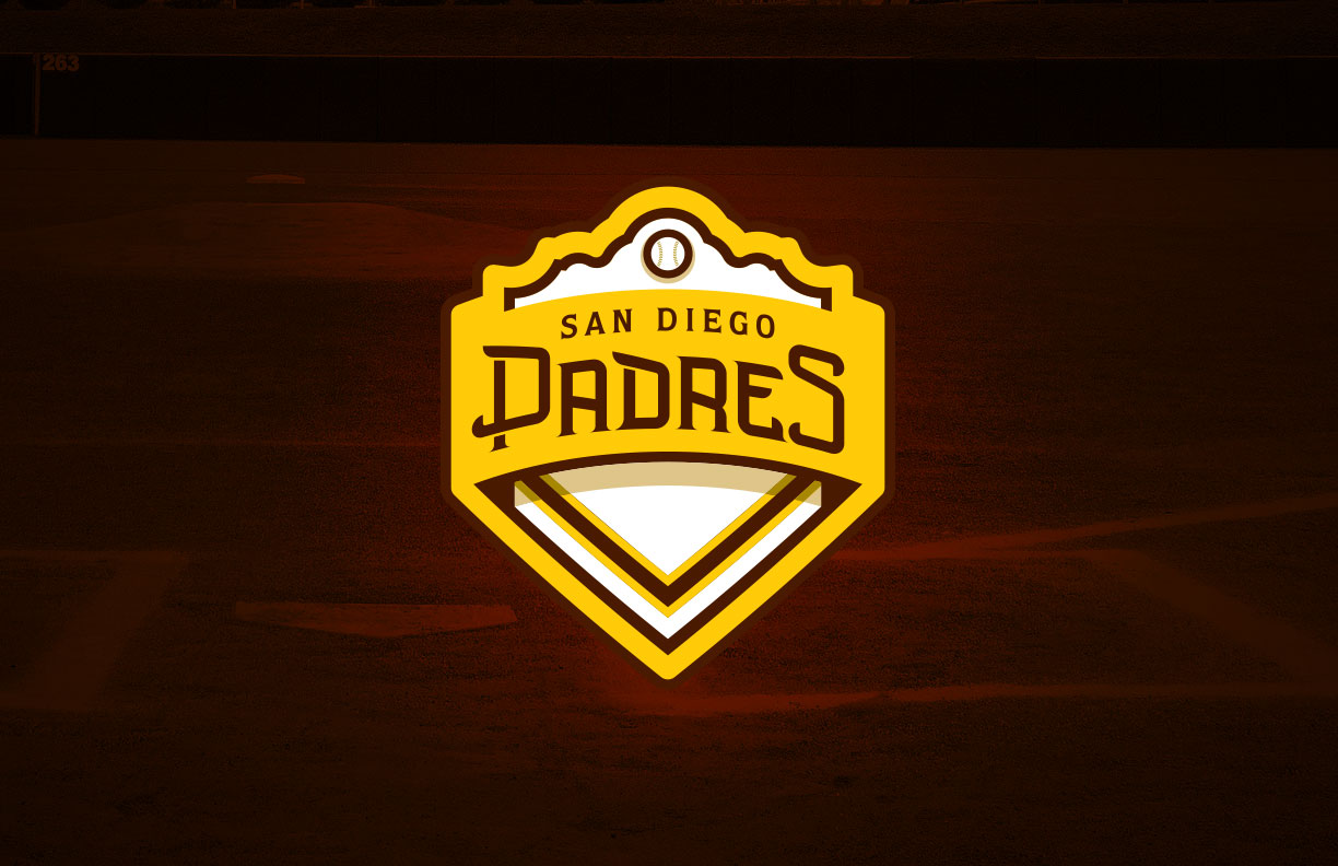
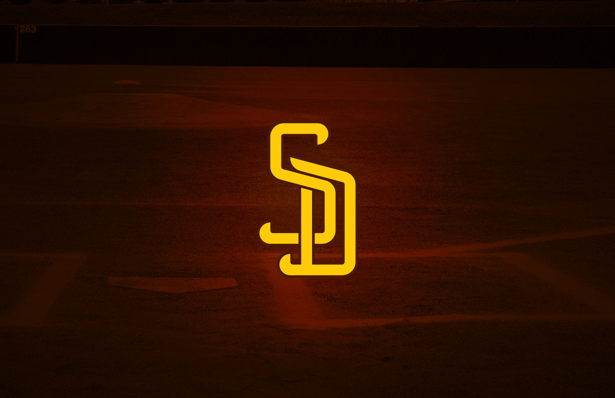
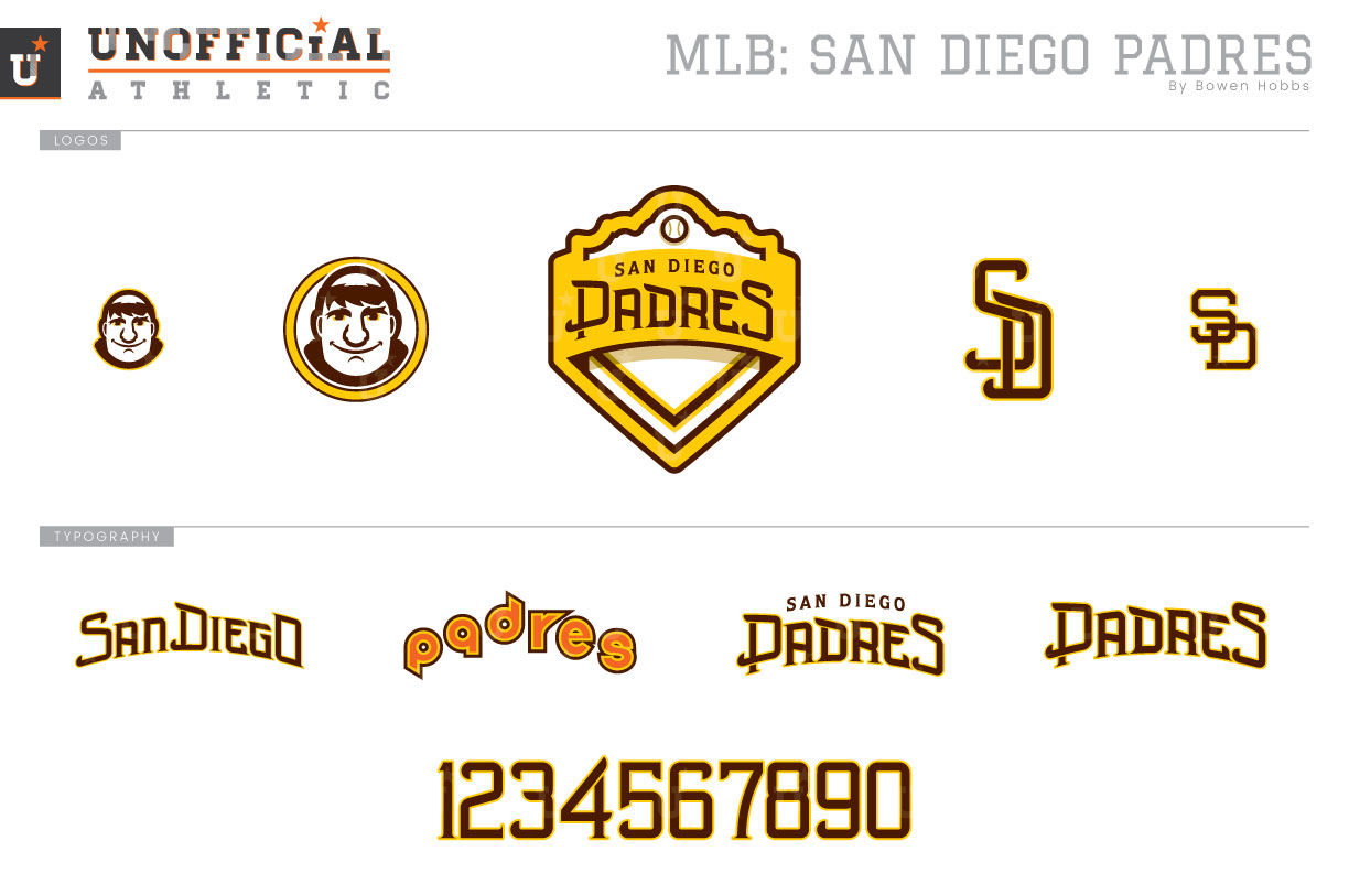
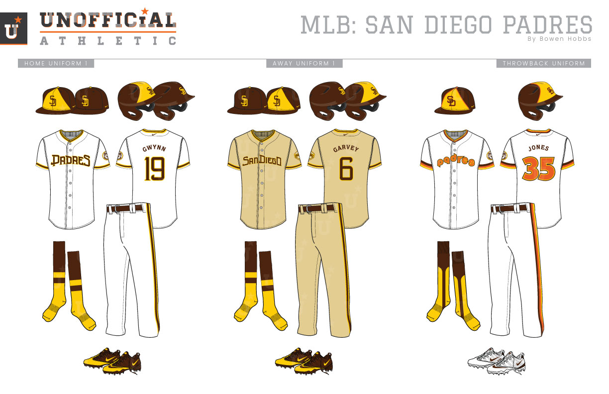
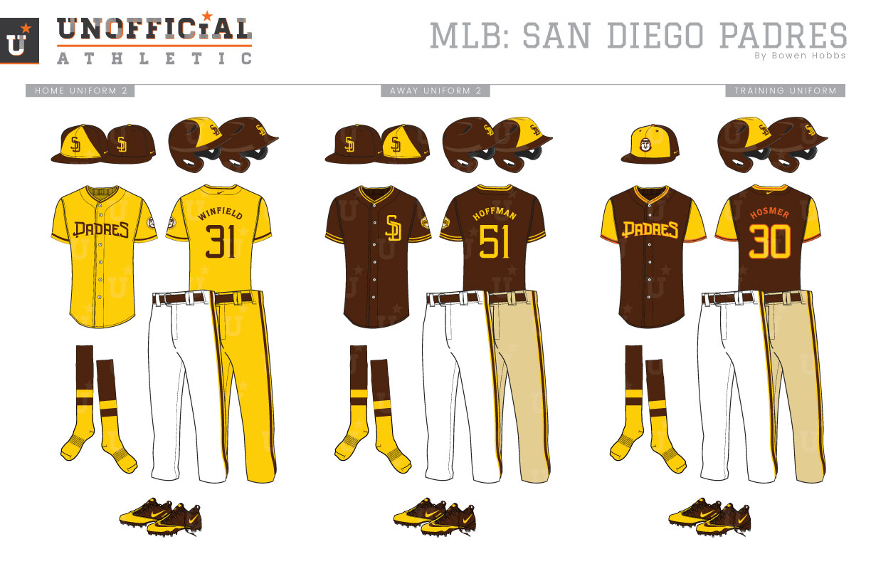
Although the San Diego Padres name predates the franchise, the MLB version of the Padres began playing in 1969. The Padres were also the first team to wear brown since the St. Louis Browns moved to Baltimore between the 1953 and 1954 seasons, as they blended the chocolate tone with athletic gold details and tan away uniforms. The Friars would experiment with all gold uniforms for the 1972 and 1973 seasons and once more in 1978. As the 70s continued, the Padres would use more modern typefaces, design elements, and athletic gold. With the 80s came the introduction of orange and the taco uniforms that blended all three autumn hues. By 1985, however, uniforms started to swing back toward more traditional styles, so the team dropped the athletic gold for a brown-and-orange pinstriped scheme that would last through the 1990 season. The following season navy replaced brown and the pinstripes were removed from the away uniforms. The navy-and-orange scheme lasted through 2003, albeit with home uniform change prior to the 2002 season. The 2004 rebrand saw the removal of orange in favor of sand and powder blue. The sand would also reprise its role as the away uniform base color until 2010. All traces of sand would be removed in 2012, with the team experimenting with a navy-and-athletic gold scheme in 2016. The sports design community have long considered the Padres to be in chromatic limbo since they switched to navy in 1991. Luckily, reports have surfaced stating the Padres plan to switch to brown for 2020. My rebrand of the Padres starts with reviving the original brown-and-athletic gold color scheme. The primary logo is a crest built from a mission and home plate with the team name separating the two. The cap logo uses the SD lockup but with a revised serif typeface that evokes the 2004 rebrand and the history of America’s Finest City. Along with the mission crest and new SD mark, a friar caricature is used as a circular sleeve patch and as a standalone icon. The classic block-SD is also used on throwbacks. There are two caps for the home and away uniforms: a brown cap with a gold front and a brown SD, as well as an all-brown cap with gold type. The home uniforms feature brown-and-gold trim with PADRES across the chest. The away uniforms are tan with a brown SAN DIEGO across the chest. The throwbacks bring back the white 1984 taco uniforms with orange type. The home alternate jersey is athletic gold with brown type, and can pair with either white or gold pants for a 1970s throwback style. The second alternate jersey is brown with gold trim and SD on the left chest. It can be worn at home or on the road. The spring training / batting practice uniforms use a brown cap with a gold front and the friar outlined in orange. With those caps are a brown jersey with gold sleeves and orange trim.
Date
February 17, 2019
Category
Baseball, MLB

