San Jose Sharks


San Jose Sharks
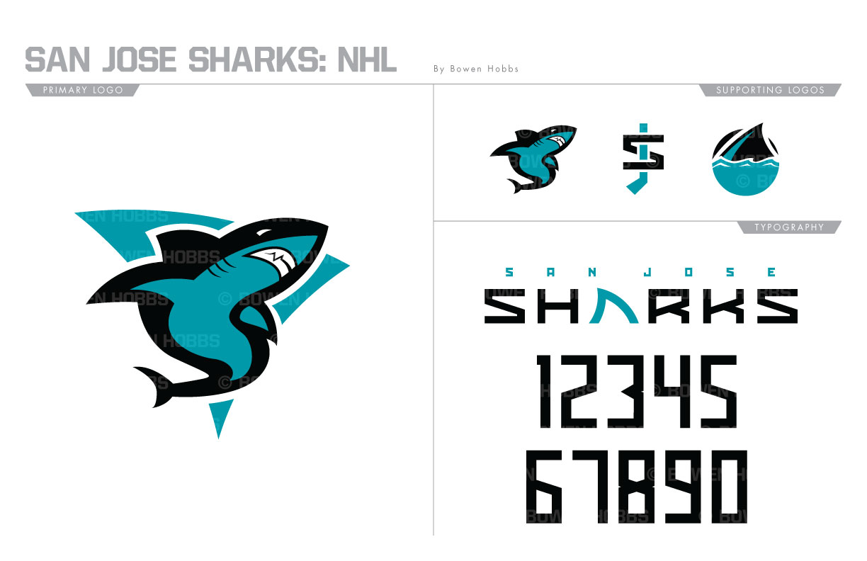
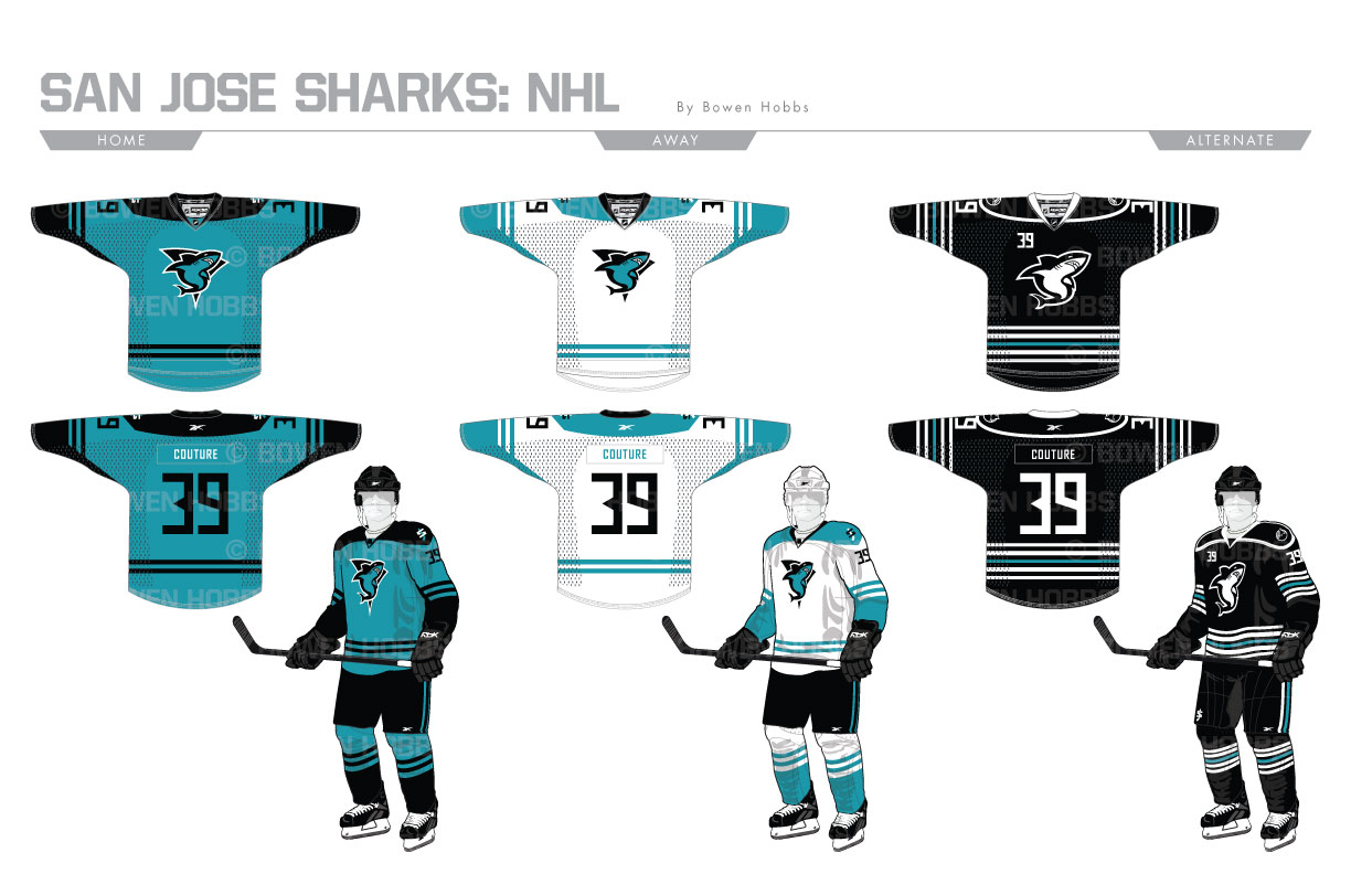
The Bay Area’s first hockey team, the Seals, were part of the NHL’s “Next Six” expansion. The Seals would call northern California home until moving to Cleveland in 1976 and folding two years later. Fast forward to 1991, when pro hockey would return to the Bay in the form of the San Jose Sharks. Armed with a color palette of teal, black and silver, they would defy convention and usher in an era of unique color schemes within the NHL. While the current Sharks traded the silver for orange, the teal and black still remain and form the basis of my redesign. The primary logo is is comprised of a shark in the form of an S with a triangle representing the three major cities of the Bay Area in San Francisco, Oakland, and the titular San Jose. A standalone shark, an SJ-hockey stick mark, and a circular patch of a shark fin in the water round out the logo set. The typeface in modern, angular and minimal, with a fin replacing the A in the wordmark. The home uniforms is almost entirely teal and black as an homage to the unique palette the Sharks have sported since their inception, while the away jersey is mostly white and teal, but is paired with black breezers. The alternates feature the standalone shark as the crest and are rendered almost entirely in black and white with just a hint of teal for a minimalist yet modern feel.
Date
July 2, 2017
Category
Hockey, NHL

