Seattle Kraken
Seattle Kraken
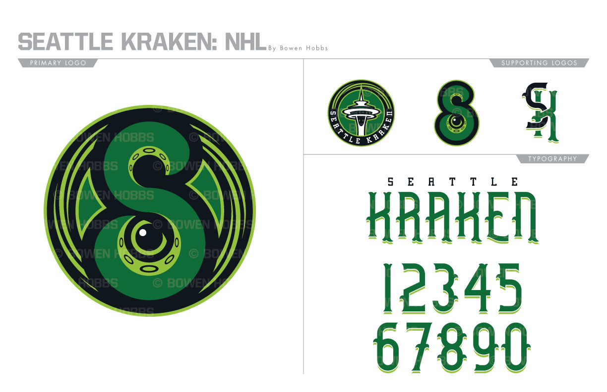
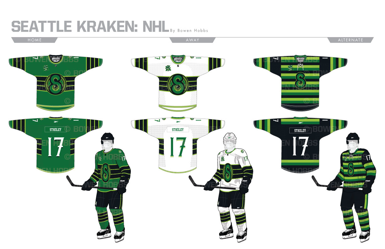
From 1915 to 1924, Seattle was home to the Seattle Metropolitans, a pro team in the Pacific Coast Hockey Association. Their colors were green, cardinal red, and white and they were known for their barber pole striped sweaters. As the Emerald City looks to return to the top league for the first time in nearly a century, a number of names have been thrown into the ring. From the classic Metropolitans and the former minor league moniker Totems to original submissions such as Firebirds, Sockeyes, Steelheads, Emeralds, and Sasquatch, one name stuck out: the Seattle Kraken. The Kraken is a giant squid that is capable of consuming entire ships. Diving into the lore, I developed a primary logo of a Tentacle-S against a whirlpool holding shape with the beast’s eye peering out from inside the S. The S also stands by itself as a secondary mark, complemented by a Space Needle roundel and an SK mark. The typography for the team blends an ornate team name and numbers with a subtle drop shadow and a squared-off slab serif for the supporting text. The home uniforms feature emerald green sweaters with midnight navy helmets and breezers along with lime green trim. The circular S Mark proudly state SEATTLE on the chest with the Space Needle roundel on the shoulders. Both the home and away jerseys feature a bold midnight navy chest stripe with lime green accents. The aways, however, feature a white sweater and helmet. The alternates bring back the barber pole design with a modern color palette of midnight navy, emerald, and lime as well as solid midnight sections on the upper sleeves and back to ensure the readability of the players’ numbers.
Date
November 25, 2018
Category
Hockey, NHL


