Tampa Bay Lightning


Tampa Bay Lightning
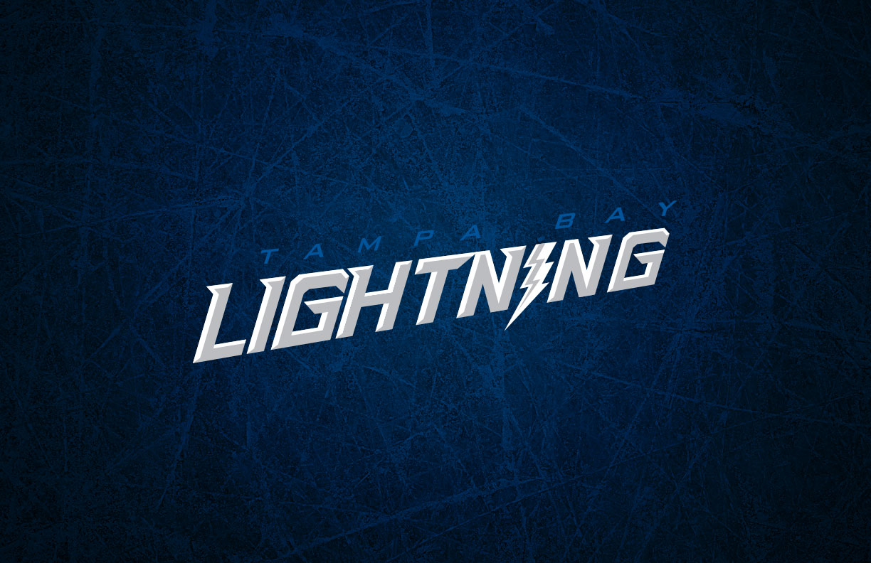
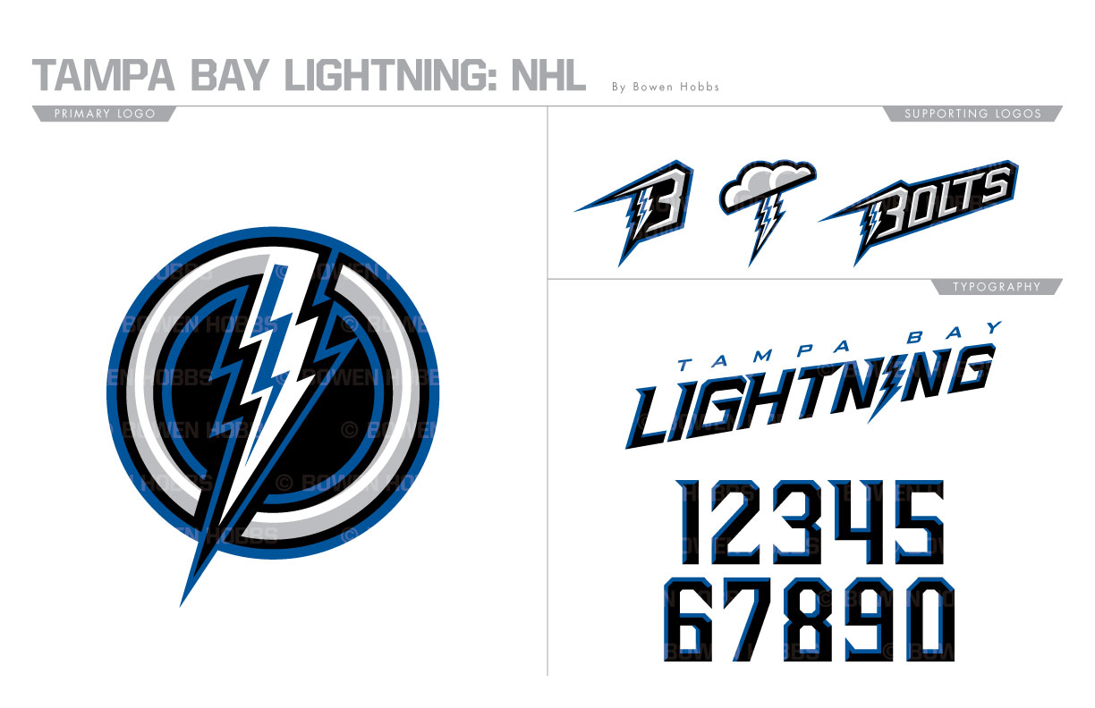
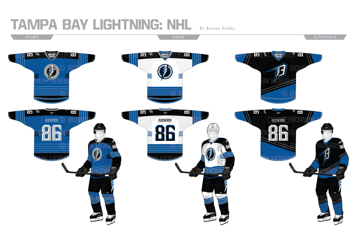
In 2011, the Tampa Bay Lightning unveiled a new scheme that looks eerily like a cross between the Maple Leafs and the Red Wings. I wanted to take them back to their roots by reinstalling black and silver to complement the blue in their scheme. The primary logo consists of a lightning bolt piercing through a beveled ring. A TB-Bolt, a thundercloud/bolt combo, and a BOLTS wordmark complete the logo set. The font conveys the jaggedness found in the logo and in lightning itself. The home and away sweaters contrast thick black stripe down the sleeves with blue and silver strips across them and the hem line. The lightning bolt on the breezers stays, and the victory stripes under the arms return. The third jersey is black with he TB logo and an asymmetrical pattern in blue and silver.
Date
July 1, 2017
Category
Hockey, NHL

