Tennessee Titans

Tennessee Titans
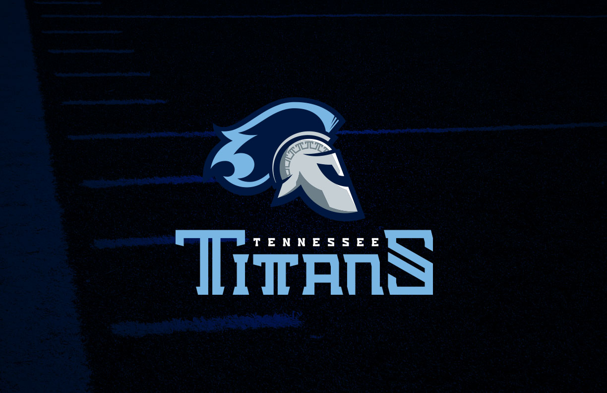
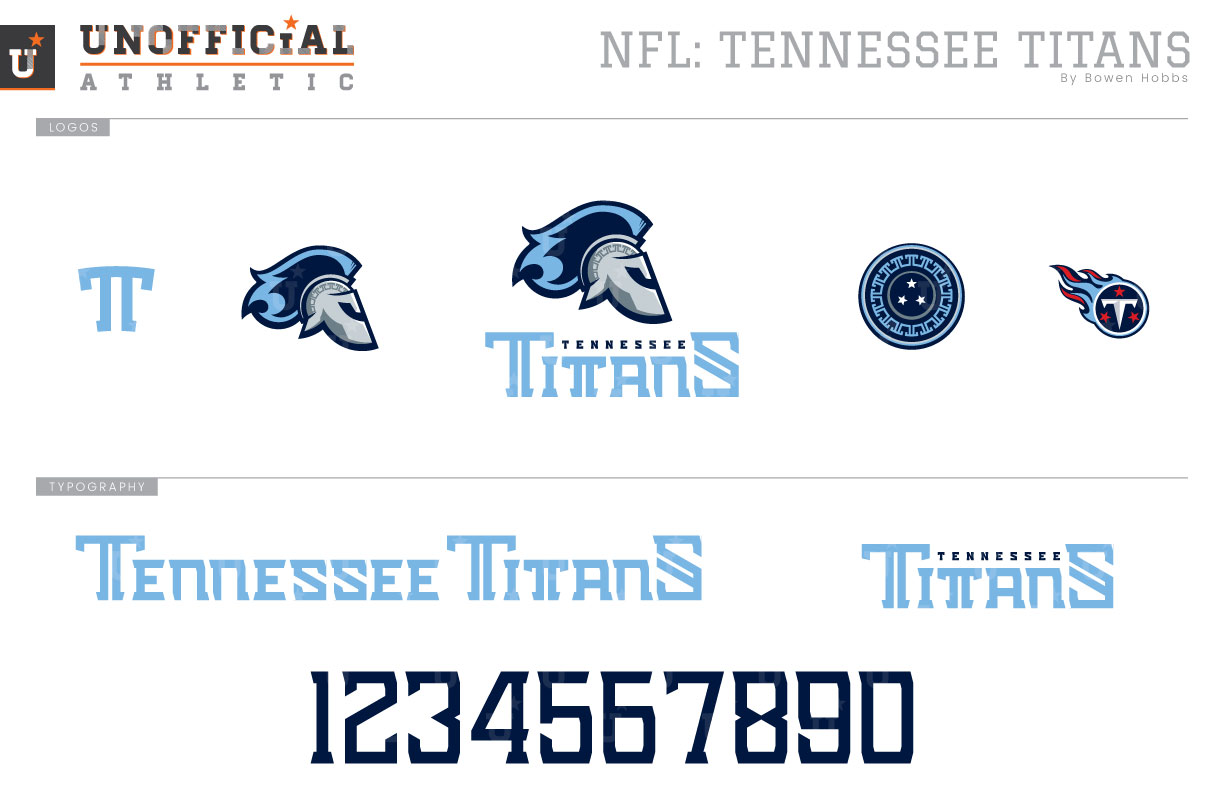
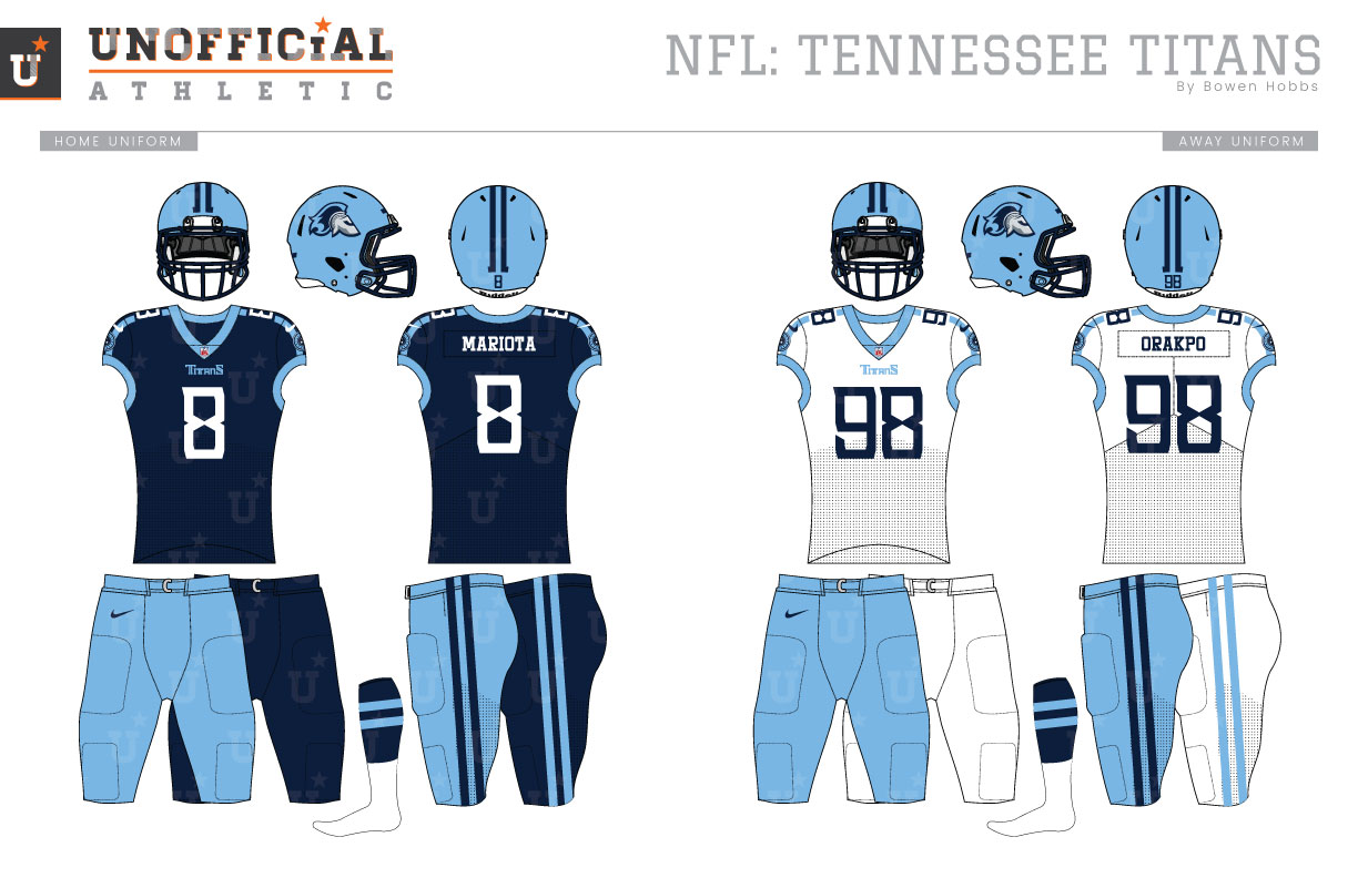
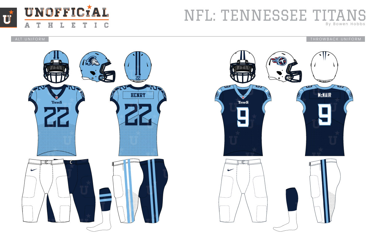
The Tennessee Titans are one of the original eight AFL teams, along with the Raiders, Chargers, Broncos, Chiefs, Patriots, Jets (who were the Titans), and Bills, but they were neither in Tennessee nor named the Titans at the time. Back in 1960, they started their history as the Houston Oilers, and wore powder blue, red, and white. In 1966 silver was also a part of the color palette, but was removed after the 1971 season. The Oilers would don their classic white helmets starting in the 1975 season, paired with white and columbia blue uniforms trimmed in red. That scheme would endure the team’s move to Tennessee for the first two years before their Nashville stadium opened and they rebranded to the Titans. The original Titans branding kept the white helmets, but changed the color scheme to white, navy, and columbia blue, with a small touch of red only in the logos. The jerseys were navy with white numbers and a light blue shoulder yoke. The away jerseys swapped the navy and white. The team would add a columbia blue jersey and pants and mix their different jerseys and pants to create many combinations, some better than others. The Titans evolved their identity for the 2018 season, switching to a navy helmet with a chrome facemask, and re-emphasizing silver with sword-like accents on their shoulders and pants. But the team, somewhat oddly, kept the much-maligned “Flaming Thumbtack” logo. My Titans redesign takes a critical look at the team’s on-field visual language, making key decisions on color hierarchy and typography, as well as giving more definition to the term Titans. I developed a primary icon of a Greek warrior’s helmet with a plume transforming into flames for a fast and fierce feeling that carries over from the Flaming Thumbtack years. The warrior’s helmet is rendered in two-tone silver, with a Greek Key design, while the plume is captured in columbia blue flames. The helmet icon is combined with a block typeface featuring double strokes and nested serifs. The alternate logo features a circular shield with the Greek Key T-border and three stars in the center, representing Tennessee. The stylized T complements the primary and alternate icons, as well as the Flaming Thumbtack (used on throwbacks). The number set keeps many of the angular features of the wordmark, but drops the double stroke for readability. The uniforms are transformed to focus on the Titans chromatic legacy, starting with a return of the columbia blue helmet. The columbia blue base of the helmet contains a metallic flake, while the facemark is navy chrome. The warrior appears on each side of the helmet while a double stripe with serifs runs along the top of the shell. The home jerseys are navy with a double stripe connecting the columbia blue collar and sleeve trim, only breaking for the TV numbers on the shoulders. The type is solid white with no outlines for a modern classic appearance. The double stripe theme continues to the pants and socks with the columbia helmet/navy jersey/columbia pants as the primary home combination and alternate navy pants available for a monochrome look. The away uniforms feature white jerseys with navy type and columbia stripes and also pair with columbia pants, with a second option of white pants for an all-white look. The third jersey is columbia blue with navy type and stripes, and it pairs with white or navy pants, avoiding a columbia blue from-head-to-toe look. The throwback uniforms recall the AFC Champion team of 1999 with white helmets and navy jerseys featuring a wide columbia blue shoulder yoke and white pants.
Date
January 16, 2019
Category
Football, NFL


