Toronto Maple Leafs



Toronto Maple Leafs
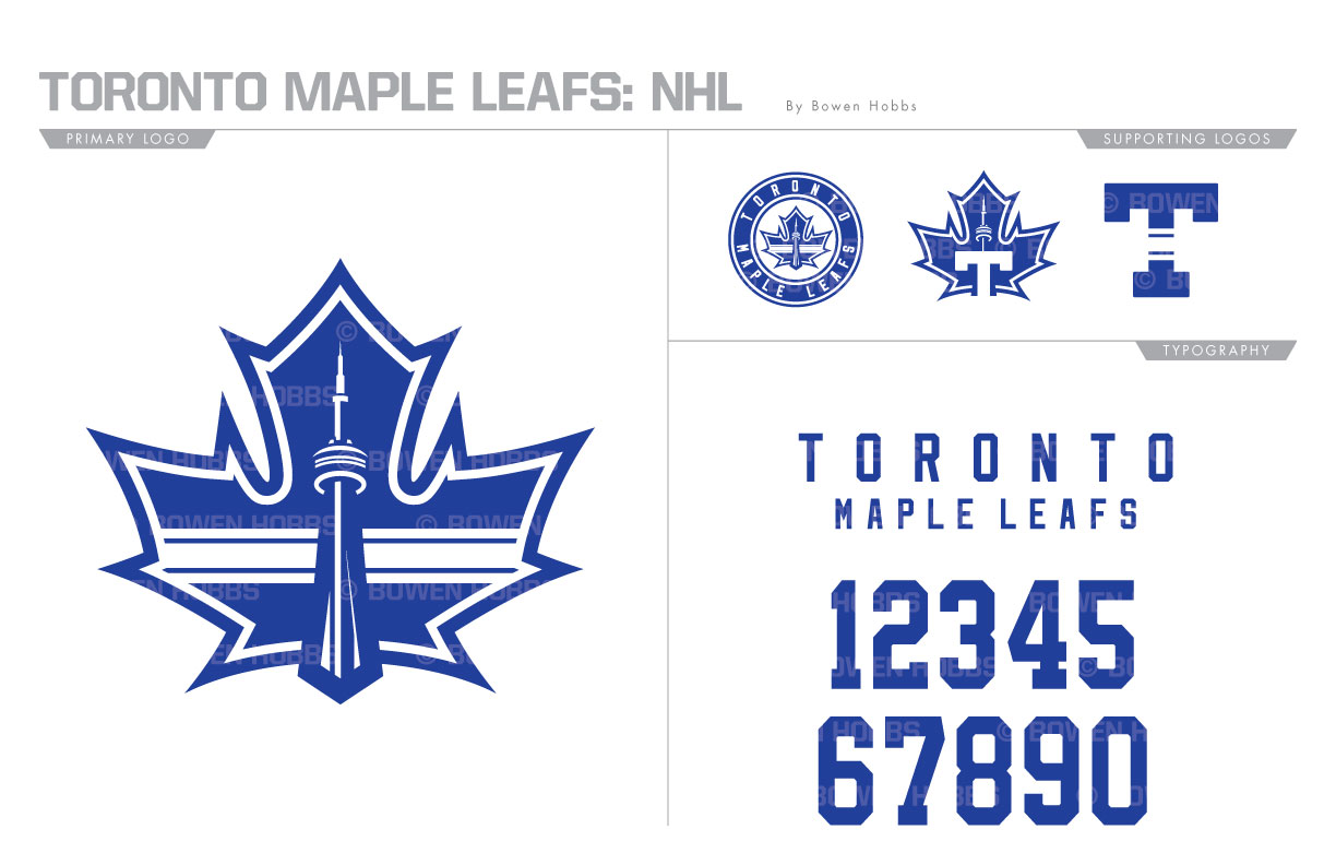
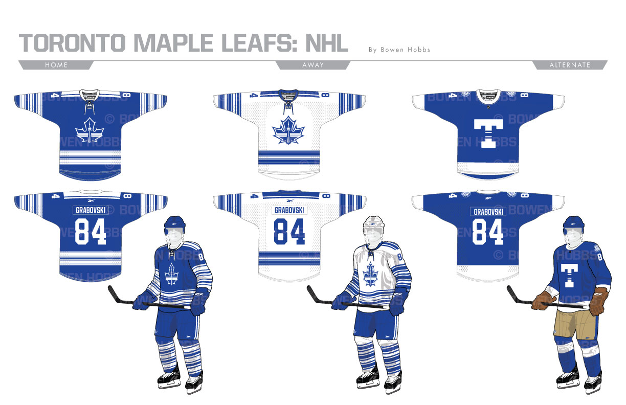
An Original Six team in the single largest hockey market in North America, the Toronto Maple Leafs are steeped in tradition. Surprisingly, the team have tweaked or changed it logo numerous times throughout its history. My take on the Leafs is decidedly more modern and features the CN Tower and a Northwestern Stripe (named after the University) contained within a leaf. There is also a roundel version, a T-Leaf, and a striped T. The typeface is a no frills block font. The Northwestern stripe from the logo is repeated throughout the home and road uniforms. The third set is an ode to the club’s formative years as the Toronto Arenas.
Date
July 1, 2017
Category
Hockey, NHL


