Vancouver Canucks


Vancouver Canucks
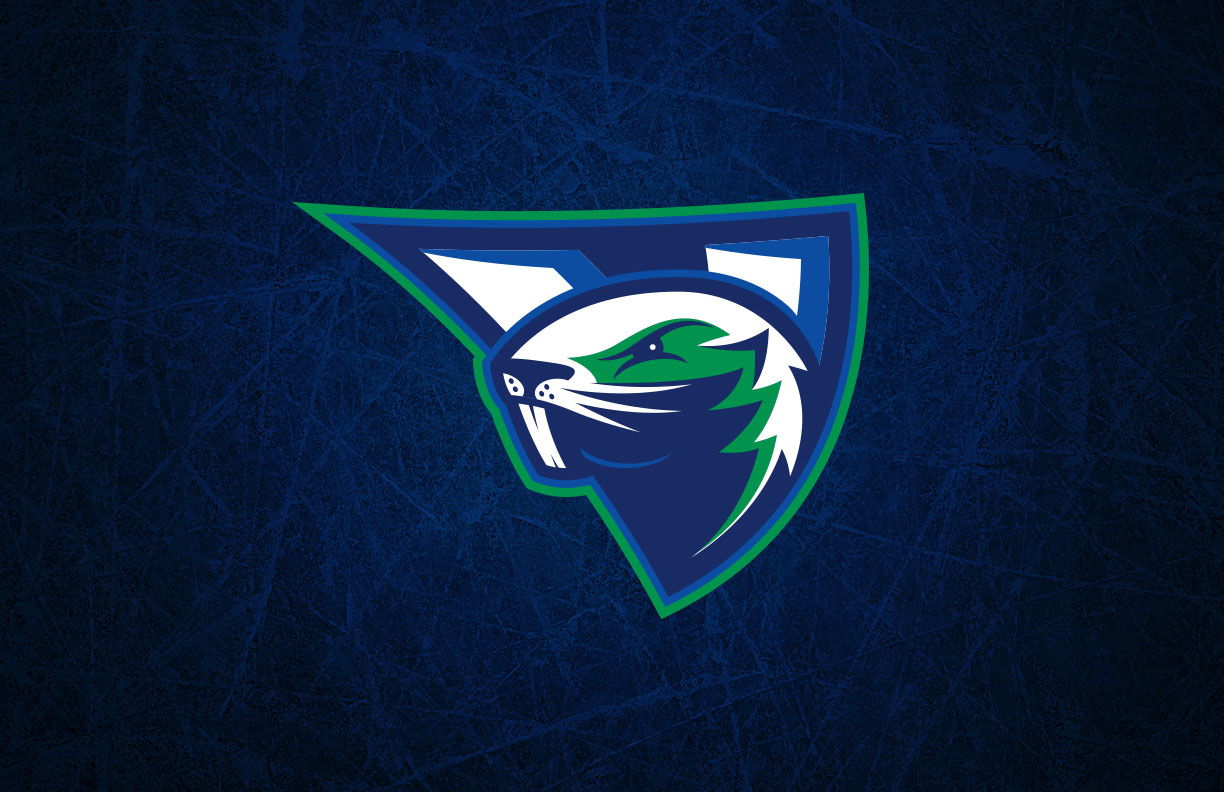
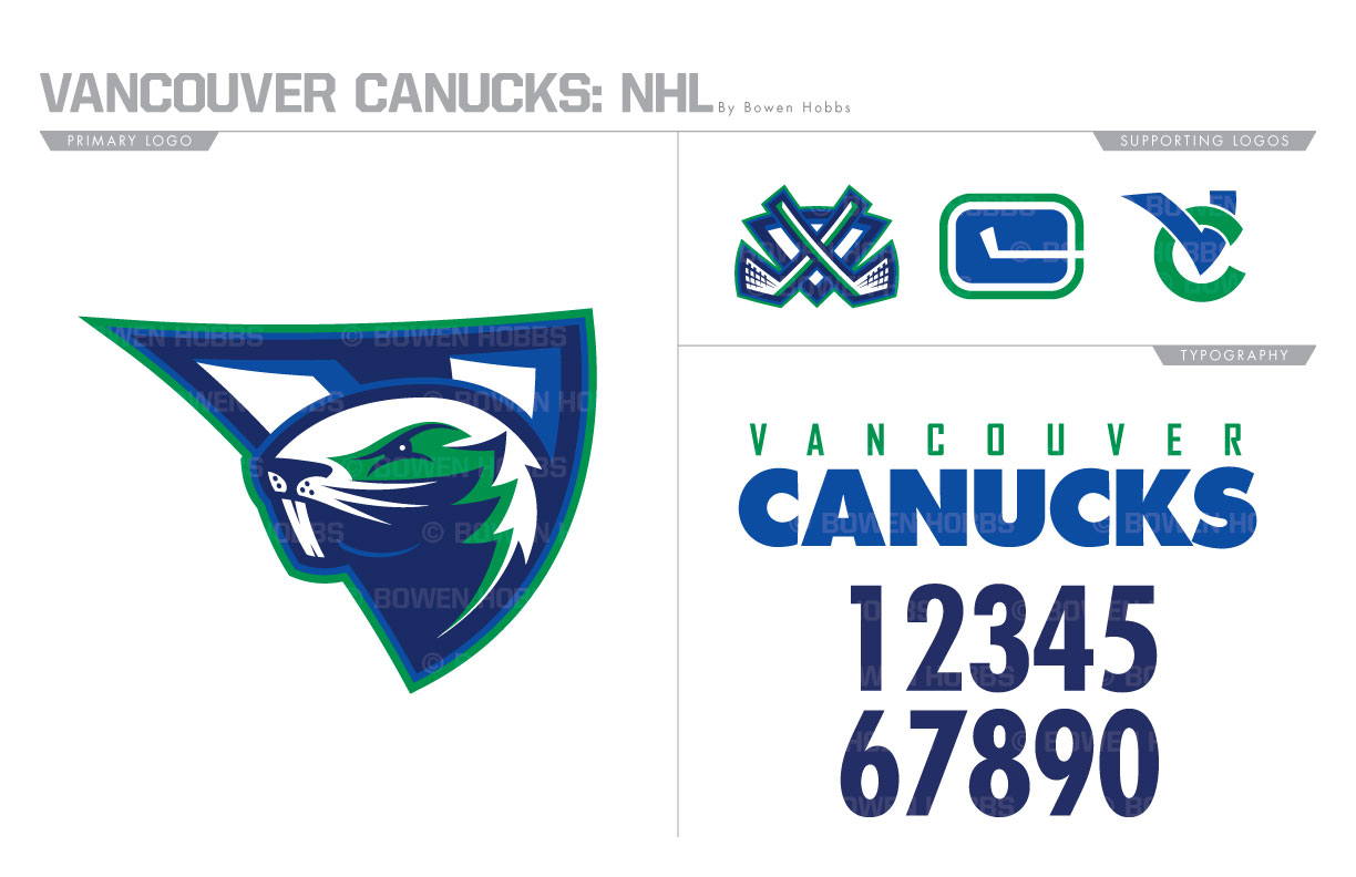
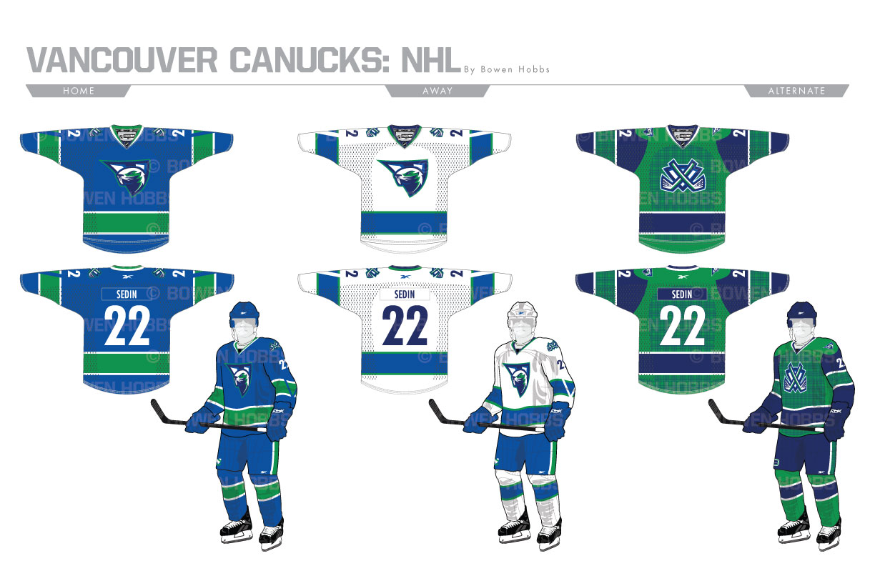
In 2007 the Canucks went back to their original color of royal blue and kelly green. During that chromatic transition the kept their Orca-C logo, much to the chagrin of their fans. When hockey fans think of The Whale, their minds go to Hartford, CT, not Vancouver. With that in mind, I designed a mark using Canada’s national animal, the beaver. The Beaver is fierce and looks west to denote Vancouver’s place on the Canadian Pacific Coast. A shield with crossed beaver-tail hockey sticks continues the new motif, along with an interlocking VC and a revival of the stick-in-rink logo. The word mark and numerals are rendered in Futura to give the concept a clean and modern look. The home and away sweater revive the V-stripes from the early 70s. The third jersey features a plaid pattern to honor Johnny Canuck, the team’s skating lumberjack mascot.
Date
June 30, 2017
Category
Hockey, NHL


