Vegas Golden Knights
Vegas Golden Knights
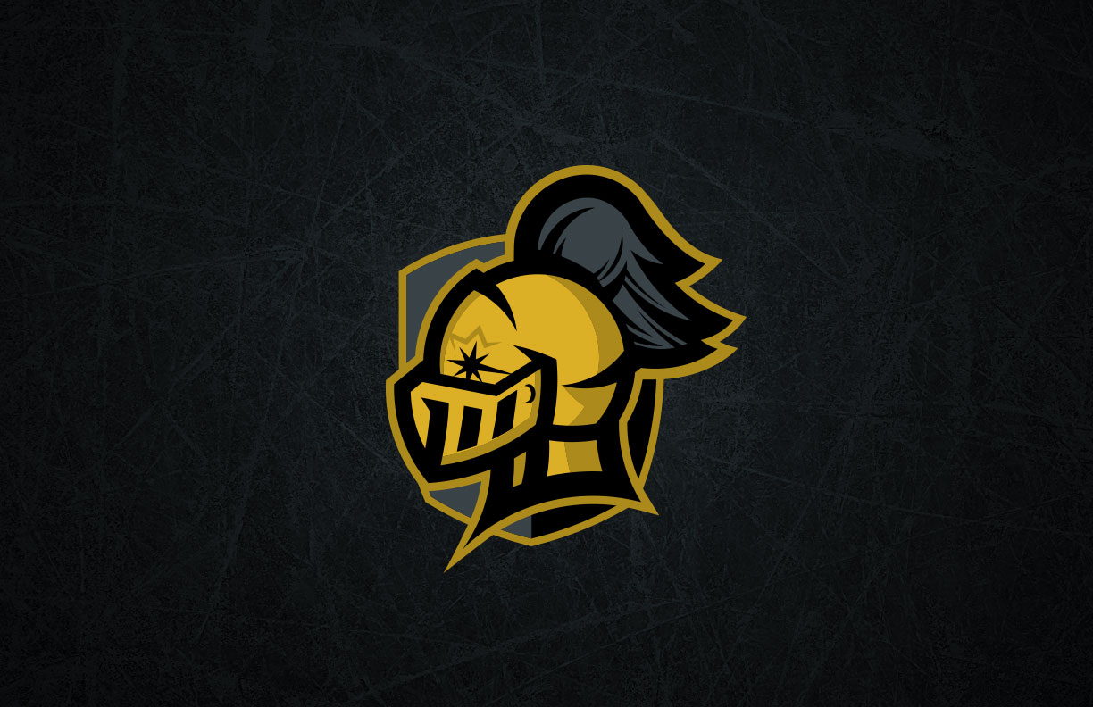
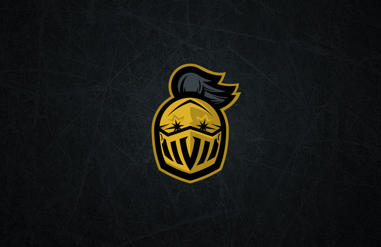
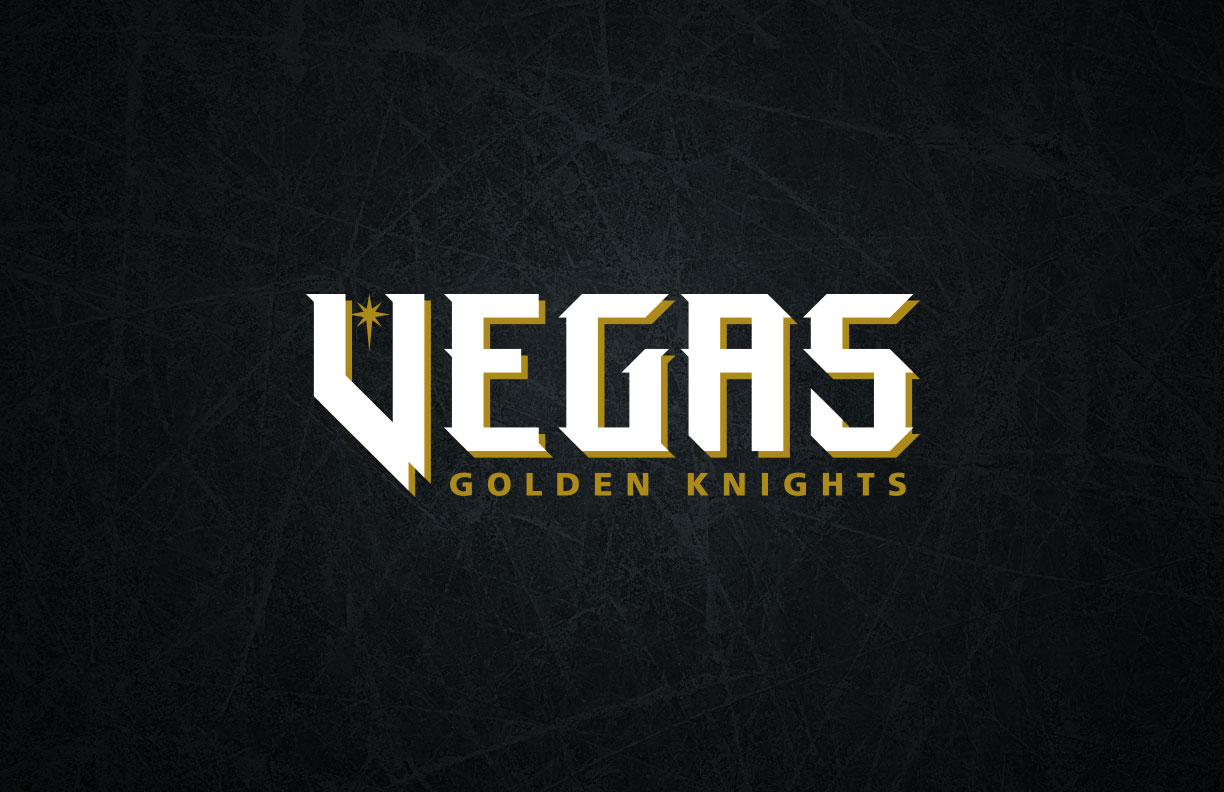
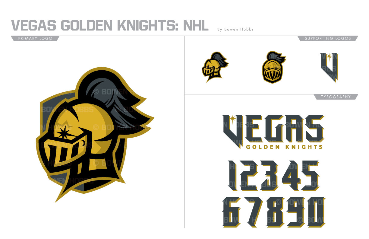
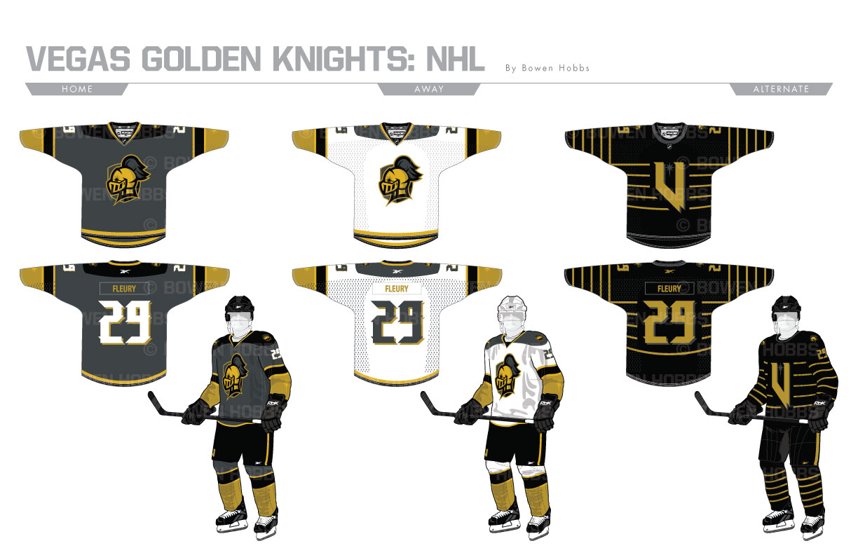
While the Vegas Golden Knights were born very recently, their branding was quickly adapted by the masses en route to a playoff appearance in their inaugural season. That said, some elements of the design could be reimagined to be more knightly and less spartan. While the charcoal and black work well together, the team could have used more gold in the overall scheme and didn’t necessarily need to add red for accents. My redesign of the team replaces the red with a second shade of gold for a more three-dimensional look. The primary logo combines a side-facing knight helmet against a shield with an eight-point star that is evocative of the signature Vegas sign. The secondary logo brings back a front-facing knight head with a V in the mouth of the mask. A standalone version of the side-facing knight and a Nevada-V complete the logo offerings. The Nevada-V also appears in the team script, along with a typeface that blends elements of athletic block and blackletter fonts. The home jersey remains charcoal, but with larger multi-tonal gold accents, while the white away sweater also retains the heavy use of gold. The third sweater is black with horizontal gold stripes and the Nevada-V logo on the chest for a desert bumblebee look.
Date
April 23, 2018
Category
Hockey, NHL

