Washington Capitals

Washington Capitals
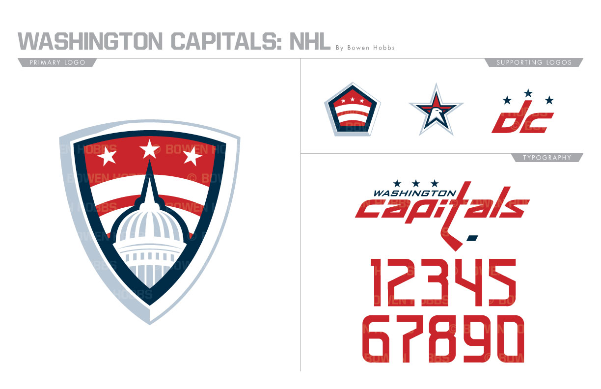
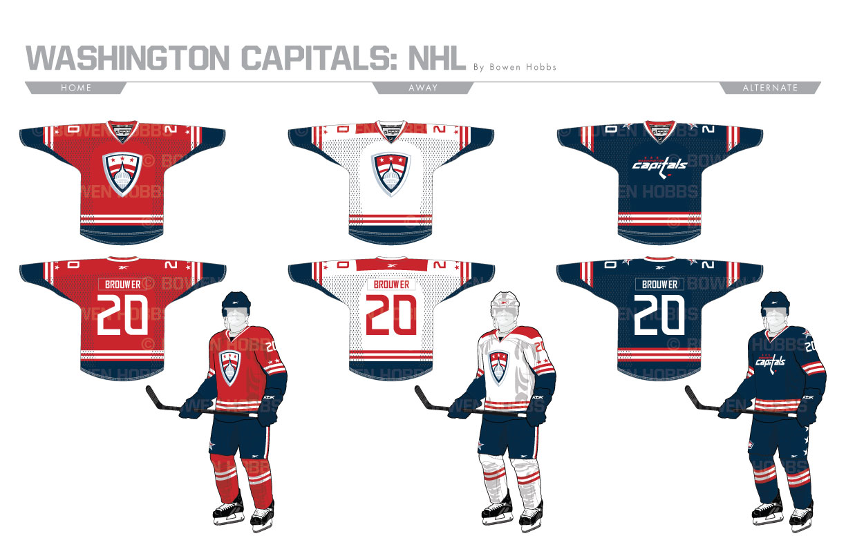
The Capitals currently use a wordmark as their primary logo. Although not unprecedented within their own history and among other teams, it seems like a lost opportunity given the abundance of historic landmarks and patriotic imagery available. The primary logo I developed showcases the U.S. Capitol building in a shield set against two bars and three stars representing the District of Columbia. To accompany this mark, I developed an eagle head within a star, a pentagon emblem, and a DC mark with three stars. The typeface is fast, sleek, and modern. The home and road jerseys carry over the three stars and two bars from the logo set, while the alternate uniform relies more on the iconic symbolism of Old Glory.
Date
June 30, 2017
Category
Hockey, NHL


