BC Lions
BC Lions
Playing their first season in 1954, the BC Lions are Vancouver’s and British Columbia’s oldest professional sports franchise. During that inaugural season the Lions opted for monochrome orange with black and white numbers and striping, updating their striping in 1956. In 1960, BC switched to a black monochrome look with orange and white accents. While the design changed over the course of the ’60s, the team wore all-black for the entire decade. In 1970, silver pants were introduced, while orange jerseys returned in 1973. Fast forward to ’80s, when the Lions would opt for a brighter look relying on the orange and white parts of their color scheme, swapping black and silver helmets for white counterparts in addition to orange pants for road games. 1990 would see another update with a return to black and silver with orange accents, but it did not last. The team returned to a version of its orange and white scheme in 2005. The next major change came in 2015, when Adidas helped the Lions craft an aggressive new look. The helmets were revised to feature more of the lion in two color schemes: back with orange for at home and orange with white for the road. The home helmets paired with orange jerseys featuring black shoulders and black pants, while the orange and white helmet was worn on the road with white jerseys featuring orange shoulders and orange pants. Most recently, when New Era took over the CFL contract in 2019, the Lions went back to the BC logo on their black helmets, nixing the orange alternate lids. Their home uniforms added white trim to the orange and black design, while the aways blended white, black, and orange more evenly than the white and orange design from Adidas.
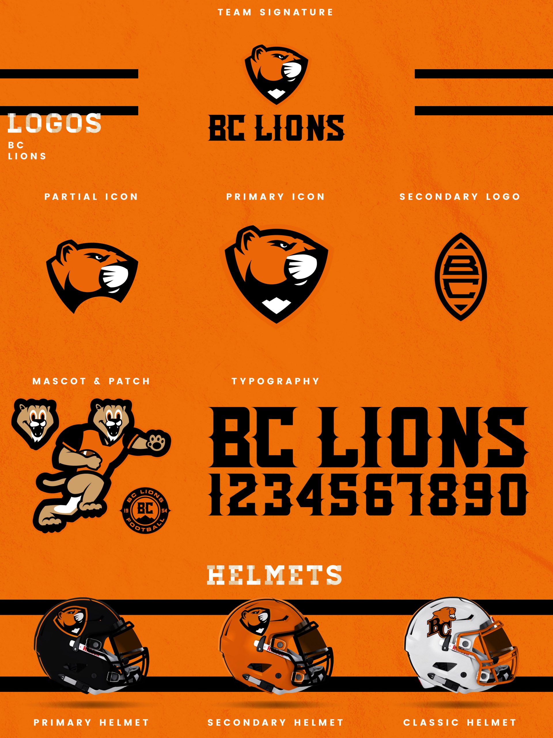
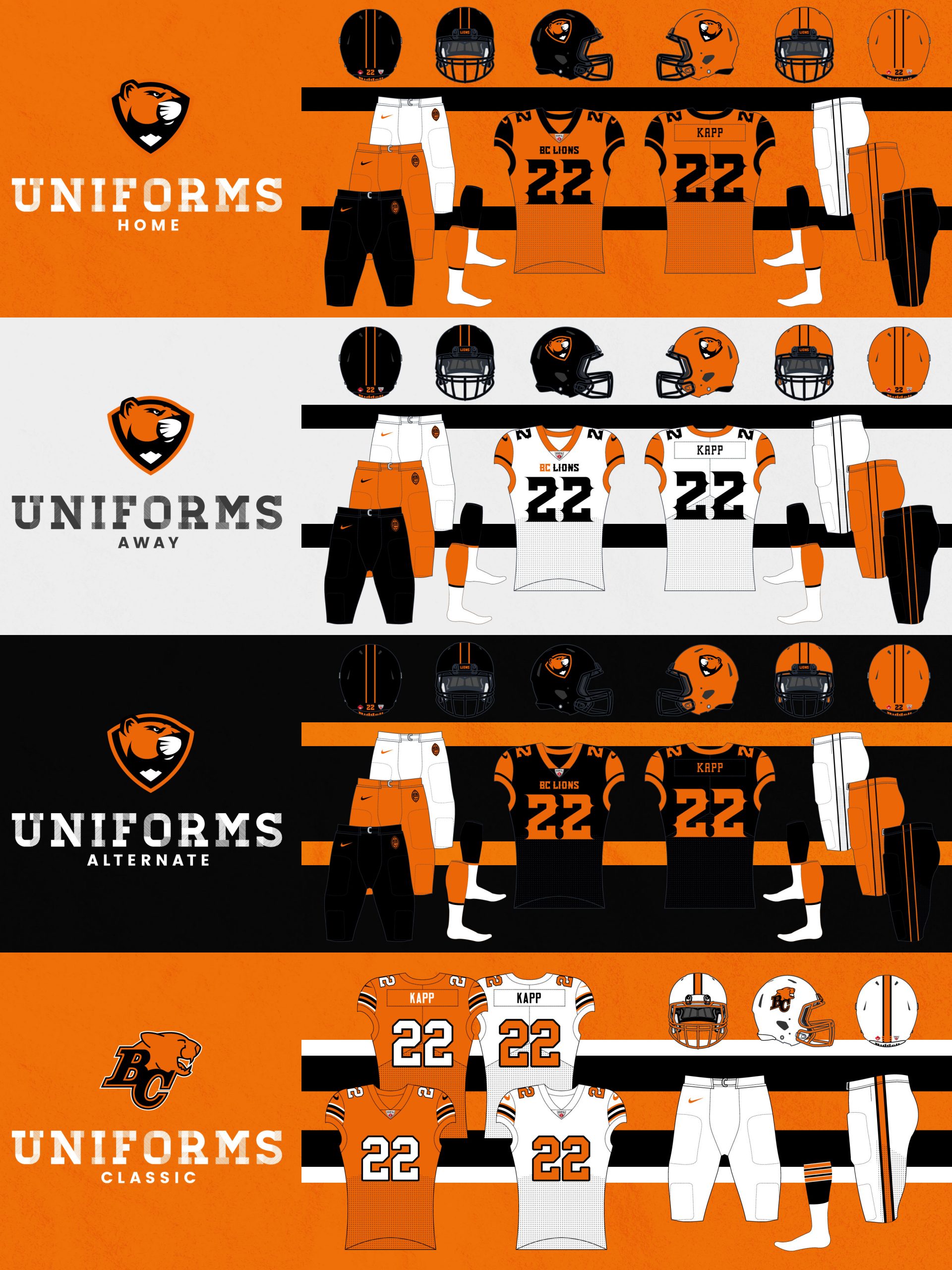
With such a vast array of styles to choose from, my BC Lions redesign focuses heavily on orange and black. I’ve updated the logo from the current BC-cat mashup to a sleeker and fiercer mountain lion looking to the right against a shield with a mountain at the bottom. The new shield is placed above BC LIONS in a modern western-style typeface to create the team signature. To complement this new mark, I developed a partial version of just the lion head, as well as a BC-football secondary, a circular patch with BC and mountains in the center, and a running mountain lion mascot. There are three helmet offerings: a primary, a secondary, and a classic design for special matchups. The primary helmet is black with the primary logo and two thin orange stripes along the center. The secondary helmet swaps a black shell for orange with two black stripes. The classic helmet is white and blends the striping from the 1985 Grey Cup winning team with the newer BC-cat mark from the 2011 championship team. The home uniforms refine the current design with black cap sleeves, collar/sleeve trim, and numbers against an orange jersey, with the white aways featuring orange cap sleeves and trim with black numbers. The black alternates reverse the orange and black from the home jerseys. The home, away, and alternate jerseys all pair with black, orange, or white pants with two thin stripes on each leg. Lastly, there are two classic jerseys for special heritage matchups that honor the 1985 team. Both classic jerseys are worn with the white classic helmets and white pants.
Date
July 27, 2020
Category
CFL, Football

