Buffalo Bills
Buffalo Bills
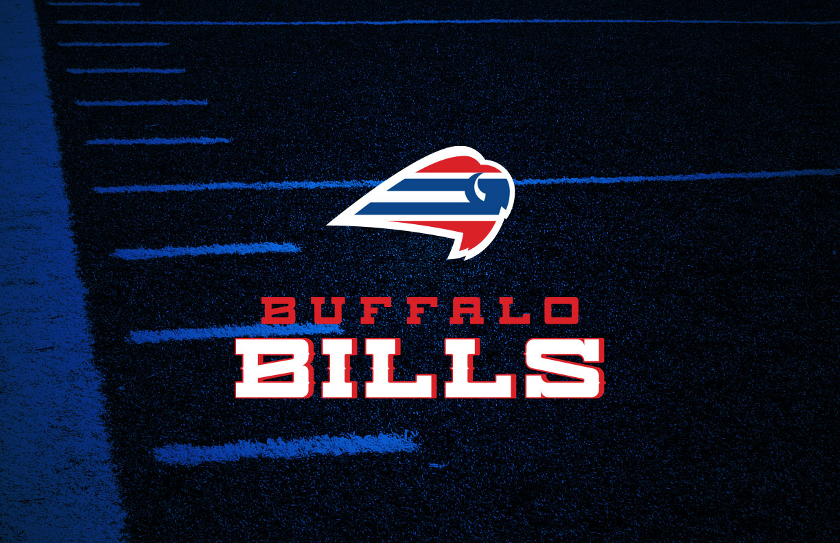
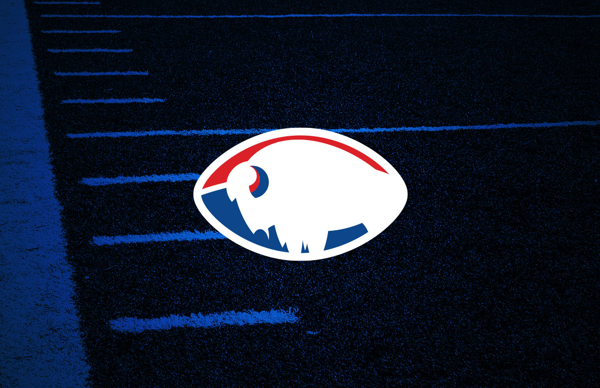
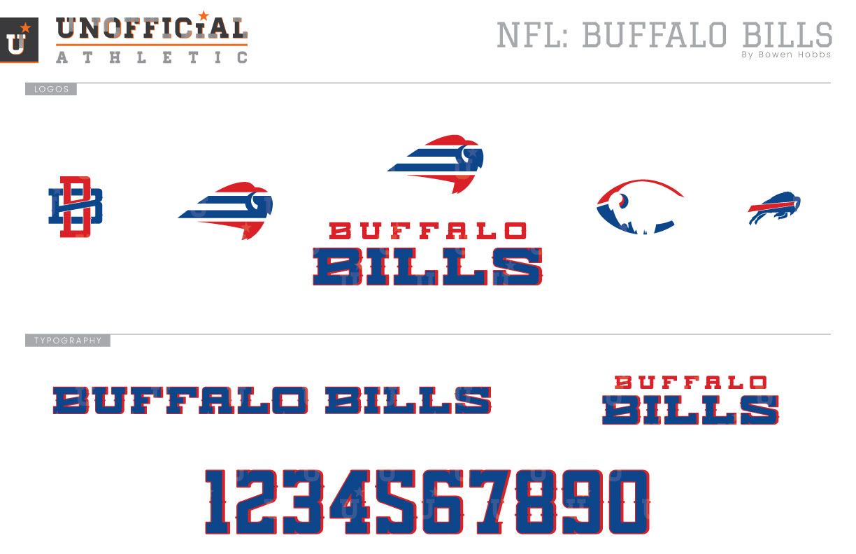
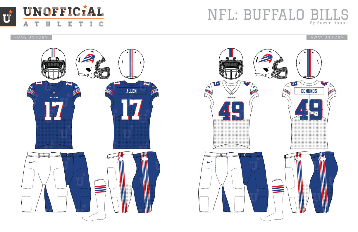
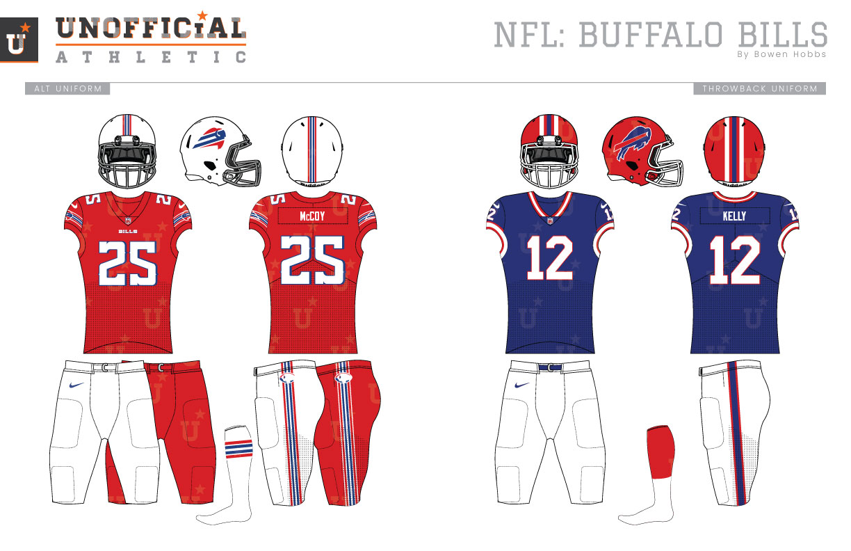
As one of the eight original AFL teams, the Buffalo Bills have been playing professional football since 1960. During their first two seasons they looked more akin to the Detroit Lions than to their present aesthetic, wearing royal blue jerseys with silver numbers and helmets atop white pants. Starting in the 1962 season, the Bills’ unveiled new uniforms in royal, white, and red with a red standing buffalo on each side of the helmet. The jerseys contained two-color shoulder stripes, while the TV numbers occupied the sleeves. Two seasons later, the uniforms would again be revised, with the Bills exchanging the shoulder stripes for sleeve stripes. This look would survive for almost a decade, with the team adopting a royal pants option in 1973 and a new logo the following season. That new logo was the streaking buffalo logo, and it is still in use to this day. Although the uniforms would be tinkered with over the ensuing years, the next major change came in 1984, when the Bills would unveil red helmets. The original logic for the red helmets was that they would help the team’s quarterbacks see the receivers better in the often snowy conditions along the shores of Lake Erie. Fast forward past the four AFC Championships of the 90s to 2002, when the Bills unveiled radically different new uniforms. Here’s a breakdown: navy and nickel were added to the color scheme, the helmet stripe was revised to reflect the additional colors, the home jerseys became navy with red trim and royal stitching around the shoulder yoke, the away jerseys featured a navy shoulder yoke with red trim, and there were both navy and white pant options. Due to inconsistencies between the mixed-and-matched items, the deviation from the brand, and the team’s record while wearing them, the 2000’s Bills uniforms were widely criticized as some of the worst in the League. Finally caving to public outcry, the Bills redesigned their brand again in 2011, simplifying their look with mostly royal and white elements that paired with red and navy accents. My Bills redesign starts with a simplified buffalo mark that focuses on the head and shoulder area of the mammal and places the team’s classic striping inside the silhouette. The mark is placed above a stout slab serif typeface to form the team signature. The secondary logo revives the standing buffalo within a red-and-royal football, while a BB monogram is used on the coach’s caps and the streaking buffalo is retained for the throwbacks. The home uniforms keep the royal jersey and white helmet, but also place the primary logo on each sleeve over the top of the sleeve stripes. BILLS appears just below the collar of the front of the jerseys. The home jersey can be paired with white or royal pants. The away white and alternate red jerseys follow the pattern of the home jerseys. Red pants were also developed to pair with the alternate jerseys for Color Rush. The throwbacks retell the story of the four-time AFC Champion team of the 90s, with red helmets and the streaking buffalo. The royal throwback jerseys feature red-and-white trim consistent with those Jim Kelly-led teams.
Date
May 11, 2019
Category
Football, NFL

