Chicago White Sox
Chicago White Sox
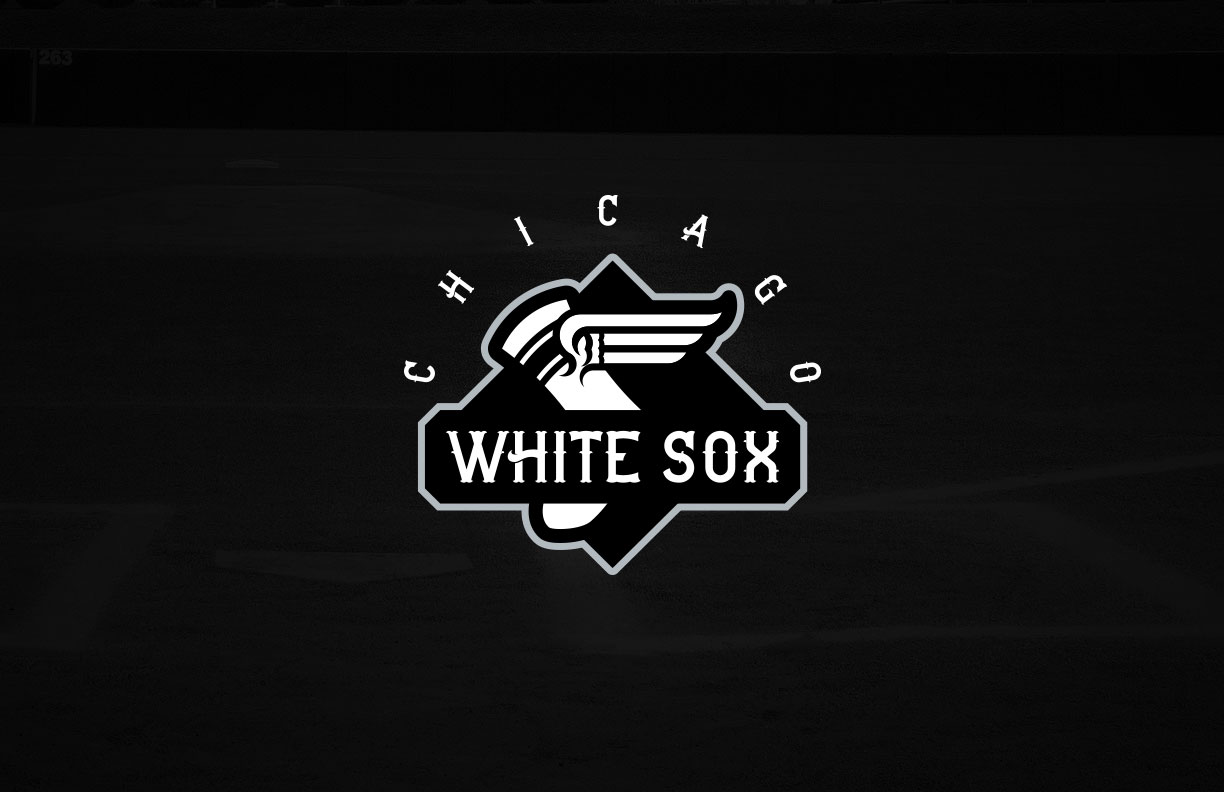
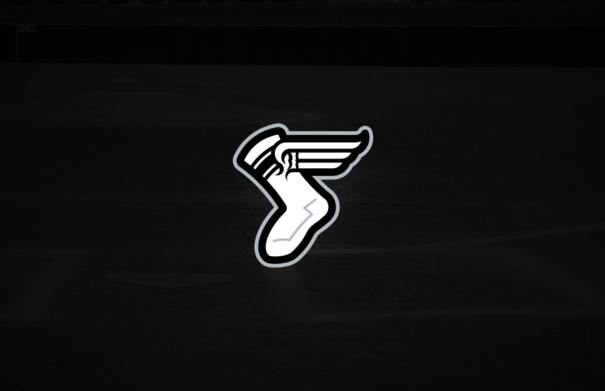
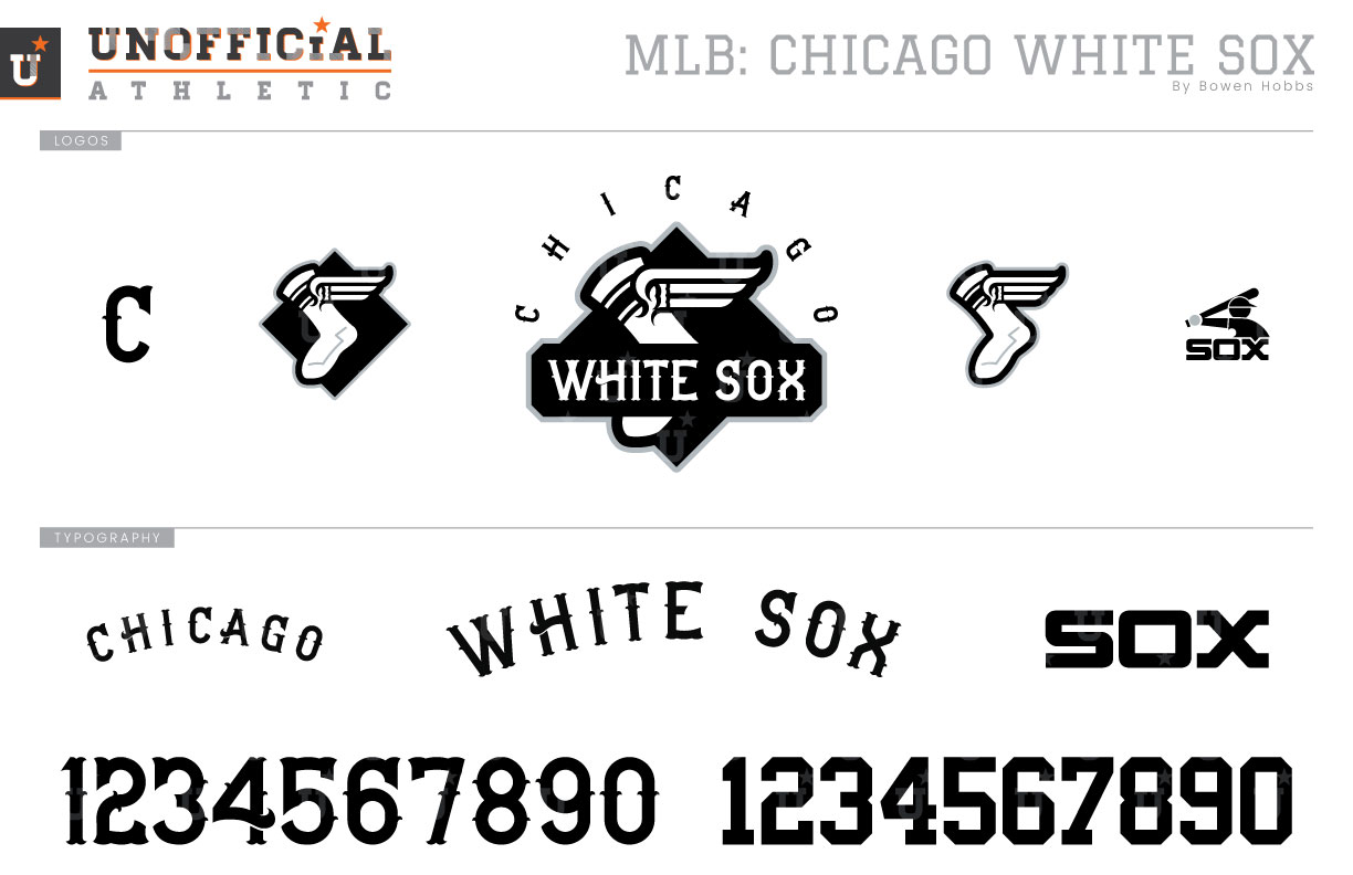
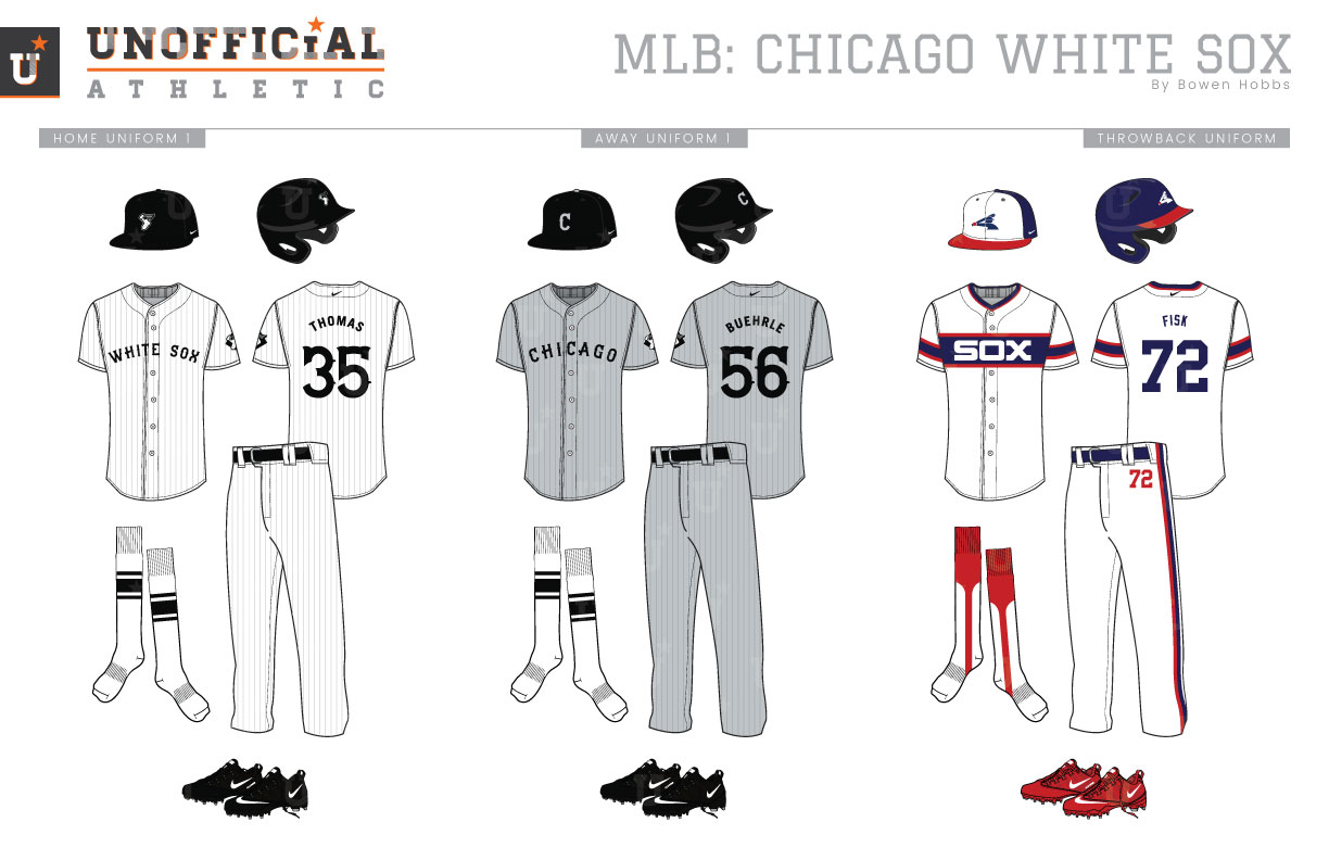
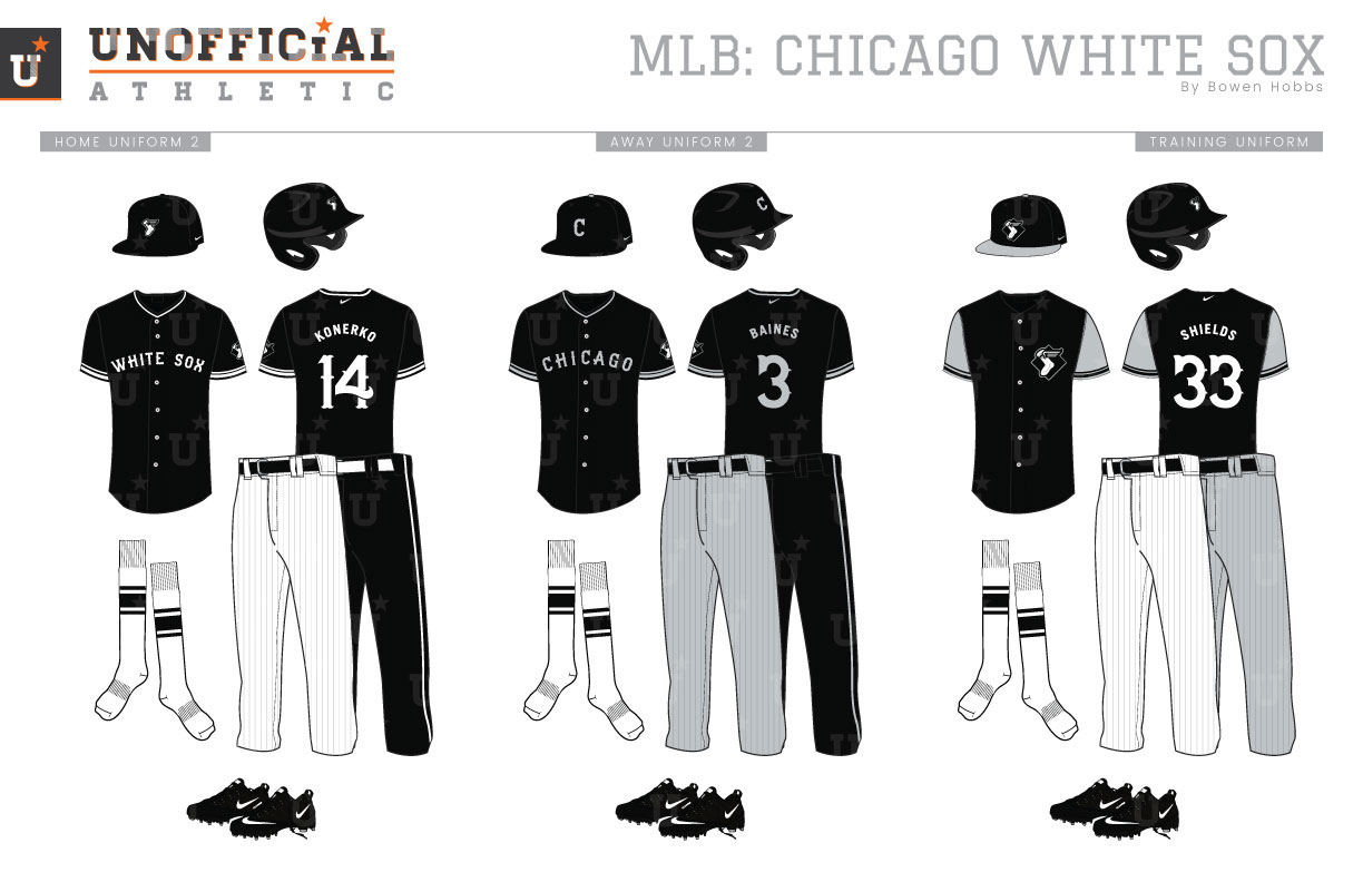
It’s hard to believe, but the White Sox current branding isn’t even thirty years old yet, although versions of the current Sox logo were used from 1951 through 1975. The Sox have tinkered with their color palette throughout their history, typically wearing navy, white, and sometimes red until 1949, when their first black and white cap appeared emblazoned with a Tuscan-C. It would last two years before the team started mixing red into its brand, wearing the devilish combo through the 1963 season. From 1964 through 1975, the team would use navy, then royal, then red paired with white (and powder blue on the road). Starting in 1976, the team returned to navy and white and experimented with shorts, which were quickly shot down by fans and purists alike. The navy and white scheme relied heavily on tuscan lettering, although it didn’t match the squared SOX font on the cap at all. From 1982 through 1986, the team would wear the “Beach Towel” jerseys featuring a broad navy chest stripe with red trim, along with red accents throughout the uniform. The navy-and-red scheme would be toned down from 1987–1990, with jerseys featuring cursive scripts and a more navy-dominant palette. During the 1990 season, the White Sox would take their current form in black-and-silver with an Olde English Sox logo on their caps. My concept reimagines the Winged-Sock logo from used from 1949 to 1959, but with a Northwestern Stripe aptly named for the university from the same city. The Winged-Sock is placed against a diamond with WHITE SOX on top and CHICAGO arched over it to create a field shape. The sock mark also appears with just the diamond and as a standalone element. For the throwback logo, I brought back the 1976–1990 batter logo. To complete the logo set, I developed a Tuscan-style C as part of a typeface that blends old-time baseball charm with Windy City horizontal strokes on the H, A, and 4. The home uniforms feature the sock logo on a black cap and WHITE SOX across the chest of a silver-pinstriped uniform for a subtle classic feel. And yes, the socks are white. (And they match the sock logo.) The away uniform starts with a silver Tuscan-C on a black cap and CHICAGO arched across the chest against a grey uniform with subtle grey pinstripes. The throwback uniforms revive the Beach-Towel uniforms of the early 1980s, albeit with a minor cap adjustment. The home alternate and road alternate both feature black jerseys and can be paired with black pants for special occasions. The home alts have white accents, while the away alternate tops opt for silver to accompany black. The training jerseys mix black, white, silver, and grey for a versatile look that works equally well at home or on the road.
Date
September 18, 2018
Category
Baseball, MLB

