New York Yankees
New York Yankees
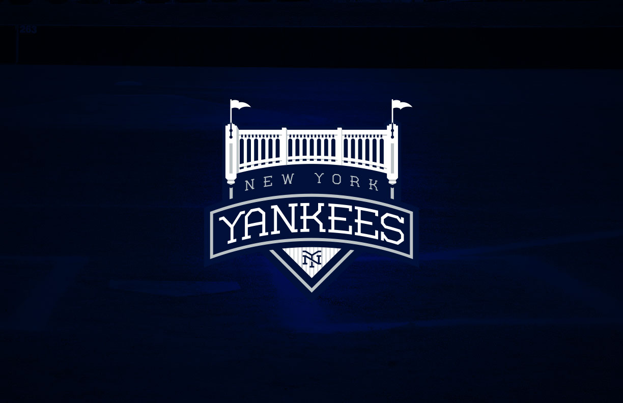
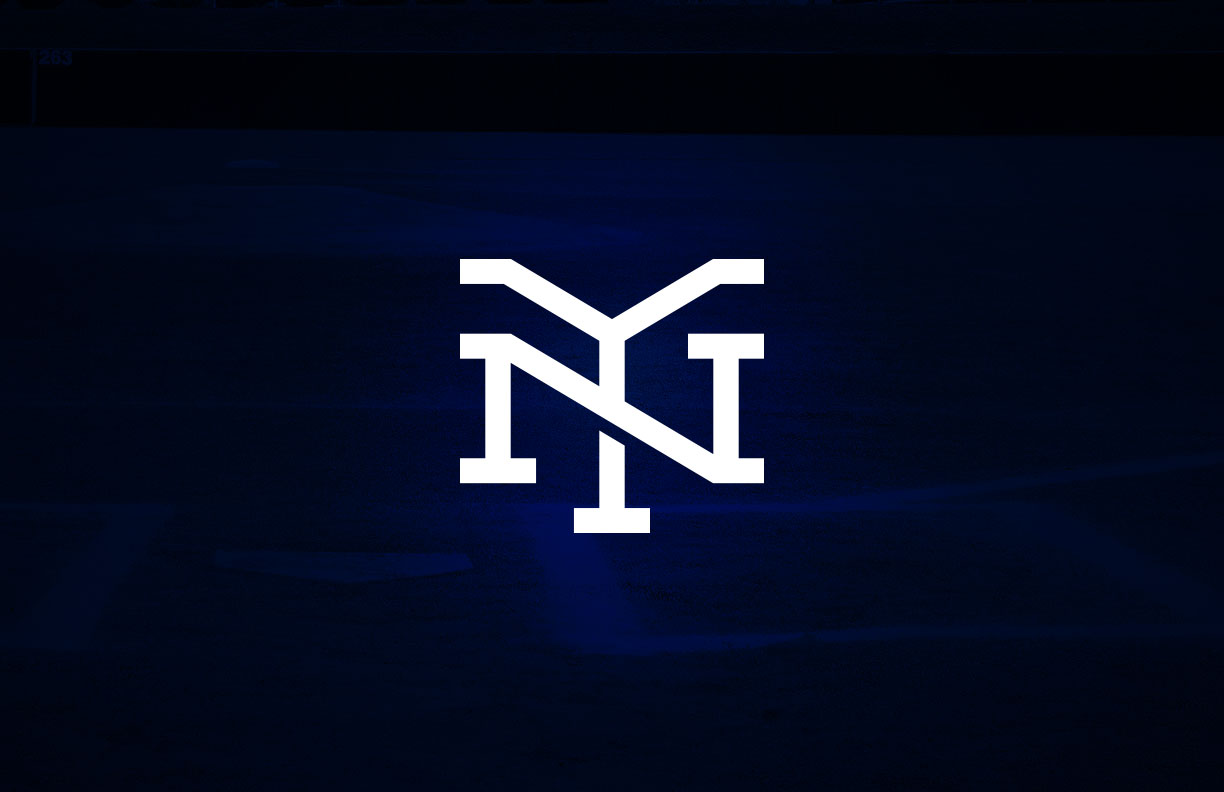
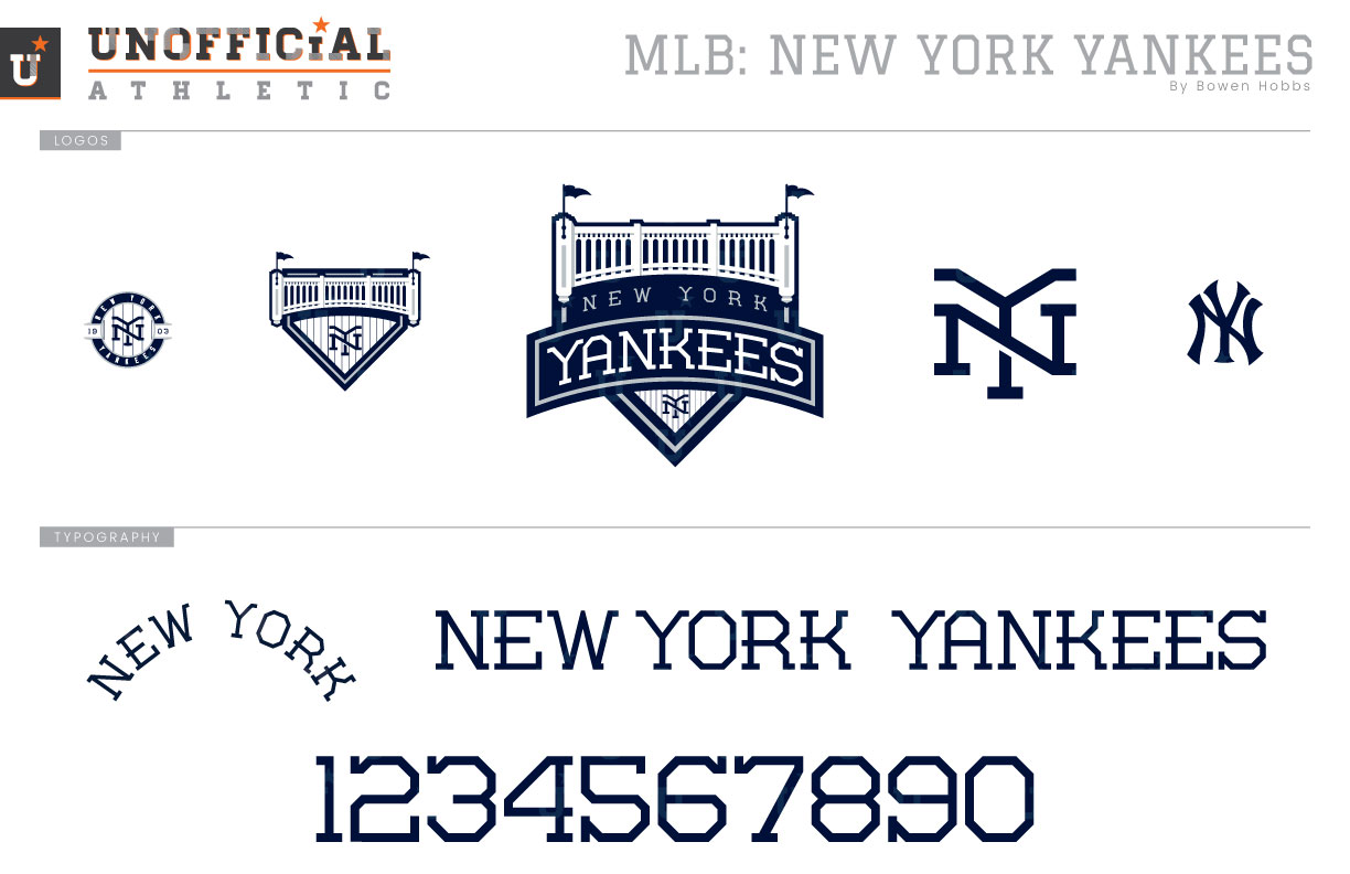
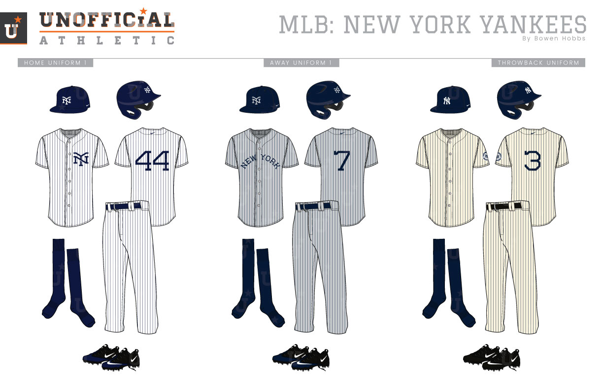
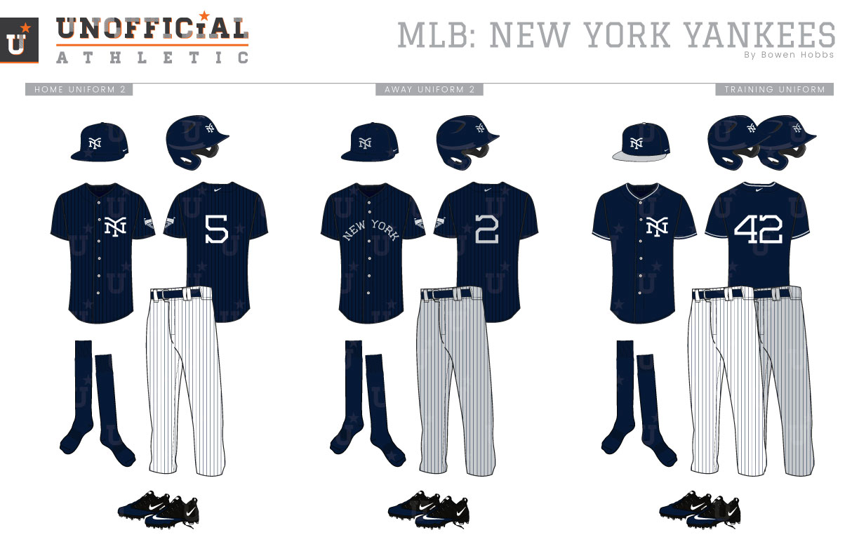
The New York Yankees. Just the name alone is enough to conjure images of navy pinstripes on white, with the ubiquitous interlocking-NY worn on midnight navy caps across the country. The Yankees have worn some version of their iconic NY (they currently wear different version on the jerseys and caps) since 1909, back when they were the New York Highlanders. Their rarely used primary mark, a Yankees script with a bat and hat against a baseball in red, white, and blue, has been in use since 1947, albeit with some minor alterations in 1968. So when it comes to a team with as much history as the Yankees, how does one redesign them in a manner that updates a classic look without stepping on the history of the team? My concept for the Yankees’ primary logo places a section of the third-deck frieze atop a home plate shape with NEW YORK YANKEES boldly displayed and a pinstriped section at the bottom of the mark. The cap mark reimagines the interlocking-NY in a vintage-inspired slab serif typeface with a subtle shadow placing the Y behind the N. To complete the logo set, I also developed a paired-down version of the primary logo, as well as a pinstriped roundel celebrating when the franchise first came to the Bronx. For throwback purposes, I did keep the classic NY available. The typeface uses many of the same hallmarks as the NY mark, with a uniform stroke weight and significant diagonal strokes to display the more rounded corners. The result is a typeface that feels equally at home in 1918 as it does in 2018. With the home uniform, I kept much of the classic intact. It is white with navy pinstripes and a navy cap, and paired with navy socks and black shoes. I did, however, update the logos and number font in addition to adding a touch of navy to the cleats. The road uniform is a different story. The team has only used their current away grays since 1973. Through the majority of their history, the Bronx Bombers have opted for plain gray away uniforms with no trim and no outlines on the text. But the 1916-17 road uniforms served as an inspiration with their solid navy type and navy pinstripes. Shouldn’t a team that is referred to as “The Pinstripes” wear pinstripes after all? My road uniform concept features no white: the cap is navy with a gray logo, the type on the jerseys is solid navy, and navy pinstripes are placed on a gray base uniform with solid navy socks. The throwback is another place where I wanted to bring back Yankees styles of the past. I started with a cream base uniform and the classic cap. The jerseys only contain a sleeve patch and a number on the back, letting the pinstripes do the talking. I did also include some alternate uniforms, probably to the dismay of traditionalists everywhere. Both the home alternate and away alternate jerseys are navy with sublimated pinstripes, but while the home alternate features a white NY on the left chest, the away alternate uses the NEW YORK wordmark in gray. The training caps combine a white NY logo with a gray brim, while the training jerseys use the white NY logo on the left chest with gray trim along the neck and sleeves.
Date
September 4, 2018
Category
Baseball, MLB


