Cincinnati Reds
Cincinnati Reds
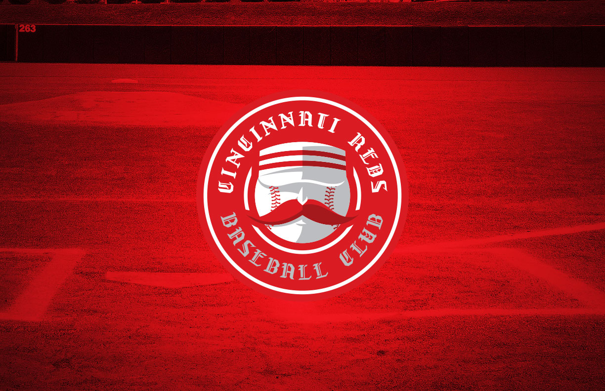
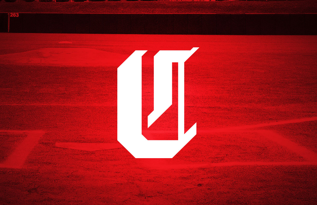
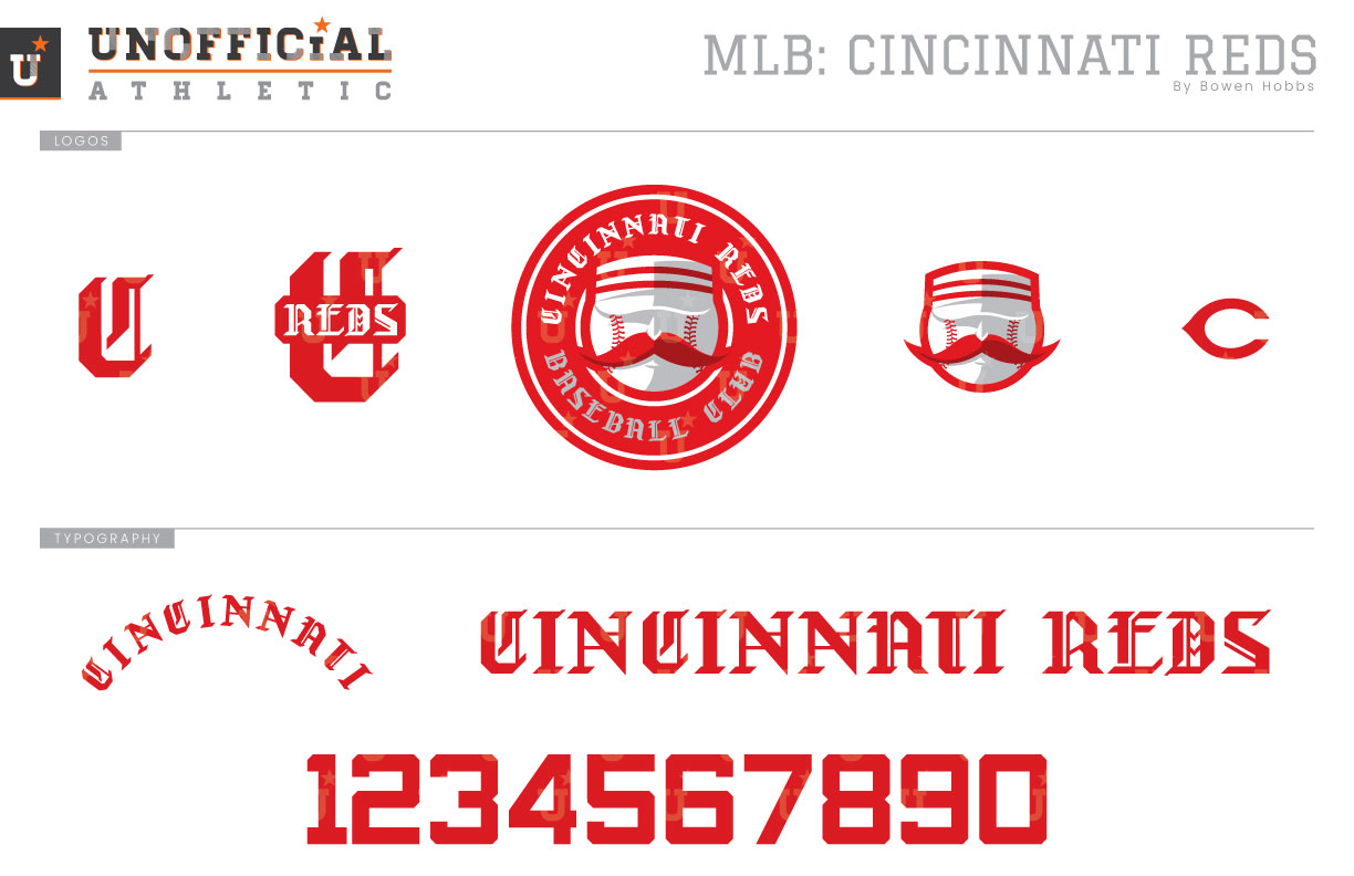
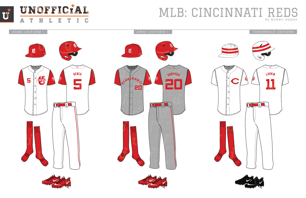
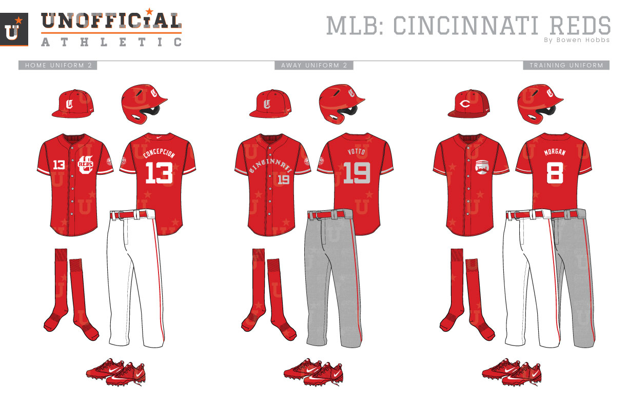
Born in 1869, the Cincinnati Reds (or Red Stockings in those days) are the longest continuously operating team in one location in all of baseball. They were a charter member on the National League when it formed in 1876. Over the decades, the Reds have experimented with many different typefaces for their logo, which has pretty much remained a C in a red-and-white color scheme. They’ve used Olde English, block, sans serif, Tuscan-style, and most recently the classic wishbone-C that remains to this day. There was a brief period, however, in the 1950s and 60s in which Mr. Redlegs was the focal point of the identity, a design the team uses as an alternate to this day. The Reds, throughout their long history, have paired their iconic hue with royal, navy, or black at times with black sparingly used currently, but my rebrand for the team turns the focus back to red and white albeit with some use of grey and cardinal red for shading. My primary logo for the team places the head of Mr. Redlegs inside a roundel containing CINCINNATI REDS BASEBALL CLUB in a custom Athletic Olde English typeface. The C from that custom typeface is used as the cap logo in white or grey against an all-red cap. The logo set is completed by an Athletic Olde English-C with REDS across the center of it, a standalone version or Mr. Redlegs’s head, as well as the Wishbone-C for throwback purposes. There are two typefaces used throughout the concept: and athletic Olde English font for all of the lettering except the player name, and a stout athletic block typeface for the numbers. The home uniforms place a white C on red caps accompanied by sleeveless white jerseys with red undershirts. The jerseys place the C-REDS logo over the heart with the player number on the right chest. Simple red trim runs down the pant leg and solid red socks and shoes complete the look. The away uniforms place CINCINNATI across the chest with the number below the wordmark on the player’s left side. The road greys make use of a sublimated flannel texture to give the design some age for one of baseball’s oldest teams. The throwback uniform continues that trend with a revival of white caps with two red stripes and the wishbone-C on the chest, similar to the uniform Mr. Redlegs wears. The home alternate features a red jersey similar to the home jersey, but with sleeves and simple white trim on those sleeves, while the away alternate jersey complements the grey flannel pants with a red jersey featuring grey type and trim. The spring training/batting practice jersey places the standalone Mr. Redlegs mark on the chest with white numbers and trim that stand out with subtle cardinal red shadows.
Date
July 24, 2018
Category
Baseball, MLB

