St. Louis Cardinals
St. Louis Cardinals
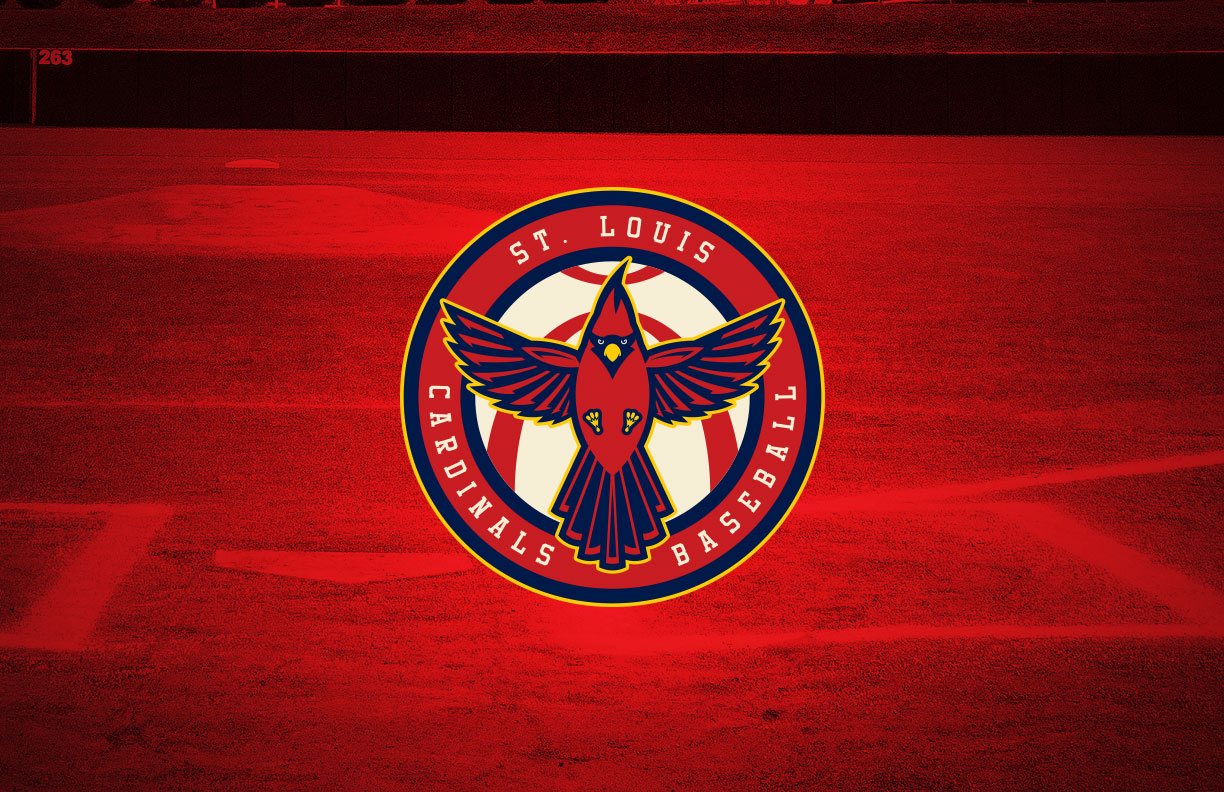
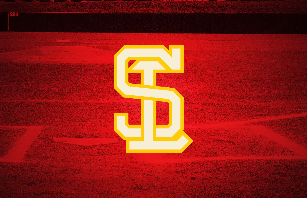
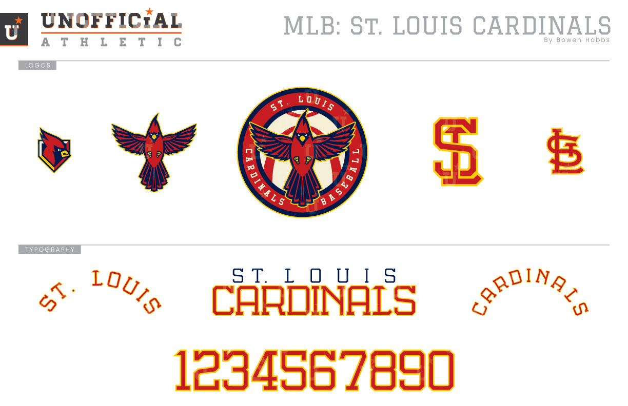
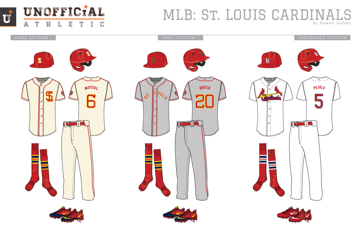
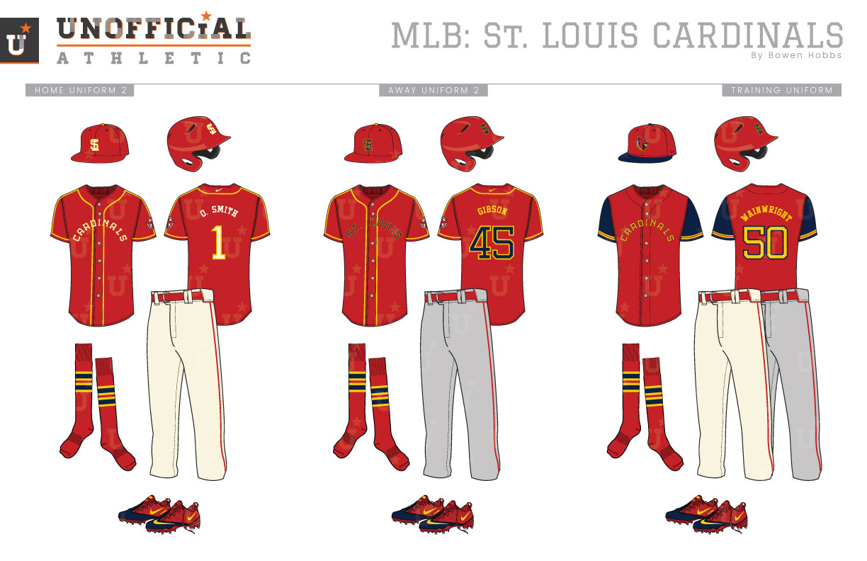
With more than 120 years of history, the St. Louis Cardinals have focused their identity around red, sometimes adding black or navy accents before landing on a version of their classic “birds on bat” motif in 1957. Since then, the team has evolved the illustration of the birds, and even toyed around with powder blues road uniforms from 1976 to 1984. The most recent change to their on-field identity came in 2013, when the Cards chose to only wear their navy caps when playing against predominantly red teams on the road, wearing red caps for the rest of their away games. My concept provides a different take on the classic birds-on-a-bat theme by focusing on the ball instead. Along with a greater emphasis on red and athletic gold, my primary logo places a cardinal, wings spread, against a baseball with the lower seam mimicking the St. Louis Arch within a roundel stating ST. LOUIS CARDINALS BASEBALL. My concept also provides an evolution of the cap logo, featuring an old school block slabserif S and L with the top of the L forming a subtle-T to declutter the team’s current monogram. The roundel and S(T)L cap mark are complemented by a standalone cardinal, a cardinal head/home plate alternate mark, as well at the classic STL monogram. The typeface applies the proportions laid out in the S(T)L mark across the rest of the letterforms to create a one-of-a-kind block serif with a classic charm. The home uniforms start with a cream base and utilize red piping along the buttons, neck, sleeves, and down the shoulders. The S(T)L mark is placed over the heart in red and athletic gold, and is paired with a red cap featuring the same mark rendered in cream and gold. The pants continue the red piping along the belt loops and down the sides of the legs, while the socks across the uniform set (except the throwbacks) are red with navy and gold stripes. The away uniforms continue the red and athletic gold theme, but with a navy and gold S(T)L mark on the cap and ST. LOUIS arched across the chest. The throwback uniforms reprise the current home uniforms in honor of the team’s two world titles this century. Both the home alternate jersey and away alternate jersey are red with gold piping, but the home displays CARDINALS across the chest in cream and gold, while the away version uses the city name in navy and gold. The spring training jersey is also red, but with navy sleeves and athletic gold typography so it is not out of place when paired with the home or away pants. The alternate logo appears on the BP cap.
Date
July 24, 2018
Category
Baseball, MLB

