Denver Broncos

Denver Broncos
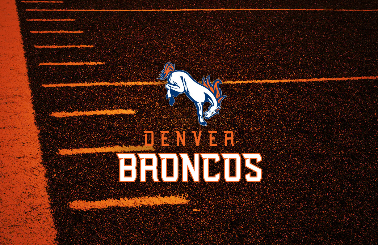
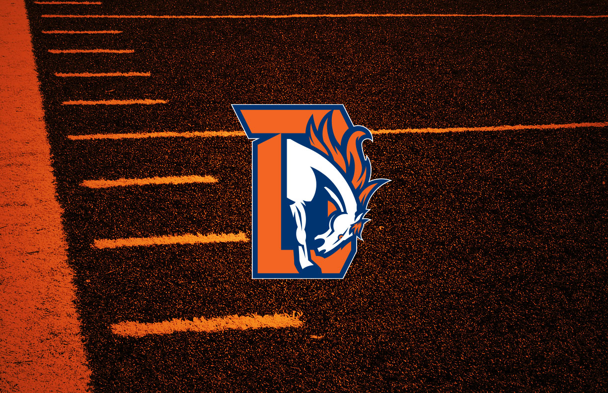
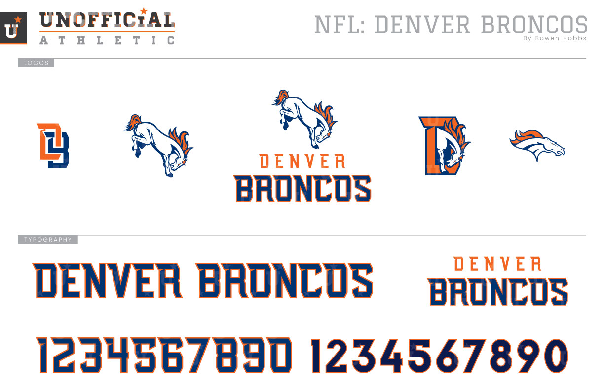
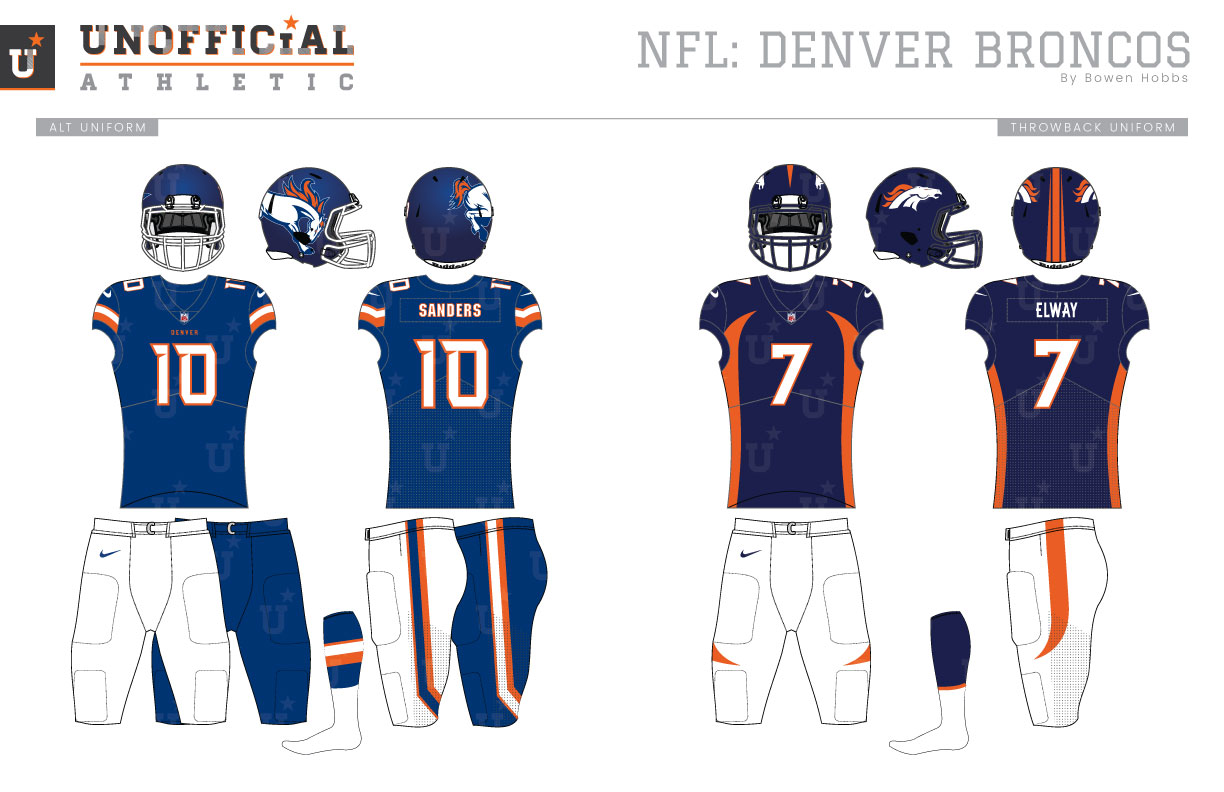
The Denver Broncos began play in 1960 as a charter member of the American Football League. For their first two seasons, they looked nothing like the famous Orange Crush teams. During the 1960 and 1961 seasons, they opted for a brown and athletic gold scheme similar to the University of Wyoming. The following five seasons would see the team outfitted in orange helmets and home jerseys with white pants complemented by a white away jersey with blue type. While the 1962 through 1964 teams opted for a simple two-stripe pattern on their sleeves, the 1965 and 1966 teams used contrasting sleeves for an additional pop on the newly ubiquitous invention of color television. The contrasting sleeve uniforms would again be redesigned for the 1967 season, replaced by blue helmets and three slightly separated stripes on the sleeves of the home and away jerseys. From there, the Broncos enjoyed a period of uniform stability, closing the gaps on their sleeve stripes for the 1991 season. Then came 1997. Looking for a radical change, the team revised every aspect of their on-field identity. They shifted their orange and royal scheme to a navy and orange palette, replaced the longstanding D logo with a profile-view bronco head, and unveiled the most futuristic uniform the League had seen at the time. Gone were the simple sleeve stripes for curved side panels that arced across the collarbones on the jersey and the quadriceps on the pants. The team would win their first Super Bowl that season after losing their previous four trips to The Big Game. Outside of tinkering with the jerseys collar, the only change would be promoting their orange alternate jersey to primary status for the 2012 season. My Broncos redesign breaks from the past by using a primary icon of a bucking bronco placed over a sharp block typeface to create the team signature. The alternate logo places the bronco inside the new D while a DB monogram and the 1997 bronco head mark complete the logo set. The new sharp block typeface features notches and serifs at the upper left corners of the letterforms. The new helmets feature a satin finish that blend the royal and navy blues for a custom shade. The bucking bronco is placed, oversized, on the right side of the helmet, while the player number is on the left side. The jerseys play on the Orange Crush era with white and blue sleeve stripes against an orange home jersey that tick upward at the back of the sleeves. That same ticked striping is also applied to the pants at the knee. The home jerseys have options for standard white pants as well as a monochrome orange combo that plays on the popularity of the team’s Color Rush look. The away white jerseys feature blue type with orange outlines and pair with the same white and orange pant options. The alternate jerseys feature the new deep royal hue with white type outlined in orange and pair with white or deep royal pants. The throwbacks retain the 1997 uniforms that Joh Elway wore as he helicoptered through the air into the end zone in SB XXXII.
Date
August 1, 2019
Category
Football, NFL

