Miami Dolphins
Miami Dolphins
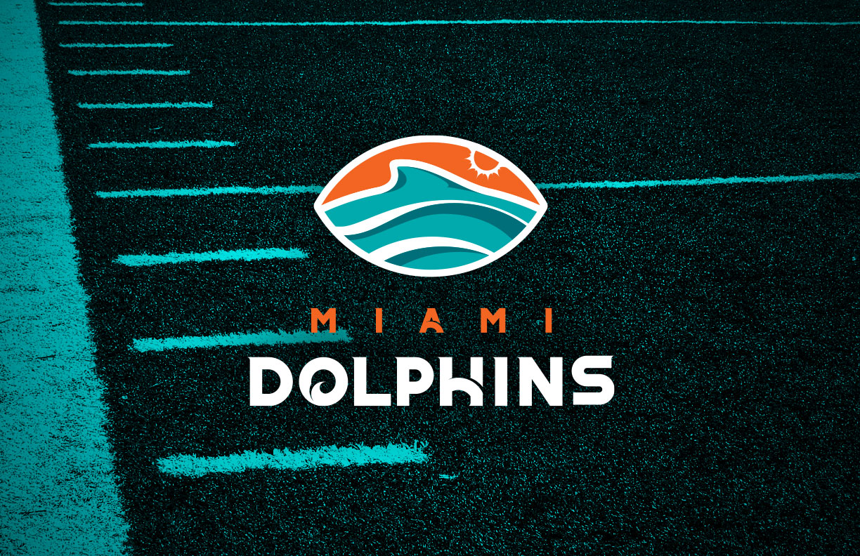
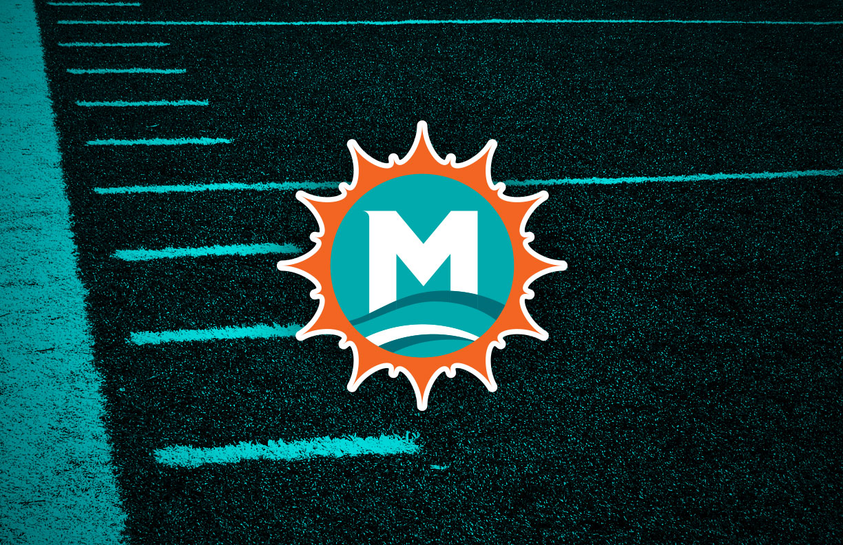
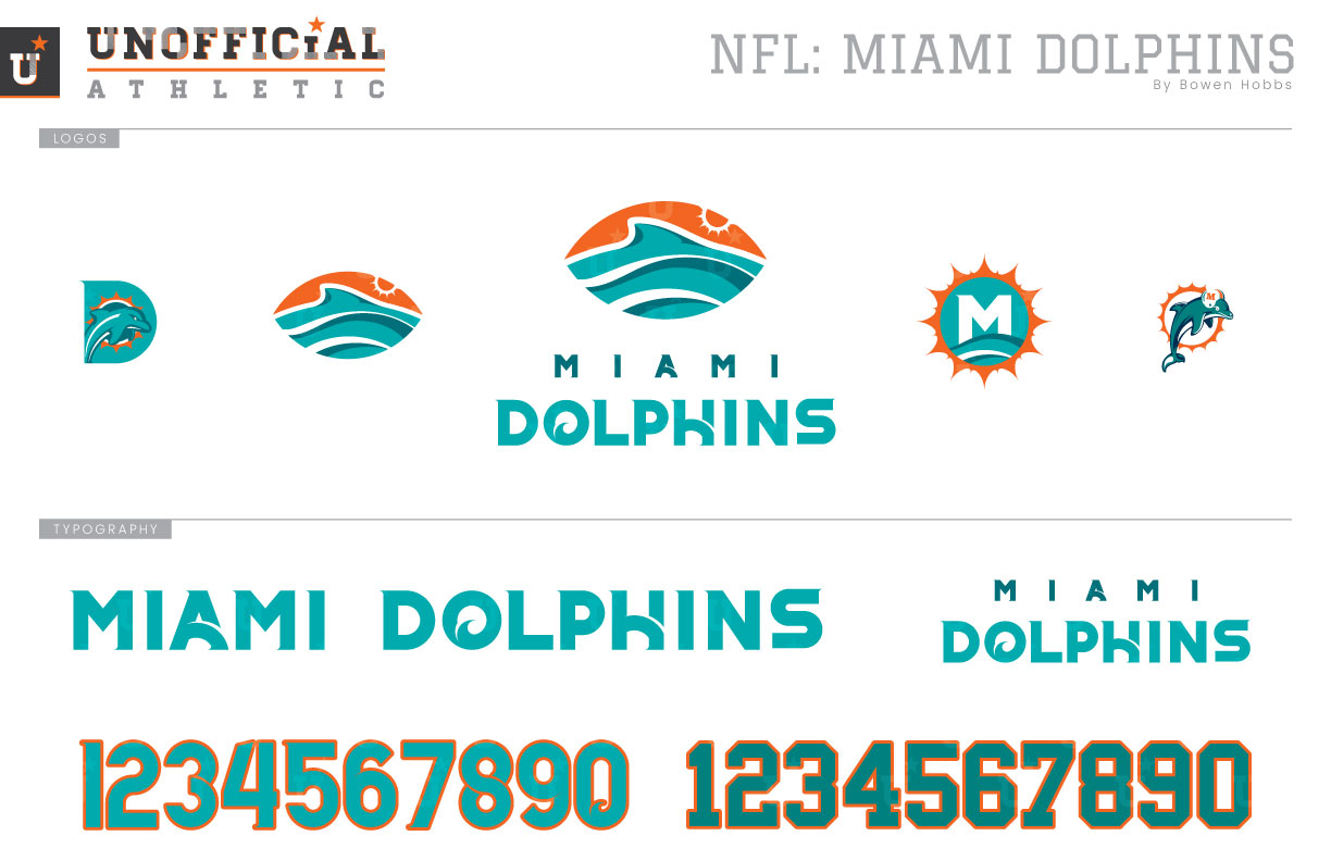
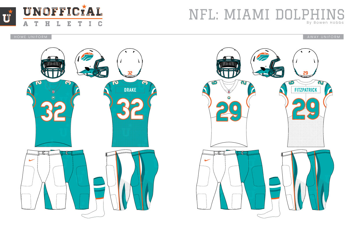
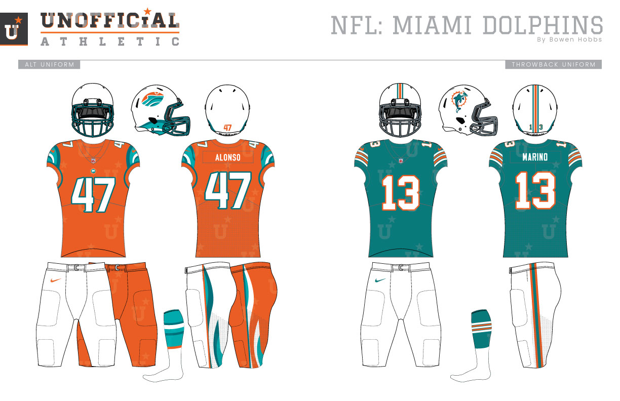
The Miami Dolphins became the AFL’s first and only expansion team in 1966, with the AFC adding its next team in 1970. Sporting a color palette of aqua and coral, the Dolphins inaugural uniforms relied on striped sleeves and block numbers in a unique color scheme to set them apart from their opponents. The team would vacillate between striped-sleeve and numbered-sleeve jerseys through their undefeated season in 1972. After that, striped sleeves became the norm through the mid-1980s. The next evolution of the uniforms involved a slimming of the stripes and the addition of the logo to the sleeves. To fit the logo addition, the sleeve numbers would move up to the shoulders. Over the following decade, the sleeve stripes would shrink even more, giving further prominence to the logo. In 1997, the ‘Phins would unveil their most radical change in their on-field aesthetic, adding navy to their color scheme, a modernized logo to their brand, and a drop shadow to their jersey numbers. The striping along the sleeve cuffs was significantly more involved on the aqua jerseys than the white jerseys creating a subtle mismatch. Although the aqua became lighter, and the drop shadows became slimmer, those basic uniforms would last until 2013 when the Dolphins were redesigned again. The new design featured a less cartoony dolphin that was no longer wearing a helmet, a lighter orange, and new uniforms that were very stark, simply relying on the color scheme and logo’d sleeves to communicate the team brand. The numbers had a double outline of deep aqua and orange. The next development would be the team’s orange Color Rush set that was used for a game in 2016, before Miami returned its orange to the original shade and simplified its jersey numbers for the 2018 season. My Dolphins redesign takes a radical approach that is fitting of the avant grade city. The team signature I designed places a dolphin racing through the sea within a football over a redesigned team typeface. The finned-football stands alone as the team’s primary icon. To complement it, an M-sun logo was also developed as an alternate mark. A Dolphin-D and the classic Dolphin-Sun mark round out the logo set. The new typeface combines the modern tastes of Miami with selective serifs that communicate speed. The helmet is easily a more radical design than the team has worn, combining the new football logo with a wave pattern on the jaw and neck areas of the helmet. The new jerseys feature the wave pattern on the sleeves, a rounded number font, and orange trim, while the pants also incorporate new wave pattern and trim. The aqua home jersey and the white away jersey both pair with white or aqua pants. The orange alternate jerseys use deep aqua trim but maintain the wave pattern while pairing with white pants or orange for a monochrome look. The throwback-inspired uniforms combine the classic striped jerseys with the revised logo from the 1990s.
Date
August 18, 2019
Category
Football, NFL

