Detroit Red Wings
Detroit Red Wings
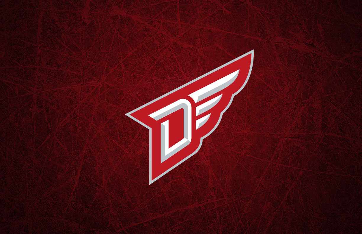
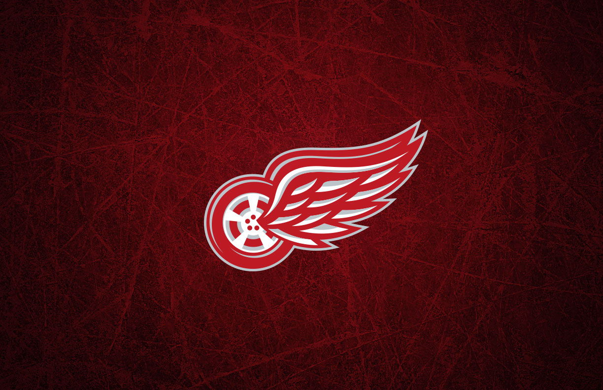
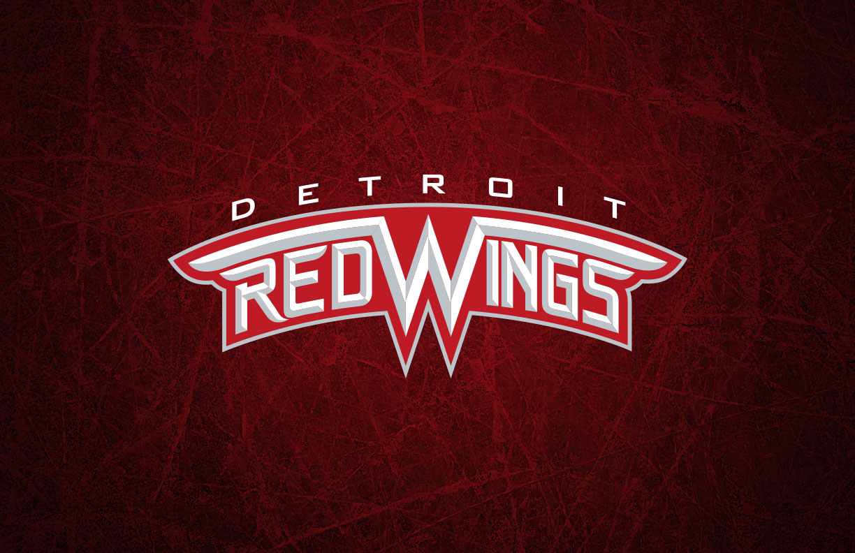
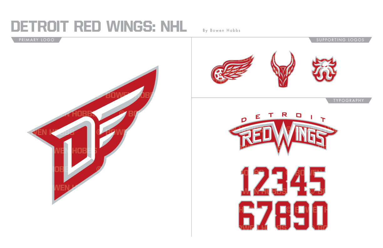
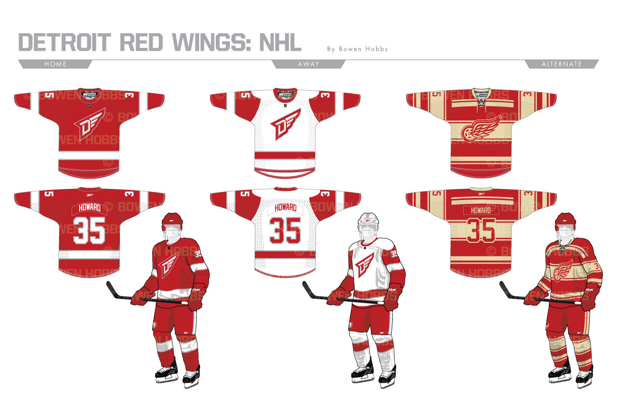
After ending a streak of 25 consecutive playoff appearances and retiring the famed Joe Louis Arena, the Red Wings are beginning new chapter in the storied history. My Red Wings redesign starts with a new primary D-Wing logo, beveled to insinuate the chrome of Detroit’s famed auto industry. The secondary logo is a revamped wheel-wing, updated and sharpened for the next chapter. The wheel-wing also comes in a front-facing version, and an octopus signaling the seafood that locals throw on the ice for a hat trick finish the logo set. The wordmark is beveled and arched with a wing on each side, as it would appear on the grille of a car. The numbers are the same font as the previous generation, but with a thin silver outline. The homes and roads also add those small touches of silver, but keep the team’s vertically arched player names on the backs of the sweaters. The thirds give the Red Wings a vintage option, drawing from various throwback uniforms to craft an old-time hockey feel.
Date
July 2, 2017
Category
Hockey, NHL

