New York Rangers
New York Rangers
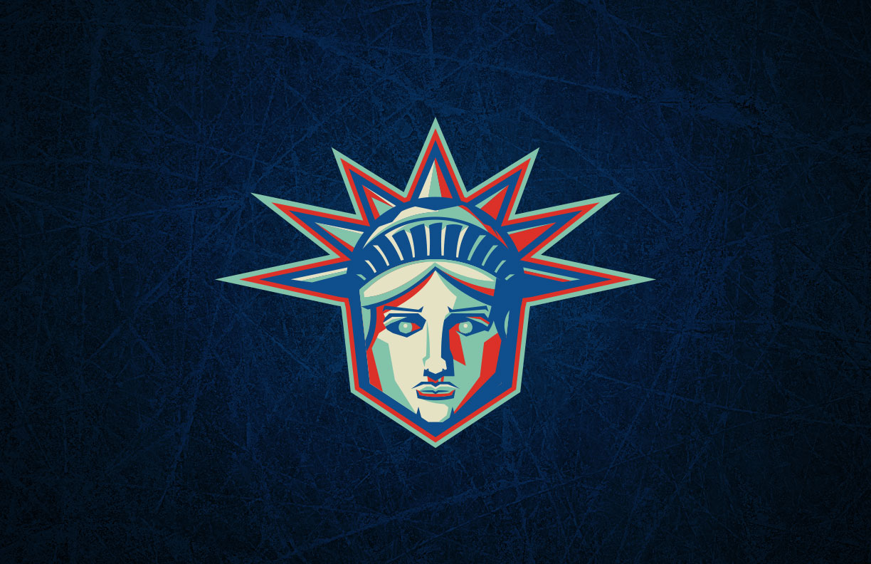
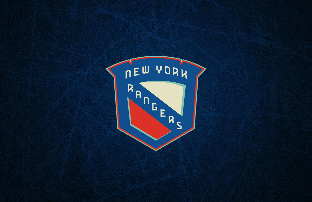
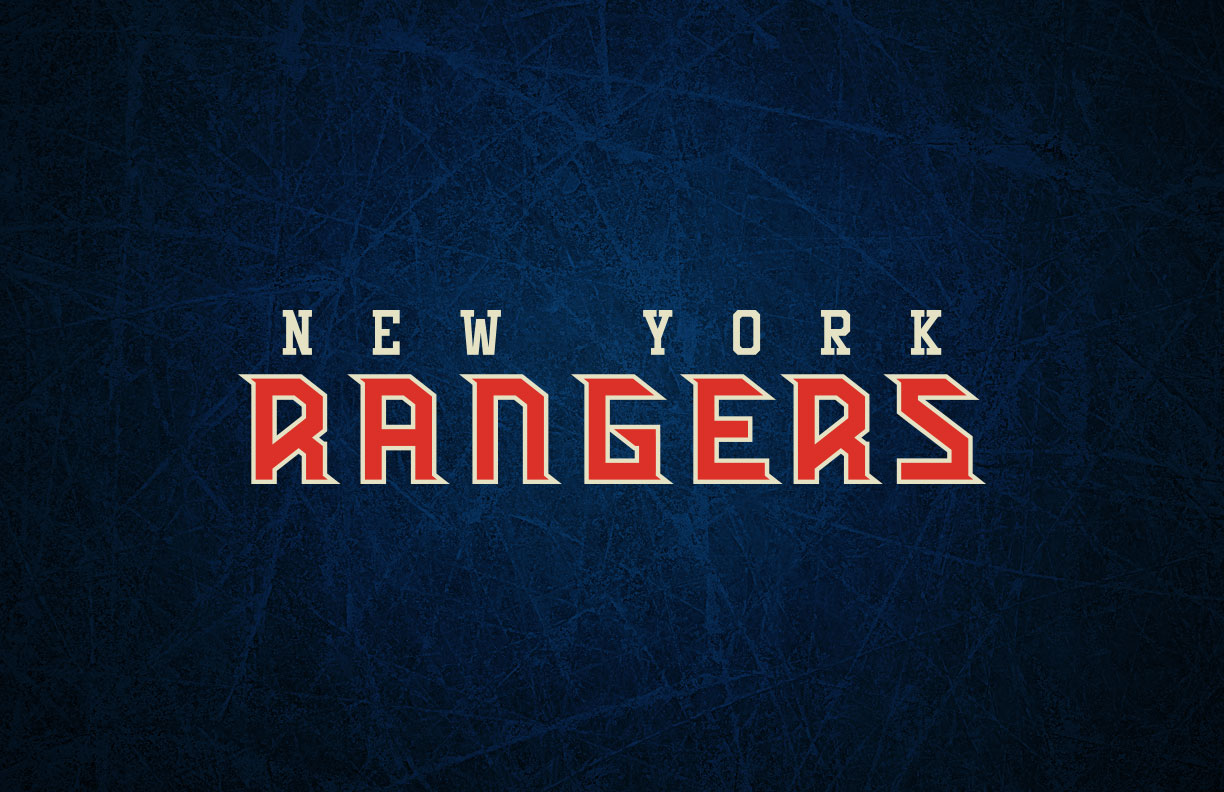
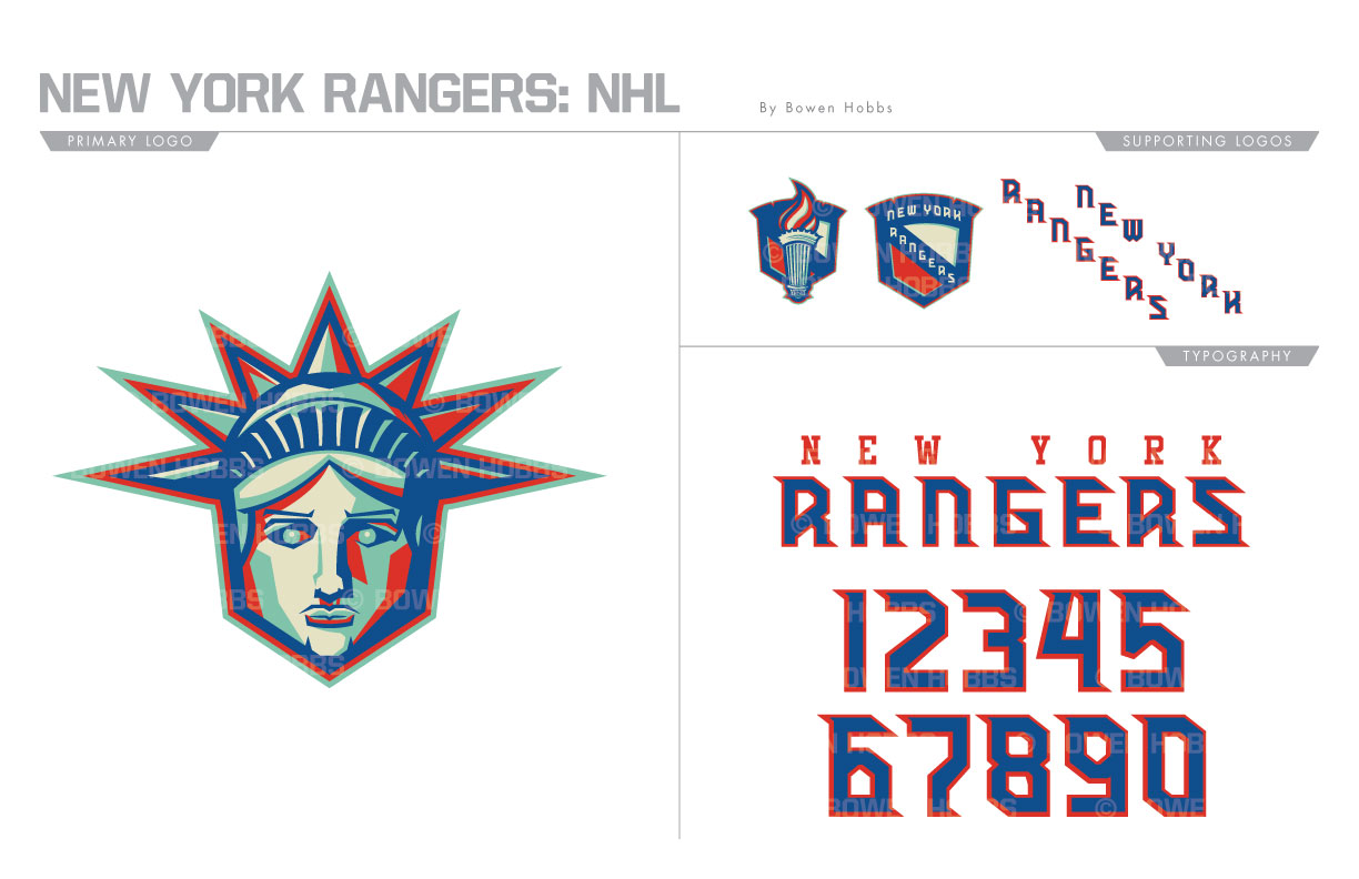
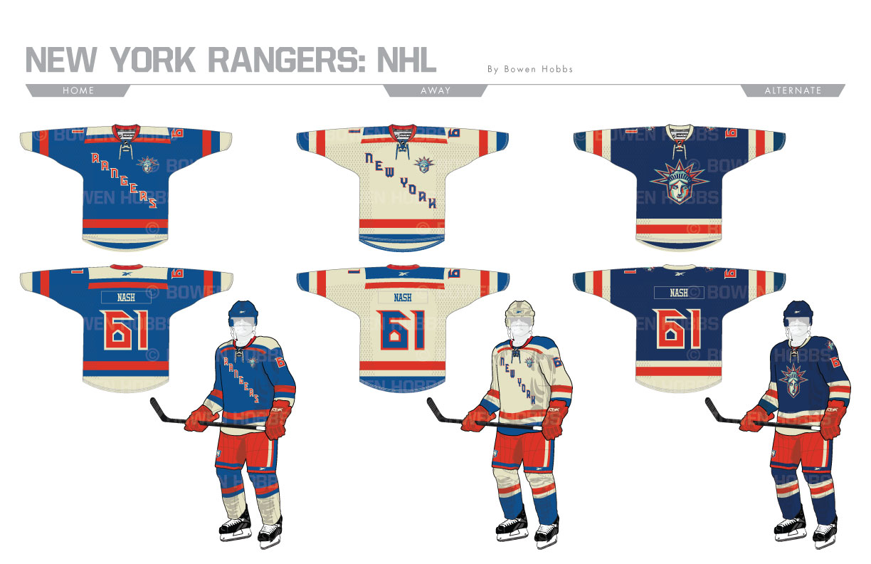
There are few symbols that evoke New York more than Statue of Liberty. Since 1875, it has stood (quite literally) for the American Dream. The primary logo I created for the Rangers harnesses that symbolism into an aggressive head of the famed monument that says “Give us your tired, your hungry, your poor,” but nothing less than your total effort. The identity is rendered in the team’s longstanding broadway blue and red, but with liberty green added and vintage white replacing the standard shade. To round out the logo set, I developed an updated Rangers shield, a shield with the Statue’s torch, and a pair of diagonal wordmarks proudly stating NEW YORK and RANGERS. The typeface is significantly modernized to be more readable given the Rangers propensity for royal blue and red, two colors which can cause readability issues when placed next to each other. My goal with the home and away sweaters was to combine them into one unified design, keeping a simplified version of the white sweater’s shoulder yoke and matching the sleeve and hem stripes to it. RANGERS has been replaced on the aways with NEW YORK, which the team hasn’t worn on an road jersey since 1987. In addition, the Statue of Liberty logo has been added where the captaincy patches usually appear to state that we are all united. The alternate sweaters use the striping pattern from the Rangers’ current home jerseys against a navy base with the SoL crest proudly displayed for all to see.
Date
July 2, 2017
Category
Hockey, NHL

