Hartford Whalers
Hartford Whalers
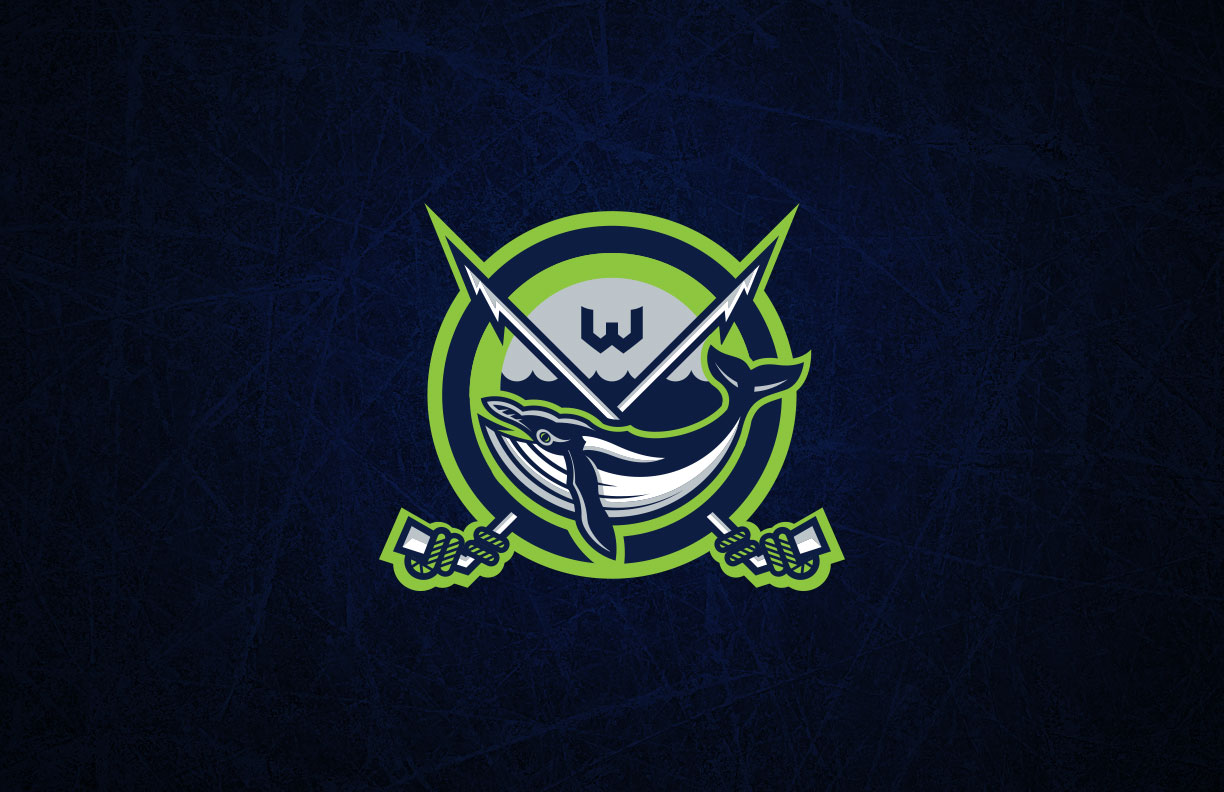
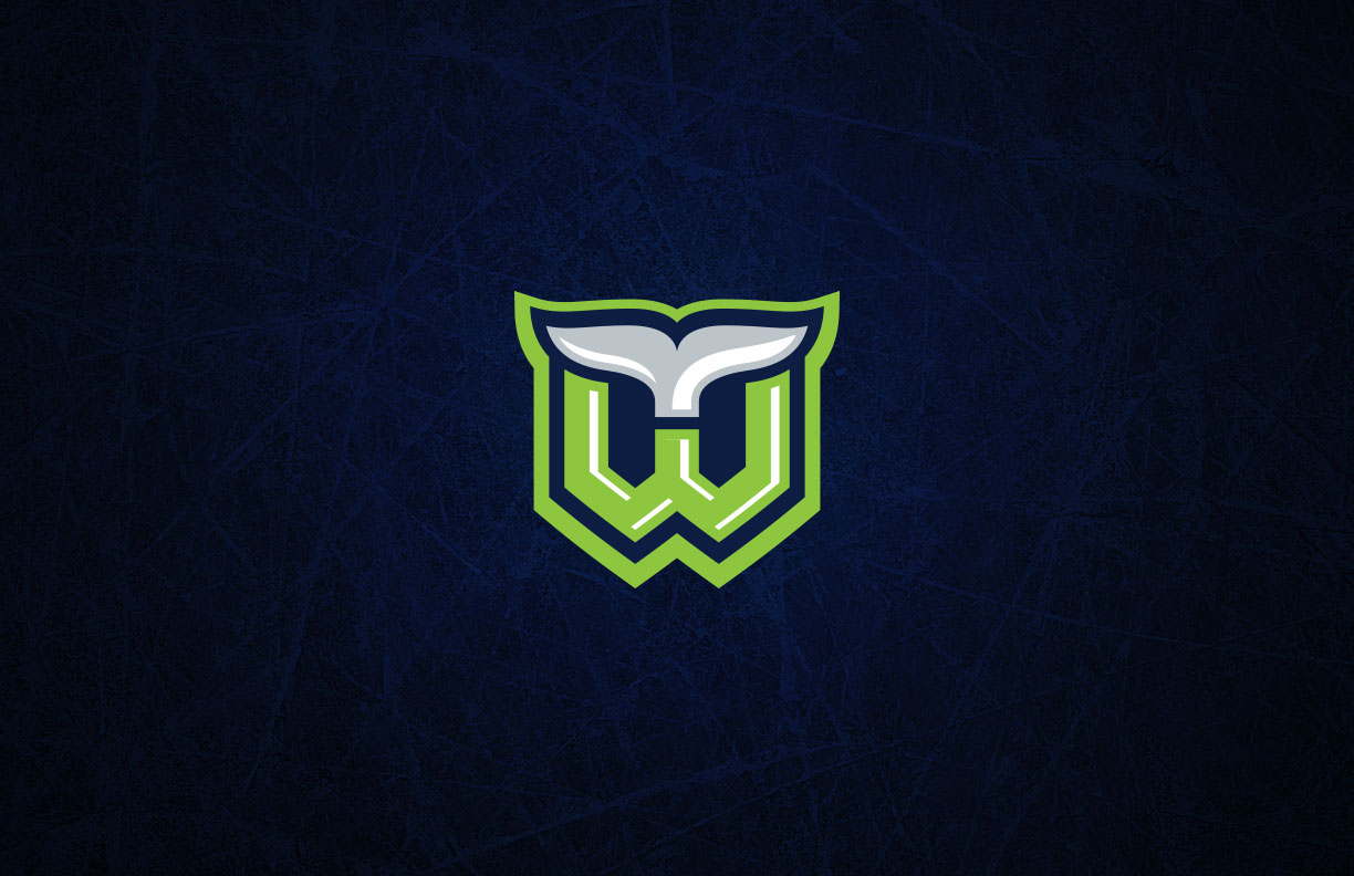
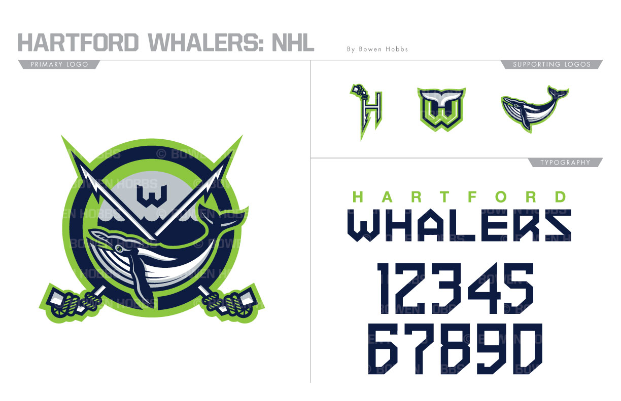
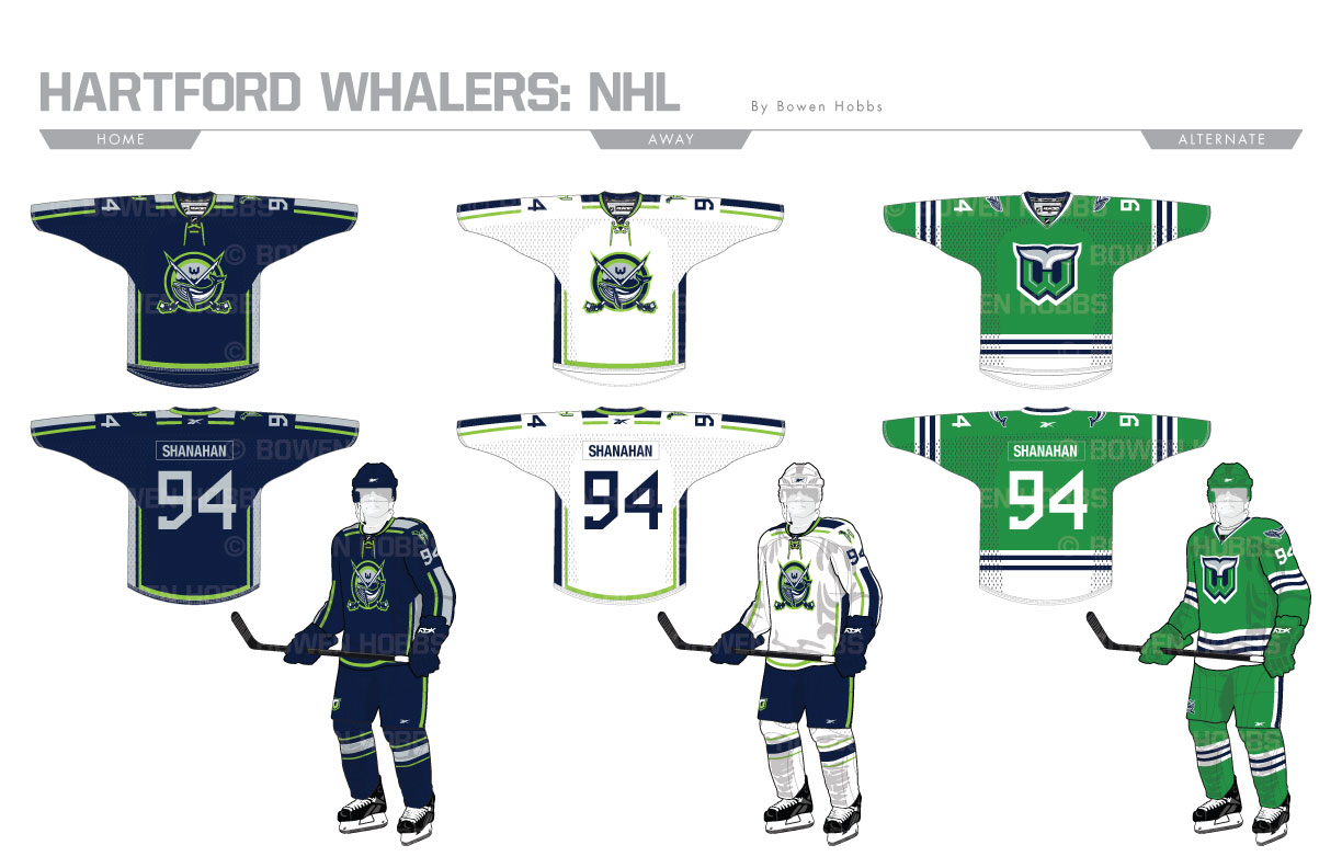
The Whalers began their history as a WHA team in 1972, as the New England Whalers, editing their geographic handle to Hartford in 1979. They would continue as the Hartford Whalers until 1997, when the team moved to Raleigh, NC and became the Hurricanes. The Hartford Whalers have always held a special place in the hearts of most hockey fans. Colloquially known as “The Whale,” the team had one of the most iconic logos in NHL history. I created a Whalers primary logo that is just at home on the side of a ship as it would be on a hockey jersey. In a color scheme of navy, lime green, and silver, it features a humpback whale below the ocean line with two harpoon/hockey stick hybrids against a circular holding shape. The Whale Tail-HW returns in a modernized form, while a harpoon-H and a standalone whale finish the logo set. The typeface is is futuristic as not to revel in the past, should a rebirth come to fruition. The home and away sweaters feature a continuous striping pattern along the sleeves and shoulder yoke. The alternate uniforms revive the classic Whalers uniforms worn from 1979 to 1992.
Date
July 3, 2017
Category
Hockey, NHL


