New Jersey Devils
New Jersey Devils
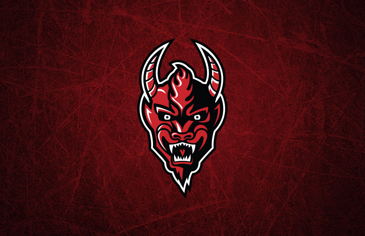
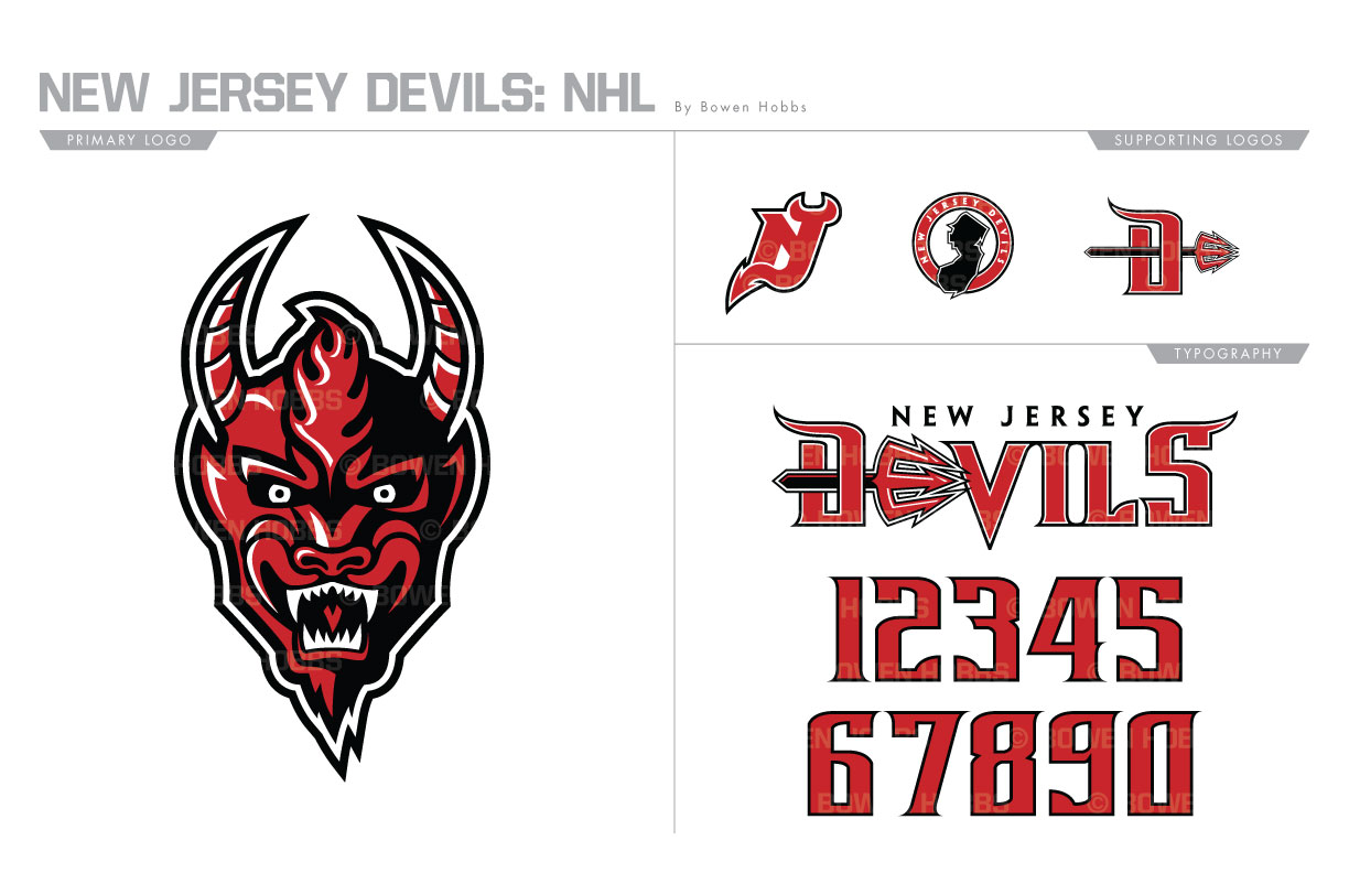
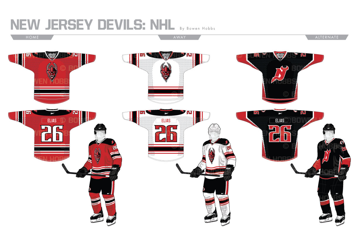
The Devils get their name from the legend of the Jersey Devil, a mythical beast who stalked the forests of southern Jersey terrorizing residents. From this legend I developed a primary mark as haunting as the legend itself. My devil has sunken, maniacal eyes, horns, and sharp fangs. Alongside this mark are an updated NJ logo, a state-themed roundel and a pitchfork-D. The typeface has sharp, tapered serifs and a high x-height. The script features a pitchfork forming the E in DEVILS. The homes and roads are have an updated striping style compared to the classic sweaters and make use of the new devil head and numerals. The alternates place the updated NJ on a more angular jersey design for a sinister all-black look.
Date
June 30, 2017
Category
Hockey, NHL


