Washington Nationals
Washington Nationals
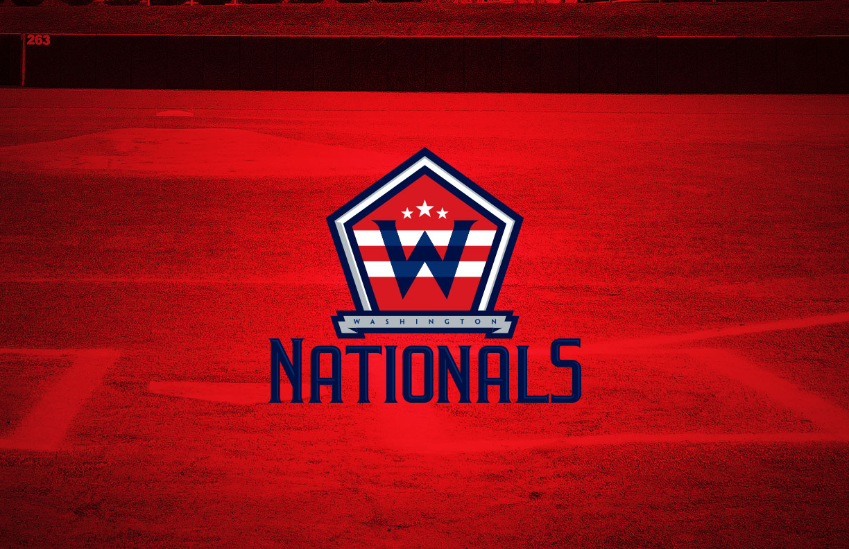
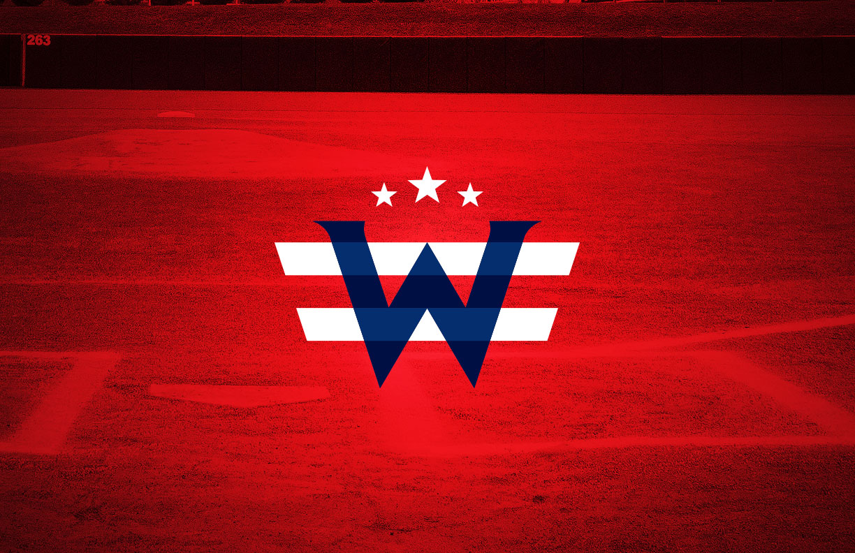
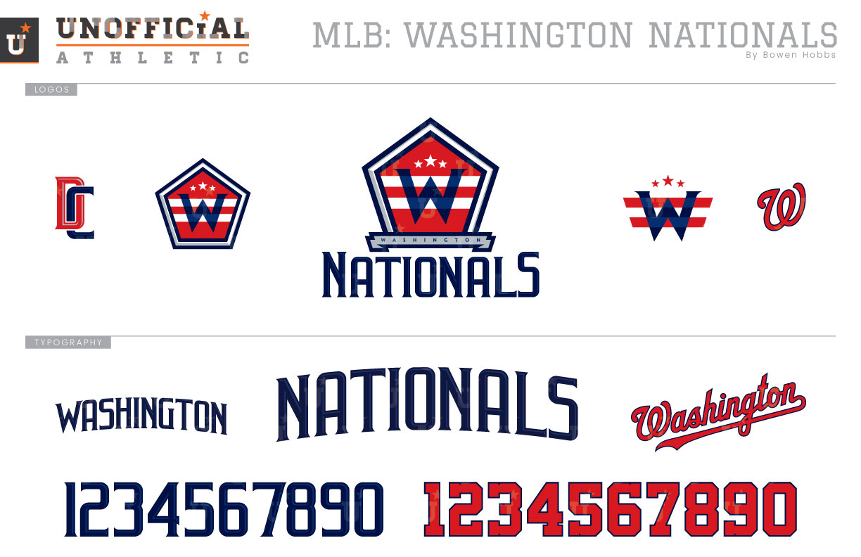
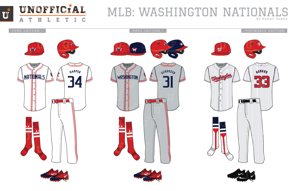
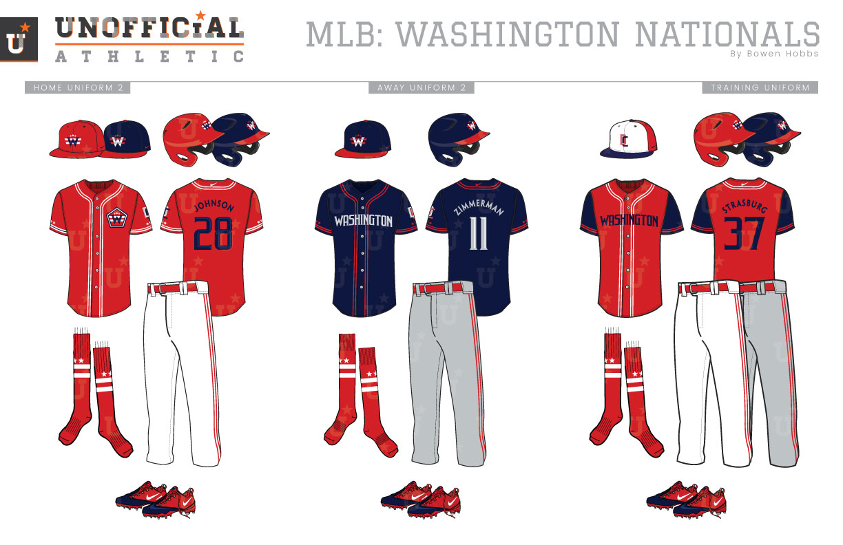
The history of baseball in the Nation’s Capital is checkered with name changes and relocations. The first team to call D.C. home was the Minnesota Twins’ franchise. Born in 1901 as the Washington Senators, that nickname would last four season before the team decided to refer to themselves as the Nationals despite playing in the American League. They would be known as the Nationals from 1905 to 1954 before returning to the Senators moniker for the 1955 season. The born-again Senators would only last six seasons before moving to Minnesota and becoming the Twins. That said, the city went right back at it in 1961, with the new Washington Senators who would also leave The District after the 1971 season, this time for North Texas. During that time, the teams only used two cap logos: the Sans Serif-W from 1901 through the 1962 season and the Curly-W from 1963 through 1971. In 2005, baseball would return to D.C. in the form of the former Montréal Expos, who had been purchased by MLB to avoid folding and moved to Washington to stay solvent. This occurred despite the Orioles franchise claiming “territory rights” and attempting to block the move. Upon moving, the team would resurrect the Curly-W and use it on both red home and navy away caps. The team complemented the cap mark with a patriotic primary logo centered around a beveled wordmark and a shaded baseball, as well as an interlocking-DC mark used as a standalone and in a roundel. In 2011, the team would streamline their look by removing the silver and gold accents they had used since 2005 and placing the Curly-W in a roundel. My Nationals redesign starts with a new shape, replacing the circle with the pentagon. Inside that pentagon I’ve placed a serif-W, two stripes and three stars, overlaying events of the D.C. flag on top of the two-tone blue W.At the base of the pentagon a banner stating WASHINGTON and a NATIONALS wordmark complete the lockup. I refreshed the cap logo by using the serif-W/two stripes/three stars lockup from the pentagon mark. The serif-W also appears in the pentagon as an icon without the typographic lockup, while a refreshed interlocking-DC and the old Curly-W round out the logo offerings. The typeface is tall, beveled, and slightly serifed for a stern monumental look and appears vertically arched on the jerseys. Both the home whites and road grays feature navy type and red trim with the two-stripe/three-star theme carried into the team wardrobe. The design calls for red caps with the white uniform, and either red or navy caps with the away uniform, depending on whether the home team wears primarily red or blue. The throwback combines a few eras of Washington baseball with a red Curly-W cap placed against a navy-pinstriped uniform with red type. The home alternate jersey is red and can be paired with the red or navy cap, while the away alternate focuses primarily on the navy and gray parts of the color scheme, using red as a trim color. The BP caps adopt the pinwheel design of the team’s Expos history, as also seen in the 2018 MLB All-Star Game, but with the DC logo front-and-center. The training jerseys are red with navy sleeves and type.
Date
September 4, 2018
Category
Baseball, MLB

