Ottawa Senators



Ottawa Senators
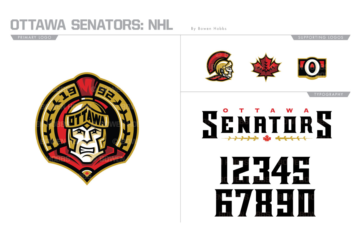
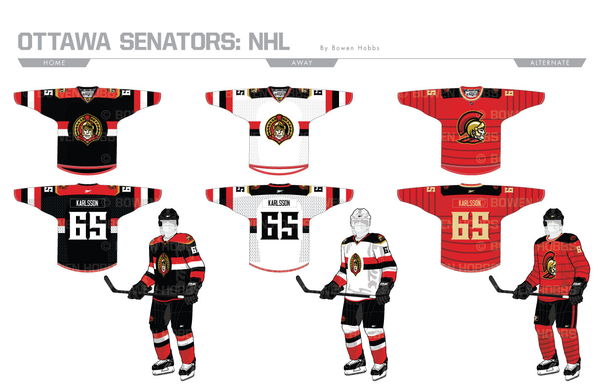
The original Ottawa Senators won three Stanley Cups between 1917 and 1934. But it would be almost 60 years until hockey returned to Canada’s capital in 1992 with the rebirth of the Senators. The current Sens boast a color palette of Ottawa’s signature black and red with accents of metallic gold. In my redesign, I’ve added hints of vintage white and burgundy for shading. My version of the Senators’ primary logo depicts a front-facing Roman centurion with Ottawa on his helmet and a maple leaf on his collar against a partial golden ring with olive branches and 1992 inscribed on it and a split black and red circle in the background. A soldier in profile, a maple leaf with olive branches on its seems and an O with the city red/black split complete the logo set. The typeface is strong and vertical, similar to a Roman shield, with flared semi-serifs on the corners. The home and away sweater feature a paired down version of the team’s famous barber pole striping with a two-color stripe across the chest, sleeves, and socks. The alternate jersey is red with horizontal burgundy stripes and the secondary logo adorning the chest.
Date
July 2, 2017
Category
Hockey, NHL


