Philadelphia Phillies
Philadelphia Phillies
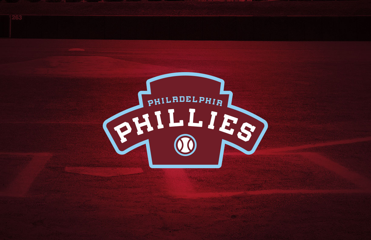
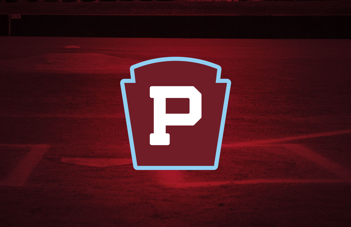
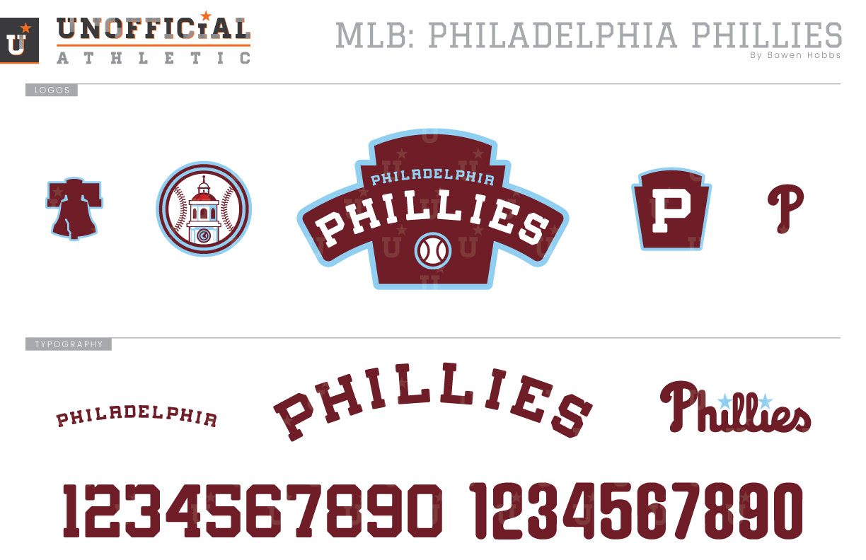
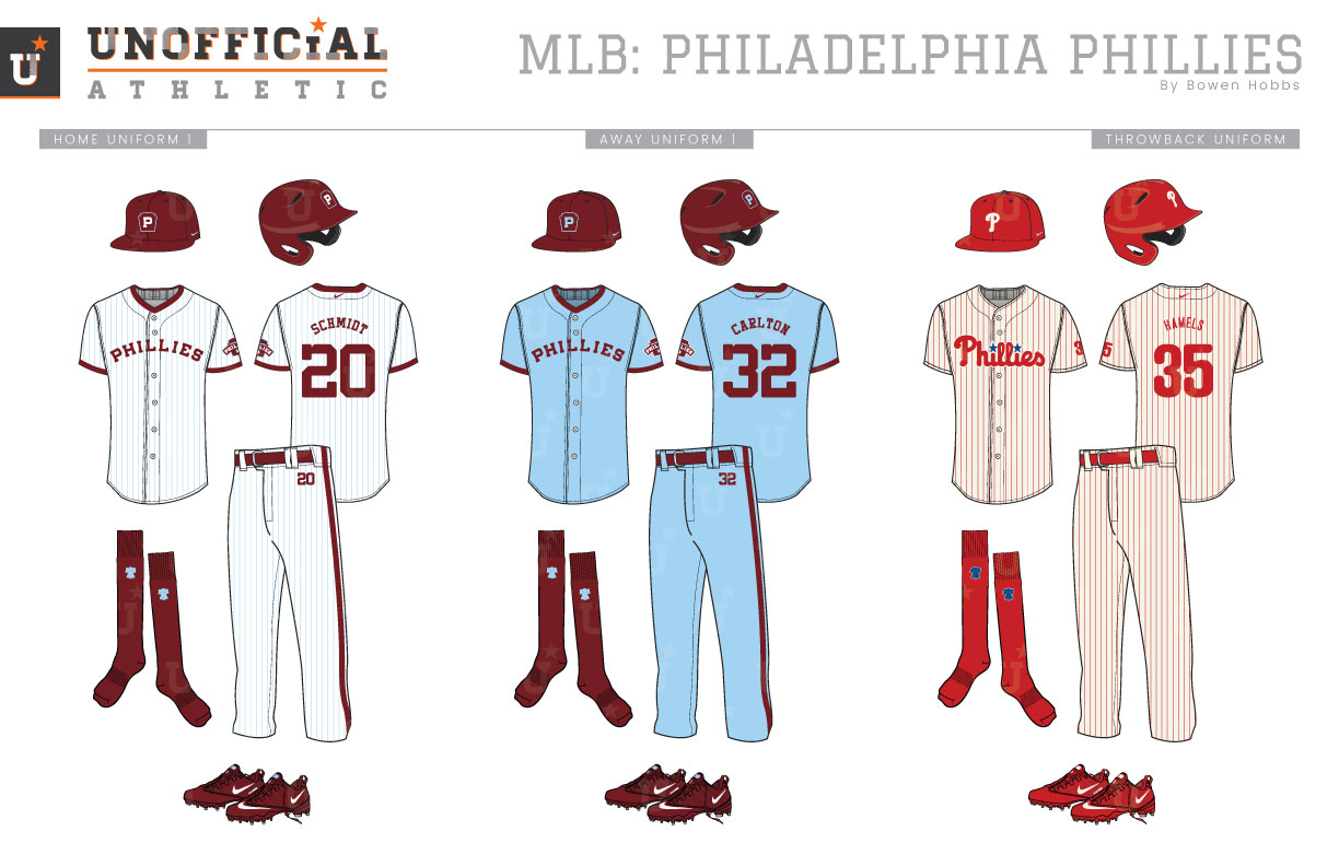
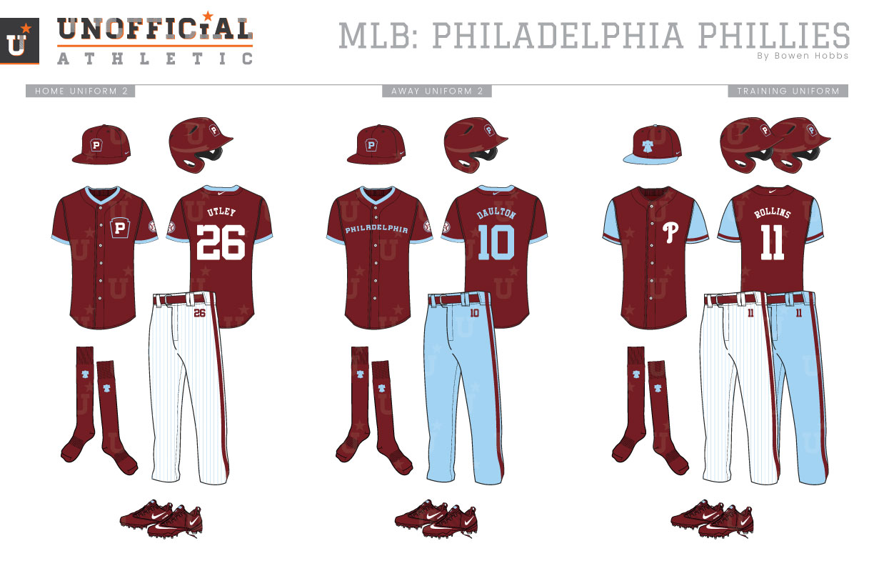
Like many older teams, the Phillies experimented with different typefaces and color schemes throughout the early 1900s. In the 1940s, they narrowed their identity down to a combination of royal and red, and displayed a blue jay as their mascot in 1944 and 1945. In 1950, Philadelphia’s NL club stuck to a warmer scheme featuring bright red and a script font that inspired the current brand. As is the case with many teams, the Phillies put out some very unique uniforms with more daring color schemes in the 1970s and 80s, opting for burgundy and powder blue (sometimes grey) over red and royal. The Phils adopted their current scheme in 1992, returning to red caps and pinstripes, in addition to adding royal blue accents to the cap and script. My concept for Philadelphia returns to the burgundy and powder blue, giving Phillies fans their unique look back. The identity honors Pennsylvania’s place as a center of the American Revolution with a keystone holding shape rendered in burgundy and powder blue. The primary logo places the team name against the keystone in a rounded corner block serif above a baseball icon, with the cap version paired down to a keystone-P. The brand identity also consists of a circular icon with Independence Hall, a revised Liberty Bell icon, and the current script-P as a throwback logo. The home uniforms accent chunky burgundy trim with subtle powder blue pinstripes and a burgundy PHILLIES wordmark. The home caps combine a white P with the keystone outline, while the road cap change out the white P with a sky-hued version. The away uniforms forgo the pinstripes for a solid powder blue base with the same burgundy trim. The throwbacks rely heavily on the current branding but with a cream fabric to reduce the pink hue that comes from red pinstripes on pure white. The home alternate jerseys are burgundy with powder blue trim, featuring the cap logo (with the white P) on the left chest, while the away alternates proudly state PHILADELPHIA across the front in blue. The spring training/batting practice jerseys are burgundy with powder blue sleeves and a white script-P and numbers. The BP cap highlights the powder blue sleeves with a matching Liberty Bell and brim.
Date
August 17, 2018
Category
Baseball, MLB

