Sacramento Kings
Sacramento Kings
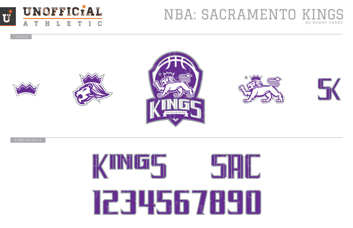
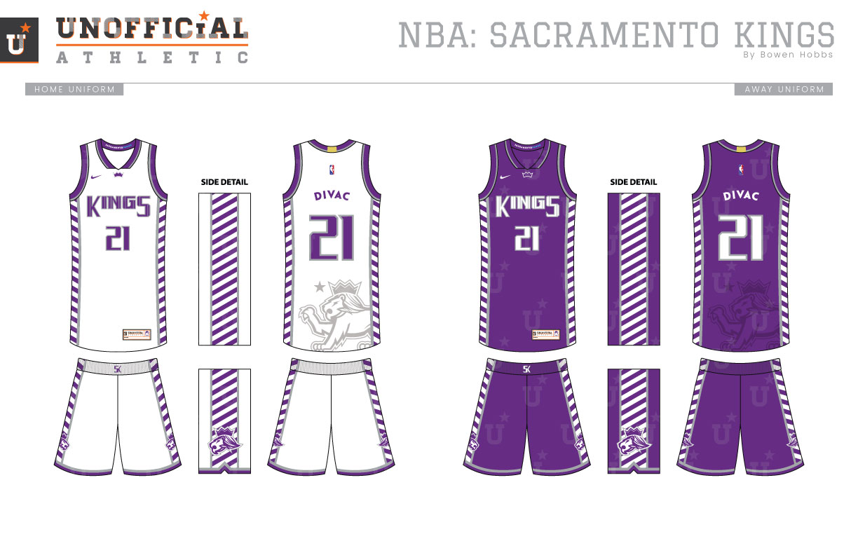
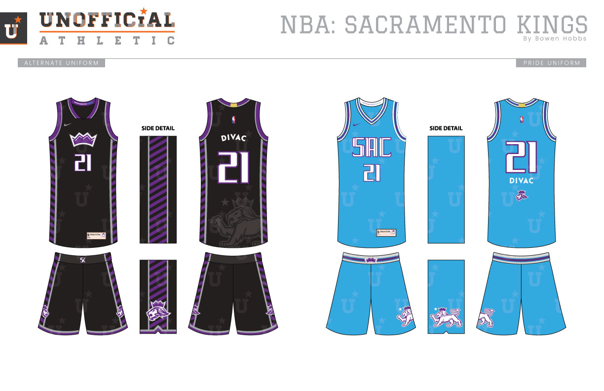
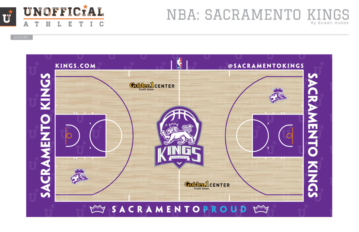
The Sacramento Kings came into the league as the Rochester Royals, and upon doing so, embarked on a 40-year journey through the Midwest en route to Sacramento. In spite of playing in Cincinnati, Kansas City and Omaha in between, the Kings maintained stability in their branding. From 1971 (as the Royals), until 1994 (after nine years in California capital), the team used a royal basketball with a red crown as its primary logo. In 1994, the team moved to a purple, black, and silver palette with a pair of lances and a crown surrounding the wordmark as its logo. However, the mark was too much a product of its time, and the team reverted to the simple crown-on-ball mark, but in purple and silver. My concept keeps the purple and silver and applies it to a shield containing a lion posed in a heraldic nod to the California flag standing on a KINGS wordmark. The lion mark is also used by itself with a star just in front of its face, and as a partial of just the lion’s head. An SK monogram and a crown icon complete the logo set. The typeface blends medieval elements with an athletic block featuring heavy vertical strokes. The Icon and Association uniforms rely on a heavy use of purple and white complemented by hints of silver trim. The side panels are comprised of alternating purple and white stripes that would be as perfectly suited on a lance as a uniform. A sublimated lion appears on the back of the jerseys, and KINGS appears on the chest. The black jerseys feature many of the hallmarks of the Icon and Association editions, but with a crown in place of the team name. The Pride uniforms are powder blue in reference to the team’s first years in Sacramento, but with updated typography and purple replacing red. The court, much like the uniforms, relies heavily on the juxtaposition of purple and white. The shield is placed at mid-court, while SACRAMENTO PROUD greets the players as they start the game.
Date
August 30, 2017
Category
Basketball, NBA


