Texas Rangers
Texas Rangers
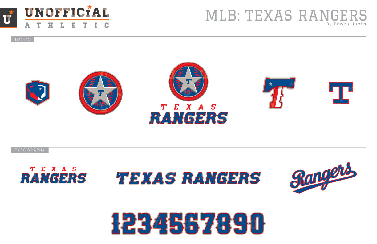
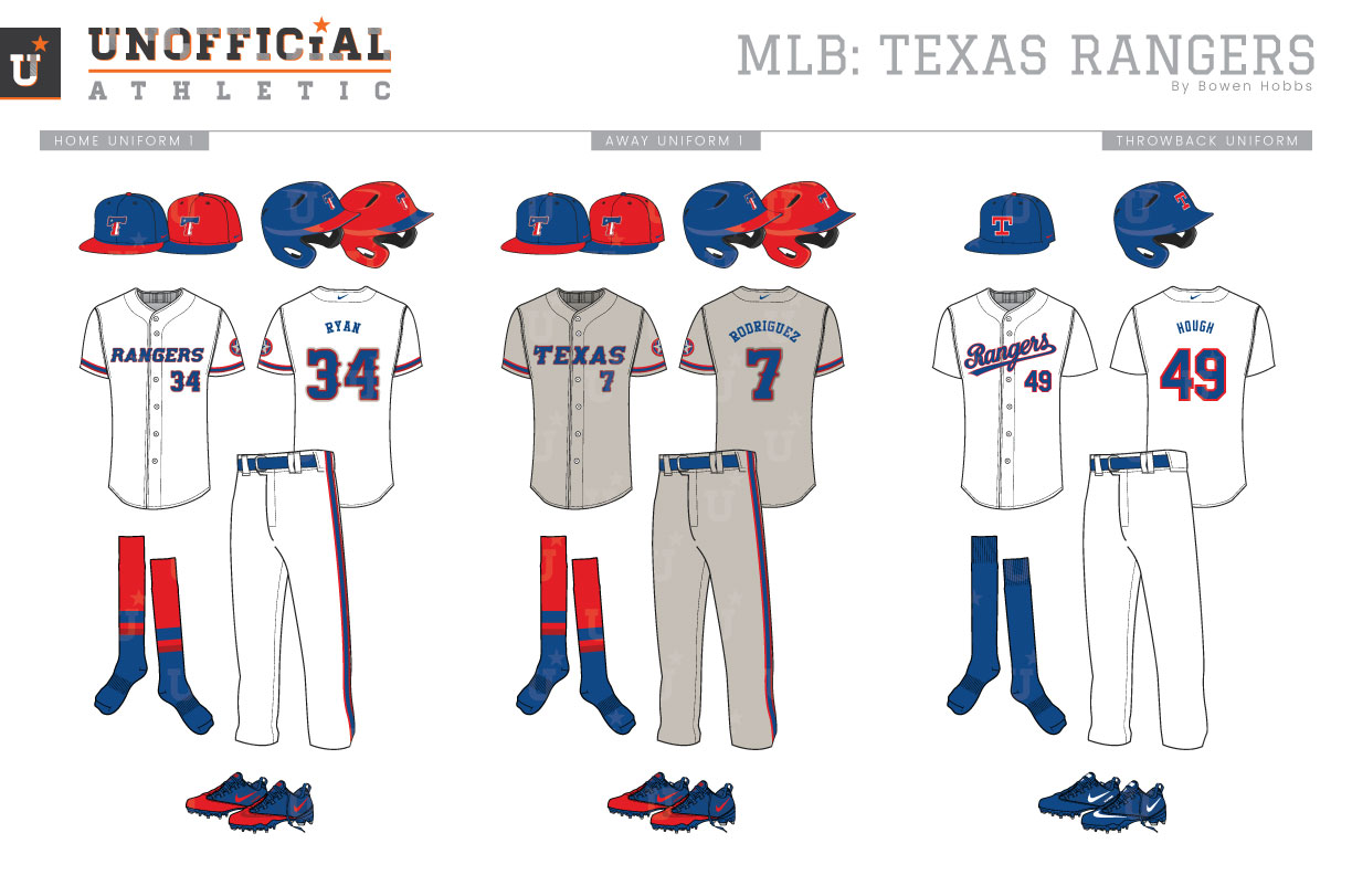
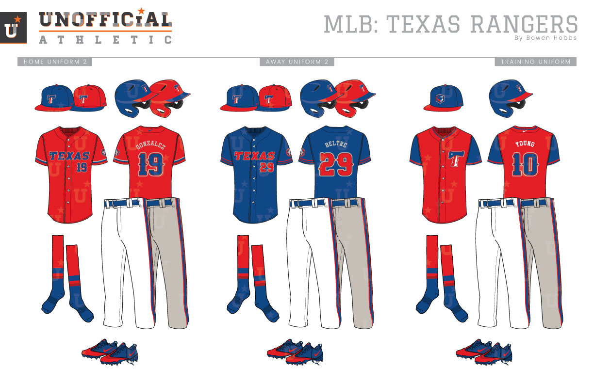
Originally the Washington Senators (Part II), the Texas Rangers kept a lawful aspect to their name when they moved halfway across the country and settled in the Dallas area after 11 seasons in the Nation’s Capital. The first Rangers logo was composed of a baseball and a 10-gallon hat rendered in white with a royal blue keyline behind the team name in a red western font. Fast forward ten years. The Rangers update their logo to a bolder slab serif red TR with a baseball and the state of Texas behind it, but the TR mark would only last two seasons before it was replaced by a similar logo that featured a Rangers script in place of the monogram. That Rangers-on-Texas logo is the team’s most recognizable mark because it coincided with the arrival of the Ryan Express. But all good things must come to and end, and in 1994, the Rangers underwent the most drastic branding change in team history: The Red Era. While the new logo, a star and circle against a blue diamond with silver pinstripes, was predominantly blue, the Rangers’ caps, socks, undershirts, and lettering were all red in this new aesthetic. The red uniforms would become blue over the 2000 and 2001 seasons (road greys in 2000, then home white in 2001), and the team would unveil its current primary logo in 2003. Since that time, the North Texas baseball has been represented primarily by a royal blue scheme with red accents, although red cap and jersey options were brought back as alternates in 2009 and are still worn for some games today. My Texas Rangers rebrand seeks to find the right balance of royal and red for the team that also differentiates them from other teams with similar color palettes like the Cubs and Dodgers. Another chromatic difference between the Rangers and other royal-and-red teams is the addition of cardinal red to the scheme and the use of a warm grey, which gives the concept a warmer tone overall. The new primary logo consists of a silver star against a blue baseball enclosed in a red ring with beveling that adds a metallic shimmer to the brand and is placed above the team name. The sheriff’s badge mark is also used on its own as a sleeve patch. The caps are still emblazoned with a T, but the new T features a tricolor pattern and star that evokes the state’s iconic flag. A home plate mark with the state inside and the Nolan Ryan-era T complete the logo set. The new typeface keeps the Western-style barbs, but opts for chunkier serifs and italicization on the letters. There are two cap options for the home, away, and alternate uniforms: royal with a red bill and red with a royal bill. Both feature the new T logo. The home uniforms are white with royal type outlined in cardinal red and warm grey with red-and-royal socks that pair with either cap. The away uniforms use the warm grey as a base color, switching the warm grey outlines to a darker shade. The throwback uniforms bring back the Ryan era with the Rangers script and the classic T caps. The two alternate jerseys are red and royal with the other color used for the TEXAS wordmark and numbers. The spring training / batting practice jerseys are red with royal sleeves and pair with a royal cap with a red brim. The BP caps feature the Home Plate-Texas logo while the T-logo appears on the left chest of BP jersey.
Date
March 6, 2019
Category
Baseball, MLB


